
So what does this mean and how can you prepare for it? In this post we’re going to brush you up on Core Web Vitals and then provide five steps you can implement to make sure your site is in line with this algorithm update:
- Reduce Javascript execution
- Implement lazy loading
- Optimize and compress images
- Provide proper dimensions for images and embeds
- Improve server response time
What are Core Web Vitals?
Core Web Vitals are page experience signals that evaluate the user experience on a website. Simply speaking, these signals measure how fast users will be able to interact with your website and what kind of result they will receive. These signals also measure how easy it is for users to navigate through the website.
If you improve user experience and make your website better in general, the better your page experience scores will be.
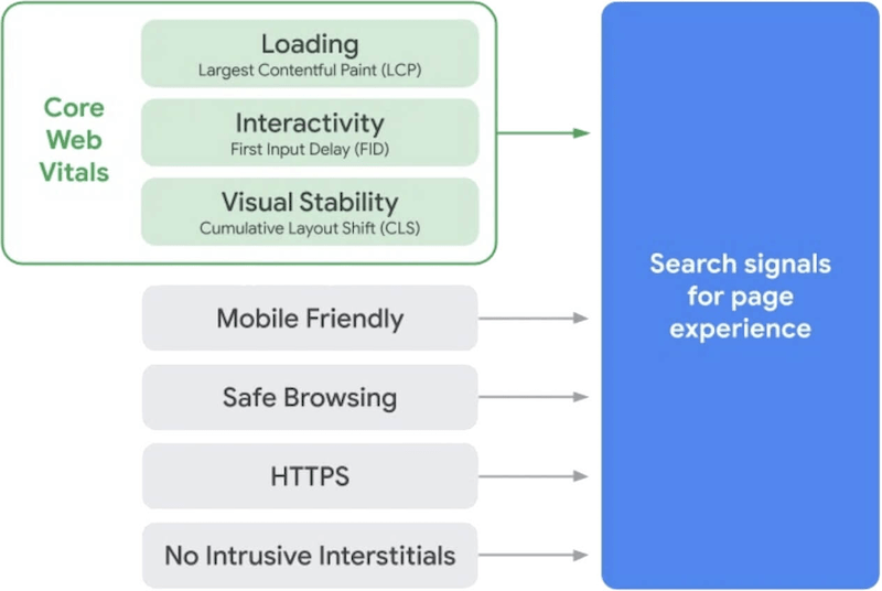
There are three Core Web Vitals metrics:
- Largest Contentful Paint (LCP) measures how fast the largest element (images, videos, animations, text, etc.) can load and appear on a website.
- Cumulative Layout Shift (CLS) ensures that a website’s pages are without unexpected, confusing movements that might disturb users from consuming the content.
- First Input Delay (FID) shows how responsive a website’s pages are when users interact with them for the first time. It also measures how fast a website’s browser can provide the result for users.
The image below shows the timeframe that indicates core web vitals score–good, needs improvement, and poor. The tips explained in the next paragraphs will help the website owners to improve their core web vitals score from poor to good.
Now, let’s continue with the tips!
5 tips to improve your Core Web Vitals
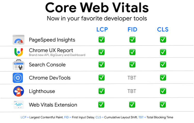
To see how well your website performs in terms of core web vitals, you should run a quick test of website performance analysis. To do so, you can use tools from Google like Search Console and Page Speed Insights and other tools like GTmetrix.
If you run performance reports using different tools, it’s worth comparing results and improving your page more efficiently.

1. Reduce JavaScript (JS) execution
If your report shows a poor FID score, it means that your page interacts with users over 300 milliseconds. You should consider reducing and optimizing your JS execution. This means that time between your browser execution JS code and page is reduced.
It’s also essential to use as little memory as you can. Why? Whenever your site’s code requests the browser, it reserves a new memory that stops the JavaScript and might slow down the page.
According to Google, one of the ways you can reduce the execution is by deferring unused JS.
In order to see if your website has unused JavaScript:
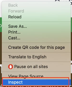
First, go to your website and press the right mouse click and choose ‘Inspect’.
- Then click on ‘Sources’ and look for three dots on the bottom. You should add a tool–’Coverage’. After you have added it, press the load function.
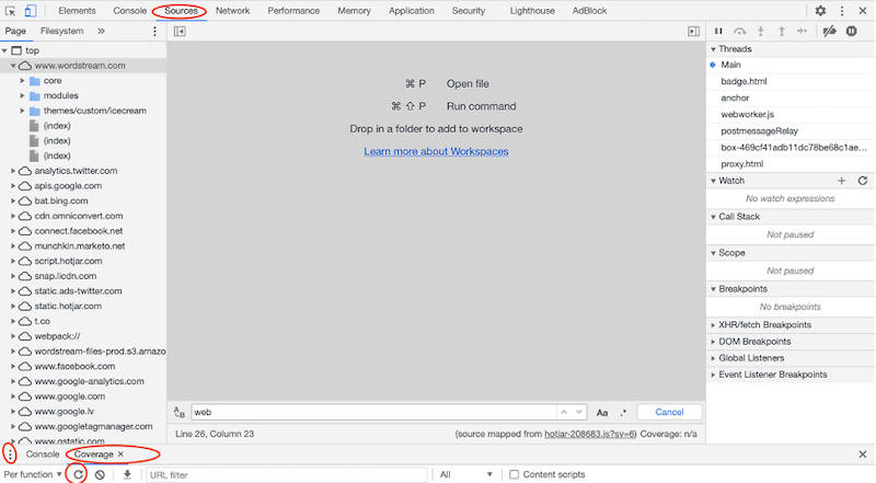
When the load is done, you will see how much JavaScript is not being used on your web page.

When you have realized the amount of unused JS, you should start to cut it down. One of the ways you can do it is with code splitting. This means to separate one JavaScript bundle (combined files into one bundle to avoid too many HTTP requests that are required to load a page) into smaller pieces.
2. Implement lazy loading
If you display images on your site, it’s crucial to implement lazy loading so your site’s UX and core web vitals score won’t get harmed. Lazy loading allows loading images at the exact moment when users scroll down through the page by not compromising the website’s loading speed and achieving your LCP score on a top-notch level.
The other benefits of lazy loading are:
- Your site’s performance will be improved.
- It will limit bandwidth usage.
- It can improve your site’s SEO.
- It will keep your visitors on the page and reduce the bounce rate.
Is lazy loading going to benefit your site? According to HubSpot, resources say that for those pages containing many images, animations, or videos (aka heavy elements), lazy loading would be considered a must. However, there are no set rules for which pages lazy loading should be implemented. So, if your site’s LCP score is poor, you should consider trying lazy loading and then compare results before and after implementation.

3. Optimize and compress images
Sounds quite obvious, don’t you think? However, for many websites, the largest elements are images. So, it’s crucial to optimize them because it can make your page significantly lighter, thus improving the loading speed, LCP score, UX, and your rankings on search engines.
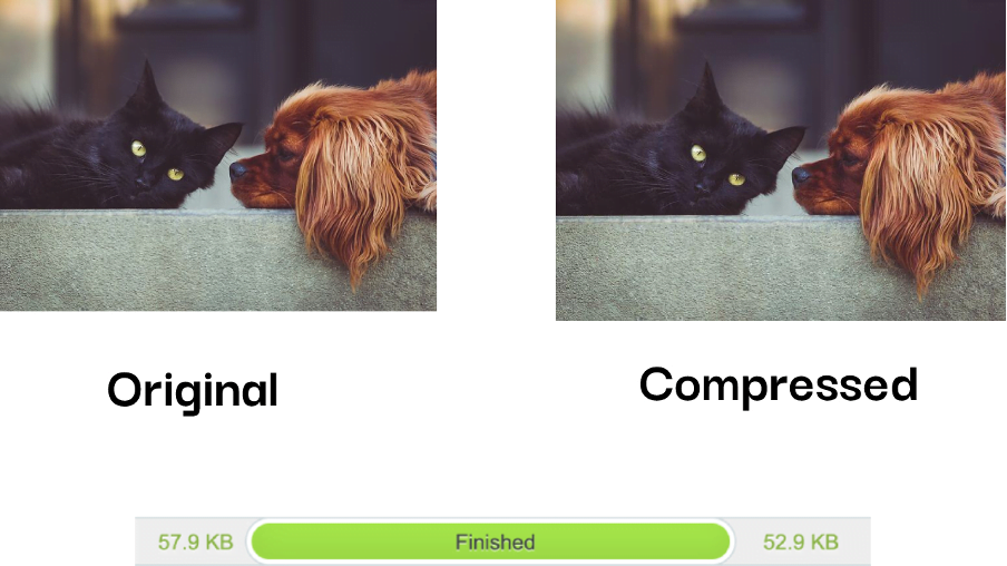
You can reduce the overall page size by compressing images with tiny jpg and improving your LCP results. You might be thinking that image compression will destroy the quality or resolution. Well, actually, you can only see the difference when you zoom in or if the image is saved in the wrong format. Always try to use jpg format for landscape images and png for graphics. You can also use next-generation formats like JPEG 2000, JPEG XR, or WebP, but we suggest doing some research beforehand.
Besides compressing, another important thing is to activate Content Delivery Network (CDN) for images. CDN is a network of servers all around the world that stores your content. Since servers are distributed in many different locations, images can be served faster from the server closest to users.
4. Provide proper dimensions for images and embeds
CLS score that’s over 0.1 is indicated as poor, and usually, it is caused by elements like images, ads, or embeds without dimensions in the CSS file. If you want to improve your CLS score, dimensions do matter. The importance of setting proper width and height helps the browser to allocate the correct amount of space in the page while the element is loading.
For example, if an image’s dimensions are not in a proper size, it usually appears later on a page. While a user consumes the content, it can suddenly drop because the image without proper dimension could not load fast enough. In this case, the browser didn’t understand how much space is needed for that particular image.
So, in order to avoid this image shift, you can earlier reserve a space where the image should be displayed. This kind of action will avoid layout shift if it’s loaded off-screen.
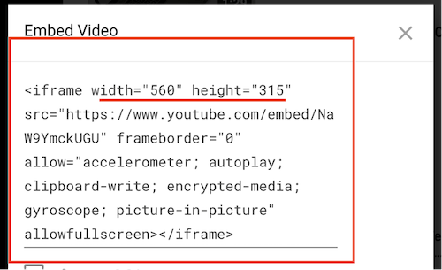
Ensure you have also set proper dimensions for embeds like when inserting videos from YouTube into your site. By default, the video might look okay from the back end, but it might look super big or messed up in the front-end. If that’s the case, there is an issue with dimensions, and you should change them.
Below you can see a step-by-step guide on finding an embed for a Youtube video. Learn how to change the dimensions and make sure the selected video looks great on your site.
How to resize the YouTube video you want to display:
Open the video on Youtube that you want to add to your site. Then, find the share button and choose the option <> Embed.

After that, all the information, including dimensions, will appear. Now, you need to copy the code into your website’s back-end and change it to the proper width and height that fits your site.
5. Improve your server response time
Google says: “The longer it takes a browser to receive content from the server, the longer it takes to render anything on the screen. A faster server response time directly improves every single page-load metric, including LCP.”
Most importantly, long server response time can negatively influence not only your SEO but also UX.
In order to measure server response time, use Time to First Byte (TTFB) that identifies the time the user’s web browser receives the first byte of your page’s content.
However, before you start, collect the data on your server’s current performance to understand how you’re doing. When you have done the report, here are tips that will help you:
- Check how fast is your web hosting.
- Use CDN for your site.
- Review your plugins. Why? It’s because each plugin comes with an additional weight for your page that can negatively impact your site’s performance. Leave only the necessary ones.’
Google suggests having a server’s response time lower than 600 milliseconds.

Improve your Core Web Vitals with these 5 tips
Even though the Core Web Vitals will roll in almost three months, it’s vital that you already work on improving them. Since the reports on vitals are available, use the tools mentioned above and compare your site’s results before and after fixing the errors.
Remember that your website’s back end works hand in hand with the front end, so make sure you optimize the back end to provide the best user experience in terms of loading speed, visual stability, and interactivity. Also, it would help if you didn’t forget about Google’s existing search signals– mobile-friendliness, safe-browsing, HTTPS, intrusive interstitial guidelines.
GTmetrix states: ”As a primarily back end optimization, reducing TTFB can complement your front-end development to significantly improve performance.”
About the author
Agnese Repule is a passionate Content Marketing Specialist at Setupad, a monetization platform for publishers. She typically covers topics on programmatic advertising, monetization, SEO, and content marketing. Another passion of hers is art—painting in particular. You can follow her on Twitter or LinkedIn.



Comments
Please read our Comment Policy before commenting.