We all need some creative inspiration now and then—and it’s nothing to be ashamed of. When Julian Casablancas, legendary frontman of the Strokes, was asked about the similarities between the band’s hit single “Last Nite” and Tom Petty’s “American Girl,” he issued a terse response: “Yeah, we ripped it off. Where have you been?”
Although this laissez-faire attitude towards plagiarism is baked into the foundation of rock ‘n’ roll, we’ve gotta play by the rules here in the digital marketing world. So, as you peruse this collection of outstanding banner ad examples, please refrain from taking the Casablancas approach. Finding inspiration is one thing; stealing is another.
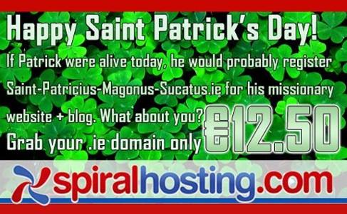
Yikes. Even if plagiarism were acceptable, this isn’t a banner ad you’d want to mimic.
Accompanying each banner ad example is a quick breakdown of what (in my opinion) makes it work. You’ll notice some themes: the versatility and effectiveness of side-by-side comparisons, the emotional power of visual imagery, the need to undermine skepticism, and so on.
Let’s get to it!
24 banner ads examples that we can all learn from
1. Bridgewater State University

Let’s be honest: This ad’s click-through rate is probably very low. Nobody stops reading a blog post to enroll in college classes. But that’s okay—the marketers at BSU aren’t going for clicks. Instead, they’re going for (meaningful, lasting) impressions.
This is a great example of banner ad copy that gets prospects thinking. Maybe it’s just me, but when I look at this ad, I can’t help but think: What would it look like for me to go beyond? All of a sudden, I’m picturing myself in a classroom. Although I wouldn’t click on this ad, there’s no denying its memorability. Sometimes, that’s all that matters.
2. Liberty University

Here we have another example from a higher education advertiser—one that’s effective for completely different reasons. First, I love the image on the left side of the ad; I think it evokes a feeling of community, of being part of something bigger than yourself. Never underestimate the power of a simple visual.
Secondly, the copy addresses a common complaint about online college: that it fails to deliver the benefits of a traditional university. By reassuring prospective students they’ll enjoy the flexibility of online classes and the advantages of a physical campus, the marketers at Liberty effectively erase some of the skepticism surrounding their offer.
3. AutoZone
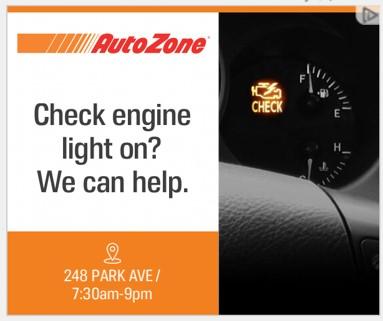
Shifting gears (zing) to an entirely different industry, here we have a banner ad example from AutoZone. Referring to a specific pain point that your product or service alleviates is a fantastic copywriting tactic; in this case, it’s the all-too-relatable scenario of seeing your check engine light rear its ugly head. Mimicking this approach is a great way to grab your prospects’ attention.
Bonus points to AutoZone for their geotargeting efforts. By providing the address and business hours of a nearby store, they make the likelihood of conversion considerably higher.
4. Capital One
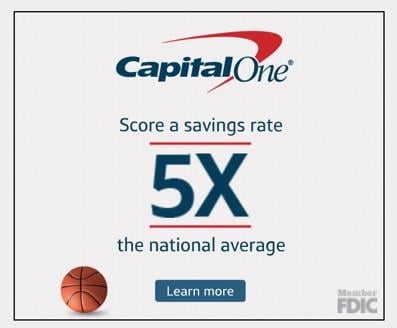
You don’t need a degree in graphic design to see why this Capital One ad works so well: It’s designed to make 5X leap off the screen. Like the team at Bridgewater State, the folks who put this winner together understand that clicks aren’t everything. Even if you don’t click that “Learn More” button—credit to them for using a low-pressure CTA, as opposed to something aggressive like “Sign Up Today”—you’ll remember that Capital One offers a savings rate 5X higher than the national average.
Bonus points to Capital One for associating their copy and imagery with basketball season.
5. Big Brothers Big Sisters
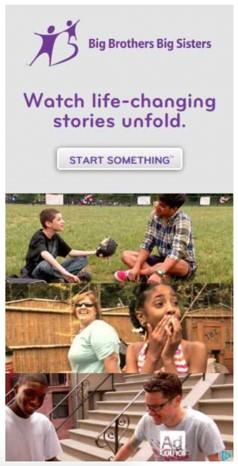
This banner ad example from Big Brothers Big Sisters demonstrates perfectly how the use of images can greatly enhance the emotional impact of your marketing materials. It sounds obvious, but this ad works largely because the images allow prospects to envision themselves working as big brothers and big sisters.
Elsewhere, I think their choice of CTA—“Start Something”—is brilliant. It gives the prospect a real sense of autonomy, no? With just two words, the advertiser sends a wonderful message: You have the power to effect change in this world.
6. nCino

Those of you who operate in competitive spaces understand the importance of establishing your authority as a brand. That’s exactly what the nCino marketing team does here with the headline copy: “The worldwide leader in cloud banking software.” That’s a bold statement—one that makes the nCino brand name stick around in your mind.
Additionally, I think the CTA button is perfectly placed; it attracts the eye as soon as you’re done scanning the headline copy. Plus, the marketers at nCino understand that they’re working with a long sales cycle—hence the use of a low-pressure CTA. They probably could have created a bit more contrast between the button color and the background color, but we’ll give ’em a pass.
7. Disney+

The effectiveness of this Disney+ banner ad can be summed up with a single word: exclusivity. More than anything, this ad serves as a reminder that Disney+ has content you can’t (legally) get anywhere else. No matter what you’re advertising, exclusivity is a heck of a sales pitch. If you have something that none of your competitors can replicate, make it known to the world.
Bonus points to Disney+ for nailing it with their CTA. Even if you don’t click that blue button, you’ll remember that Disney+ is offering a free trial. Next time you’re itching for an Iron Man marathon, you’ll know where to go.
8. Amazon Web Services (AWS)

There’s nothing wrong with using a statement to establish your brand authority. If, for example, the AWS marketing team simply wrote, “AWS is more reliable than the next major cloud provider,” I wouldn’t take issue with it. That being said, taking the cold, hard stats approach is infinitely more effective. Rather than asking us to simply take their word for it, the AWS team anchors their industry-leading status to a specific number—i.e., that they boasted 7X fewer downtime hours in 2018 than their closest competitor.
That, my friends, is good copywriting.
9. DocuSign

Here, thanks to DocuSign, we have our first banner ad example that illustrates the power of creating a curiosity gap—that is, using your copy to inspire intrigue in your prospects’ minds. Once you’ve read that headline, you can’t help but wonder: What are the six overlooked strategies that deliver rapid growth? The only way to find out, of course, is to read the ebook.
The marketers at DocuSign clearly have a strong understanding of how display advertising fits into the marketing funnel. Since it’s unlikely that you’ll get someone to buy your product or service with a simple banner ad, it’s wise to offer something small (e.g., a free ebook).
10. Ridge

Some things truly never go out of style. Exhibit A: the side-by-side comparison tactic. There’s a reason marketers have been employing it for decades: It’s a simple, direct, and painfully clear way to communicate the value of your product or service. It takes a fraction of a fraction of a second to understand what our friends at Ridge are trying to tell us. Awkward, clunky wallets are a thing of the past; if you want to keep up with the times, you have no choice but to upgrade to a slimmer, sleeker model.
Ask yourself: Could I substitute this copy for a side-by-side comparison image? If the answer is yes, the latter is often the right decision.
11. USA Today
The one and only native banner ad example included in this collection comes to us courtesy of the good people at USA Today. The best part of this ad, of course, is the way it inspires urgency. It’s never a bad idea to let your prospects know that they only have X hours left to take advantage of whatever promotion you’re running at the moment.
As the icing on the cake, “Go Ad-Free” is a fantastic CTA. Why? Because it tells USA Today’s readers what they’ll actually get if they opt into this limited-time deal. Would the ad be worthless if the CTA were “Sign Me Up” rather than “Go Ad-Free”? No way. But if you want to write banner ad copy that’s truly effective, focusing on outcomes is a great approach.
12. Allbirds
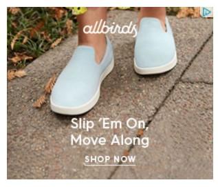
Say it with me, folks: You don’t have to choose between writing copy that’s catchy and writing copy that’s effective. In other words, it’s possible to write copy that both sticks in your prospects’ minds and communicates the value of your product or service.
Take this Allbirds ad, for instance. While there’s no denying that “Slip ‘em on, move along” is a catchy, memorable tagline, this copy is much cleverer than it initially seems. Why? Because it tells you (in a rather subtle way, admittedly) what it is, exactly, that makes Allbirds shoes such a wise decision: They’re easy and comfortable to wear. Whereas some footwear is a hassle to deal with, Allbirds’ selection is all about convenience.
13. Staples
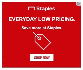
Sometimes, it’s best to take the dead-simple route. Although newer businesses may want to adopt the Allbirds approach and shoot for memorability, established brands shouldn’t be afraid to be direct. Is this example from Staples the sexiest banner ad I’ve ever seen? Nope—not by a long shot. But then again, who cares?
This ad was created for one reason and one reason only: to remind shoppers that Staples is the best place to go when you’re trying to save money. I’d argue that it’s accomplished that goal with flying colors. Plus, the design of the ad is flawless. Notice how your eyes are naturally drawn to the “Shop Now” CTA button? Most certainly not an accident.
14. Apple

Much like our friends at Ridge, Apple goes with the trusty side-by-side approach and communicates a clear, powerful message: Our credit card comes with no fees. Every other credit card comes with a lot of fees. This is a particularly strong ad because, as we saw with the Liberty University example, it makes a point to address a common pain point for those in the market for a credit card (i.e., having to deal with inexplicable fees).
Elsewhere, “Apply in minutes” is an excellent CTA. Not only does it call prospects to action, but it also communicates a secondary value proposition: Applying for our credit card is quick and easy. Don’t be afraid to kill two birds with one CTA.
15. Microsoft

There’s a lesson to be learned from this Microsoft banner ad: You can write copy with the intention of making your prospects feel as if they’re in the driver’s seat. Allow me to explain.
Nobody would bat an eye if the copy for this ad said, “Build and develop apps with Azure. Start your free trial today.” Bad copy? Not necessarily. Generic copy? Emphatically so. And if your banner ad copy fails to engage prospects in a meaningful way, then what’s the point?
This ad is brilliant because it reworks the “Start your free trial today” cliché in a way that makes prospects feel autonomous. Typically, a free trial is restricted to a set amount of time determined by the advertiser. Here, Microsoft flips that expectation on its head; all of a sudden, the consumer gets to decide when the free trial stops and the pay period begins.
It’s a simple switch, but it makes a massive impact.
16. Amazon

People don’t make purchase decisions based solely on price; often, a consumer will opt for a particular product or service because it somehow aligns with their personal values.
Clearly, the marketers at Amazon have an appreciation for this tendency. In a country where half the working population is employed by a small business, it’s no surprise that so many people are passionate about supporting the little guy. Here in the US, it’s not uncommon to hear someone say that they went with Product X or Service Y specifically because it was sold by a small business.
Advertising the fact that small businesses sell on Amazon is a savvy move—one that everyone can learn from. If you can align your brand with a principle or movement that prospects hold dear, you’ll drive some serious results.
17. Wikibuy

And speaking of Amazon, our next banner ad example comes from a company that helps make online shopping more affordable: Wikibuy. As you tell from this side-by-side banner, Wikibuy offers a price comparison browser extension that scans stores in search of the best deals.
To me, what’s unique about this side-by-side comparison is that it communicates Wikibuy’s value proposition through a specific, tangible product—an Xbox controller. If Wikibuy ran a banner ad that simply said, “We make online shopping cheaper,” it wouldn’t resonate nearly as much. By anchoring their value prop to something concrete that many consumers will recognize, Wikibuy significantly enhances the impact of their ad.
18. UMass Dartmouth
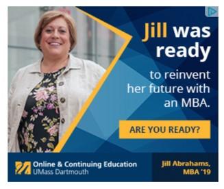
Wikibuy uses a specific product to make their banner ad resonate more deeply with their prospects; UMass Dartmouth, in a similar vein, uses a specific person. This, in my opinion, is a textbook example of how you can take the satisfaction of your current customers (or students) and use it to win new customers (or students).
Here’s why the inclusion of Jill makes this banner ad so effective: She invites UMass Dartmouth’s prospects to envision themselves as MBA students. Remember when I said Bridgewater State’s ad made me think about what it would mean for me to “go beyond”? This is practically the same idea. If you can get your prospects to think about what it would be like to be your customer, you’re making strides.
19. Hulu
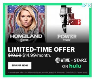
Nothing too philosophical to discuss here, my friends; the Hulu marketing team is trying to inspire that sense of urgency I’ve mentioned a few times. Though they’re far from reinventing the wheel, I want to give credit where credit is due. I like what they’ve done with the heading and the subhead; emphasizing “Limited-Time Offer” and driving it home with the crossed-out price tactic is a strong approach.
Bonus points to Hulu for perfect placement of the CTA button. No matter what you’re advertising, design your banner ads in such a way that prospects’ eyes are naturally drawn to your CTA buttons. Here, Hulu uses the F-pattern design. It’s fool-proof!
20. Invisalign
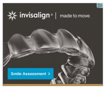
Here, thanks to Invisalign, we have another example of the curiosity gap. I have no idea what a smile assessment entails, but you better believe I want to find out. As Buzzfeed has proven time and again over the years, people go bananas for free online quizzes. If you can think of a way to create a free online quiz that pertains to your product or service, go for it!
Here’s why a banner ad is the perfect way to advertise such a quiz: The people you’re reaching with banner ads are typically at the top of your marketing funnel. As such, very few of them are ready to take any kind of action that involves payment. Because a free online quiz is, uh, free, it’s a fantastic way to move new prospects further down your funnel.
21. Dyson
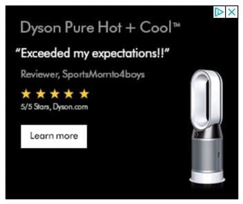
If the AWS ad and the UMass Dartmouth ad got together and started a family, this example from Dyson would be their glorious child. Why say “We make 5-star products” or “Our products will exceed your expectations” when you can use a customer testimonial to say both of those things in a much more organic and believable way?
If you want to go one step further—and why wouldn’t you?—I’d encourage you to combine the power of a testimonial with the power of visual imagery (i.e., a picture of your product in action). As much as I like this Dyson ad, it would be slightly better if we saw a customer actually using the product being promoted.
22. AAA
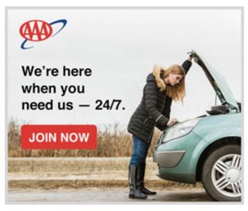
This is hands-down the best use of visual imagery out of the whole bunch. When I look at this picture of the woman inspecting under the hood, I immediately flash back to all the times I’ve found myself stranded on the side of the road. With those flashbacks, of course, come all the associated emotions: frustration, anger, anxiety, and so on. Emotions like these are incredibly good motivators—which is why AAA is tapping them to get people to sign up.
Think about the emotions you want to stir inside your prospects. Then, think about how you can use simple, direct imagery to get the job done. If you’re truly thoughtful, you’ll put together some winning banner ads.
23. One A Day

Here’s another great example of a banner ad that directly addresses a common myth. In this case, One A Day is undermining the idea that being health conscious is complicated and time-consuming. As this ad does a stellar job of communicating, all it takes to improve your nutrition is a single daily supplement.
I love the design of this banner, too; I think the use of bright colors is an effective way to cast a positive light on top of the messaging. Plus, making the CTA “Save Now” rather than “Buy Now” is a tremendous way to sneak an additional value proposition into the ad.
24. Liberty Mutual
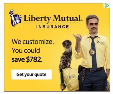
Finally, we’ve got this winner from insurance provider Liberty Mutual. Unsurprisingly, it’s the copy (and value prop) that I’m most fond of: We’ll do the work while you save money.
What makes this banner ad great rather than good is the use of a specific number ($782). Again, it’s all about making your message resonate. If Liberty Mutual simply said, “You could save money,” that wouldn’t make much of an impact on their prospects.
When someone sees $782, their mind goes straight to all the things they could do with those savings: pay rent, make a car payment, put a dent in their debt, etc. In other words, the inclusion of a specific number makes this ad emotional—and, therefore, far more memorable.
If the main value prop behind your banner ad is savings, consider using a specific number.
Let these banner ads examples inspire your next campaign!
Like I said earlier, we all need creative inspiration every now and then. So take a look at these great examples, get your ideas rolling, and then get started on your next campaign—complete with your own clickable banner ads!

