Now that we’ve entered a new decade, it is hard to imagine a time pre-Instagram. And with over 1 billion users, it is pretty clear that Instagram plans to stay.
I would spend time introducing this post with more stats about Instagram usage for business—but I believe all of you are likely already aware that your business needs to be on Instagram (in fact, I’m guessing the majority of you are already advertising on the ’gram). If you haven’t started advertising on Instagram yet, check out The Complete Guide to Advertising on Instagram for more tips to get started. Today, I’m going to focus on one of my favorite ad types, Instagram carousel ads!
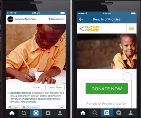
In this guide, I’m going to cover what Instagram carousel ads are, the guidelines for Instagram carousel ads, and six strategies to create Instagram carousel ads get your viewers clicking:
- Target each unique audience strategically
- Prioritize copy just as much as imagery
- Don’t feel the need to use all 10 image slots
- Intrigue viewers with deals!
- Choose your CTA carefully
- Don’t be afraid to incorporate video content
Let’s get started.
What are Instagram carousel ads?
Instagram carousel ads are slide shows in ad format, which allows instagrammers to slide through multiple images or videos in one single post. Instagram carousel ads also allow the advertisers to add in clickable calls to action, change the text below for each image, and link to various web pages. They are perfect for any industry that has beautiful imagery and is looking to show different angles or multiple related products in one advertisement.
Why are Instagram carousel ads so wonderful?
“With more creative space within an ad, you can highlight different products, showcase specific details about one produce, service or promotion, or tell a story about your brand that develops across each carousel card,” says Instagram’s parent company, Facebook.
Instagram carousel ad guidelines
Now that you understand what these ads are, it is critical to be aware of the guidelines around crafting your ad to ensure it won’t get rejected by the platform.
Here are a few things to keep in mind regarding the design and technical requirements before crafting your ad.
- Maximum number of photos/videos: 10
- Minimum number of photos/videos: 2
- Image file formats: jpg and png
- Maximum video size/length: 4GB for up to 60 seconds
- Text in images: 20% or less of image
- Text below image: ≤2,200 in up to 2 rows of text
- Maximum hashtags in text: 30
- Supported objectives: Reach, Conversions, Traffic, Lead Generation, Brand Awareness, Catalog Sales, Store Traffic, App Installs, Messages
- Supported CTA buttons: Shop Now, Book Now, Learn More, Get Showtimes, Sign Up, Download, Watch More, Contract Us, Apply Now, Donate Now, Get Quote, Request Time, See Menu, Send Message, Listen Now, Get Offer, Subscribe, Book Test Drive, Check Availability
- Ad Placement Options: Instagram Stories, Instagram Feed
6 ways to win at Instagram carousel ads
Those design and technical requirements will make sure your ads are approved by the platform—but, as an advertiser, you know that doesn’t mean your done with ad strategy. Now, let’s dive into the fun stuff to make sure your Instagram carousel ads are successful! Here are six strategies to make some crush-worthy Instagram carousel ads.
1. Target each unique audience strategically
Everyone who has advertised on Facebook and Instagram knows how ridiculously amazing their targeting is. Whether you are targeting a soccer mom who lives on the Maine coast and enjoys reading fiction novels and eating seafood or a teenager in Texas with a passion for online furniture shopping, you can get in front of your audience. You can get as detailed as your heart desires, but please just do not get lazy.
Use Instagram’s robust targeting options to segment your audiences and target them with carousel ads that fit their unique needs, wants, and stage in your buying cycle. Breaking up each unique audience for your various campaigns will ensure you are spending your budget as wisely as possible. Considering how many people are on Instagram this tip is especially important for Instagram carousel ads—since these babies take time and money to put together, making sure you are showing them to the right people at the right time is key.
2. Prioritize copy just as much as imagery
Instagram is all about the imagery, right? Well, yes, but when crafting an Instagram carousel ad, it is critical to put just as much thought into your copy. You’re spending money to accomplish a set goal, so you need to use all the persuasive tools in your toolbox.
Without context to go along with your imagery, it can be quite hard to communicate properly to visitors, so spend time on engaging, persuasive ad copy that resides below your images. Your Instagram captions should be direct, actionable, and persuasive.
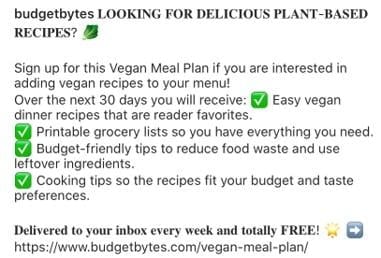
Take the great example below from Budget Bytes. Image if you saw just the images of food and CTA saying, “Learn More.” You’d be left dumbfounded thinking, learn more about what?

Luckily, this company provided context to the images of food in the carousel ad. What I love about the copy included below is that it uses different fonts to put emphasis on different areas. This also uses checkbox emojis to clearly outline what the offer is. And there are little barriers to enter since the meal plan offered is free and provided within the CTA of the ad, as well as by the link at the end of the text.
3. Don’t feel the need to use all 10 image slots
Sometimes less is more, my friends. Think about how much content is already on Instagram. Do you really think that every person who swipes through your ad is going to have the attention span to view all 10 images? Perhaps they will if you tell a compelling enough story, but if you’re able to get you point across in just a couple quality images then why not go for it?
Take this great example below from LL Bean. Rather than showing off their entire new line for 2020, LL Bean makes the point loud and clear with an initial picture, including a small amount of relevant text.

And then the second image shows exactly where their store front location is to compel me to stop by.
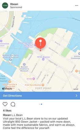
Sometimes a simple and direct carousel ad is the most effective
4. Intrigue viewers with deals!
Let’s face it: Instagrammers are going to need an incentive to leave Instagram! The social network is like a blackhole. Who hasn’t caught themselves going to bed an hour later because Instagram that has sucked you in? The platform can be very addictive! Therefore, to break the addiction and get your grammers to leave Instagram there needs to be some incentive…
What better way to incentivize Instagrammers to leave than a limited-time deal! Whether it’s free shipping, a percentage discount, or a BOGO offer, carousel ads are great for these types of promotions. With this Instagram ad format, you can promote multiple deals in one ad. Take the example below from the clothing brand, joie. The company uses the carousal ad format to show off the fabulous discounted clothing items offered as part of joie’s winter sale.

5. Choose your CTA carefully
With so many CTAs to choose from for the carousel ad format, it can feel a bit tempting to just pick the first one that makes some type of sense. Yet, this is not the best way to win folks over. Spend time really thinking about your offer and ensuring the CTA makes sense. There is nothing worse than clicking on a CTA and then feeling misled when the offer is different than expected (for instance, if you wanted to purchase something but were then led to an ebook landing page or vice versa).
The Food Network’s offer below is a great example of one well done. The ad uses the “Download” CTA since the carousel images are showing various drool-worthy recipes from their downloadable app. The CTA perfectly aligns with the offer to download the app and sign up, and the text below the CTA further enforces it

6. Don’t be afraid to incorporate video content
We all know how effective video ads are, but making a video Instagram carousel ad sounds like a LOT of hard and time-consuming work, doesn’t it? It actually doesn’t have to be!
Nowadays, our iPhones can take pretty quality videos so do not feel like you need to hire a fancy video production team to incorporate some fun and interesting videos into your carousel ads. Fitness mogul, Kayla Itsines, does a great job at making easy, quick, and low-production workout videos that she turns into Instagram carousel ads.
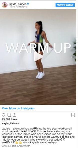
See, it’s possible to create high-quality ads without being overly nit-picky on video production perfection.
Get rolling with Instagram carousel ads
Now, you’ve got everything you need to get started making Instagram carousel ads and making sure they’re super effective for your Instagram marketing strategy! Get rolling!


