If you’re in marketing, you’re no stranger to landing pages. We’ve all clicked through an interesting ad looking for more information and abandoned the landing page because it was too confusing or didn’t hold enough information. And if we’re paying attention, we usually take note of what not to do with our own landing pages.
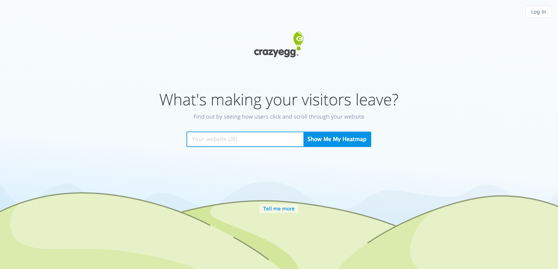
But what about what we need to do to keep those visitors? Whether you’re using a plug-and-play solution like Marketo or Hubspot or Unbounce to make your landing pages or you’re having an in-house dev team build them out, you can swear by these 11 landing page best practices for better pages and, of course, more conversions.
Non-negotiable landing page best practices
I know, 11 best practices feels like a lot, but most of these are small details that have a large impact. Conversion rate optimization is easier than you might think!
1. Align your landing page with the goal of your ad campaigns
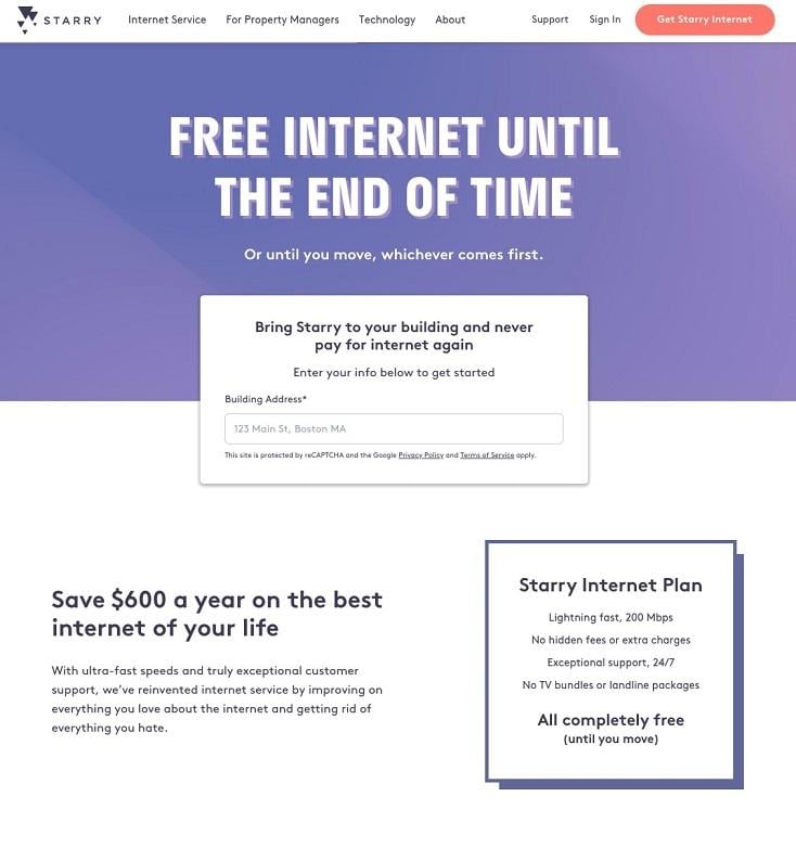
Now, I think landing pages are harder to create than ads, so I think this tip should be the other way around. But others disagree. Either way, when you’re setting up a landing page, keep your eye on the prize. What ad campaigns will drive traffic to this page? What’s the goal?
Based on that, make sure the language on the page echoes the language in your ads or vice-versa. If your ad says, “Get free internet! Learn how here,” then your landing page should explain exactly how to get free internet. Badda-bing-badda-boom, you have a new customer.
2. Simplify your forms
Though forms can be an important part of landing page design, I’m not going to dive in too deep since we have another (far more helpful) post on that here. But rule of thumb: Never ask for more information than you need. Try to keep it under seven fields of input. Appreciate white space. When in doubt, always keep it simple. You can get a feel for what your form should include these landing page examples.
3. Test your copy & CTA
Speaking of keeping it simple, let’s talk landing page copy. Anytime you’re writing copy for a designed page, keep the layout in mind. You don’t want your audience to be staring down a wall of text that they need to comb through to get to the point. When you can, use bullet points, headers, and subheads to drive your point home concisely.
But as always, test your copy. And test your CTA. And then test some more copy. And then test CTAs again. You’re never going to know what resonates with your audience until the numbers tell you the truth.
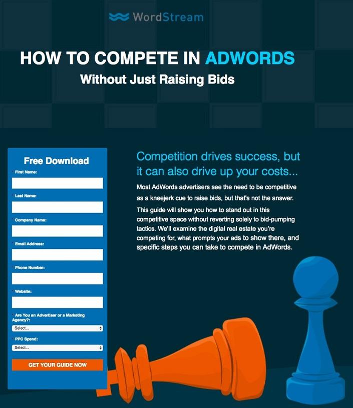
You’re going to have to trust me that this landing page has been tested against other copy and different forms and different CTAs. Turns out, competing in AdWords (without just raising bids) is pretty compelling.
4. Keep the design straightforward and easy to navigate
Have you ever landed on a page and just … gotten lost? It’s happened to me. I’ll be looking to buy concert tickets and all of a sudden, I just can’t find the “Buy Now” button because there are too many dropdowns and display ads and distractions.
Don’t lose conversions because of this. Your landing page design should reflect your brand colors and look like something you’d want to include on your website. Along with keeping your forms simple, you want to make the whole page navigable.
5. Leverage case studies and social proof
This tip is easy. Any time you can leverage the nice things your customers have said about you, do it. If you don’t have a large cache of compliments, you can lean on logos instead. Just make sure you have permission!
There are a few different platforms that will integrate with your landing pages to keep reviews fresh, like Yelp, Google My Business, and Trustpilot. You can even use simple embed codes. Keep these reviews at the bottom of the page so you don’t distract from the action you want your audience to take. These should be also related to the headline describing the action, or else your audience will get pretty confused.
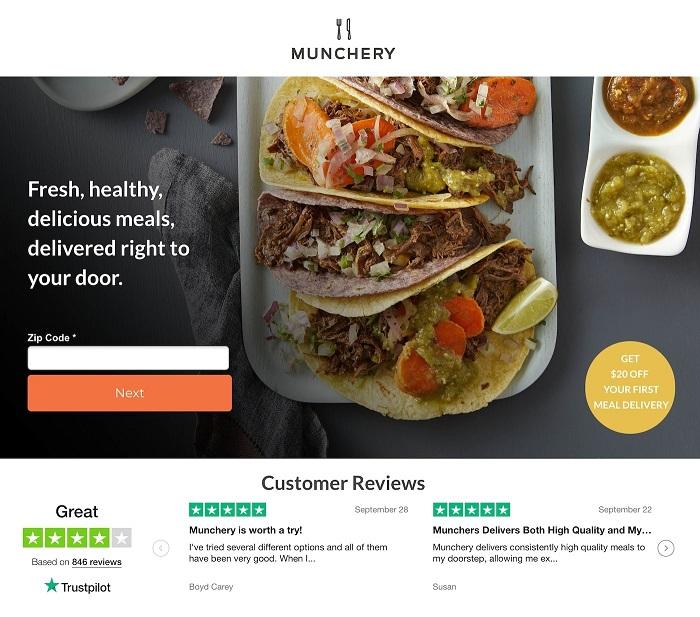
Munchery popped in some reviews from Trustpilot on their landing page and magically made the section simple and appealing, without distracting from the action above.
6. Keep your landing page mobile-friendly
As is important for any marketing, you want to make sure your landing pages are compatible with any device or viewable on any screen size. A lot of plug-and-play landing page solutions have this feature built in, allowing you to see common sizes before launching your shiny new page. Just a tip: Play it safe by keeping your buttons and/or forms toward the center of a full-size page with a single-color background. That way, shrinking and stretching on whatever strange screens your page may encounter is less likely to break something important.
7. Make sure it loads quickly
If you’re a marketer, you probably already have landing pages whirring away as well as your website. If you’re seeing a high bounce rate on a particular page, load time could be the culprit. It can be easy to cut corners with one-off landing pages, but make sure nothing on the page is too heavy or big. Resizing takes up a lot of time. And when your landing page doesn’t load fast enough, it can damage any SEO you’ve done for the page.
8. Put the important information above the fold
Just like an email, you want to make sure when someone is clicking through, the important stuff is visible first. This is particularly important for highly actionable pages, like buying tickets or entering a contest.
Things you can put below the fold: any testimonials, case studies, or client logos. Your own terms and conditions. Suggested content (e.g., if you liked this, you’ll also love our guide on our to make your lead forms pop!).
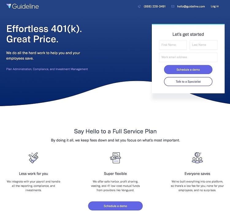
This Guideline page does this really well; there’s minimal text, a simple form above the fold, and more details below.
9. Update your landing pages regularly
User experience and landing page trends change. So like any blog post or site page, the content on your landing pages should stay up to date. If your previously best-performing ad begins to fall off, outdated landing pages could be the culprit. Even just a refresh of the background colors, a new CTA, or some fresh copy will prevent fatigue and signal to Google and any ad platform that the content is fresh.
10. Add a thank you page
Okay, it may seem like all these tips are pointing you away from confusing your audience … and maybe you’re right. Thank you pages are just another step in this process. Once someone lands on your page and completes an action, give them a visual confirmation that you have their information, the wheels are churning, they have reserved a spot. This can come in the form of a thank you script: “Thank you. Your information has been submitted.” Or you can redirect to a full thank you page that features some of those special extras you may have buried below the fold on the previous page.
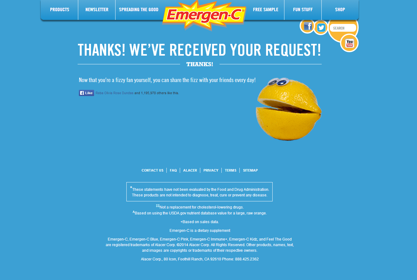
Check out these 16 great (and not so great) thank you page examples so you can get yours just right.
11. Build your landing page for SEO
This is an important one. If you need your landing page to have staying power, try to flex some of your SEO muscles. If you run a blog (or your own website), you probably already know these basics. Here’s a review:
- Unique URL: Giving your landing page a unique URL isn’t just so people land in the right place, it can also optimize for whichever keywords you want to rank for.
- Title tag: This is separate from your header tag, it’s the title of the page. Again, plug-and-play landing page solutions should have an option to alter this (i.e., make it different from your header tag), just remember to fill that field out.
- Header tag: This tag is the title of your page (ironically). Whatever your landing page headline is, shrink it down for your header tag.
- Meta description: I know that a lot of people forget to fill this field out, which could be fine, but for landing pages, you want to. The meta is what google populates under your search result, and landing pages often have some … dispersed copy. So you want to tell google exactly what to grab and put out there on the SERP.
- Image file names: Self-explanatory, obvious, necessary. Name your images! Give them names that reflect the purpose of the page. If you can get your target keywords in there, even better.
- Backlinking: This is the final step, after publishing your page. Not only should you link to your landing page from ad campaigns, you can try to embed the link within blog posts, your website pages, hand it out to affiliate partners, etc. The more spots your link appears, the more google is going to recognize its relevance and authority.
Live by these landing page best practices!
Follow these 11 key landing page best practices:
- Align your landing page with the goal of your ad campaigns
- Simplify your forms
- Test your copy and CTA
- Keep the design straightforward
- Leverage case studies and social proof
- Keep your landing page mobile-friendly
- Make sure it loads quickly
- Put important information above the fold
- Update your landing pages regularly
- Add a thank you page
- Build your landing pages for SEO
Now, good luck out there in landing page land! Let us know if you have any secret, trusted tips of your own.





Comments
Please read our Comment Policy before commenting.