Pop-up advertising gets a bad rap: It’s annoying. It’s invasive. It’s distracting.
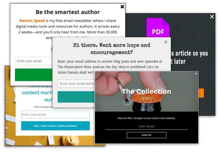
But pop-ups don’t have to be annoying or invasive or distracting—in fact, pop-up advertising works way better when your pop-ups are appealing to your website visitors and enhance their experience.
Today we’re going to look at seven surprisingly effective ways to use pop-ups on your website, with real-world examples from businesses like yours.
But first, let’s talk about why pop-ups work.
Why pop-up advertising works
The average pop-up—of almost 2 billion tested by Sumo—converted at 3.09%, and the best around 9.28%. With those kinds of numbers, even with 100 visitors a day, using a newsletter subscription pop-up would give you between 92 and 274 subscribers every month.
Aweber found that moving from a sidebar opt-in form to a pop-up increased subscription by 1,375%.
But why? Why do these things work when so many people complain about them?
There are a few key reasons:
- Pop-ups show to everyone. Banner blindness occurs just as frequently on your website as it does in display advertising. Pop-ups (because they have to be seen to be closed) have a 100% view rate. A 3% conversion rate may not sound that impressive, but 3% of every website visitor becomes a significant number over time.
- Pop-ups deliver a message when site visitors are engaged. Well-implemented pop-ups deliver a prompt exactly when your site visitors are most likely to click through (not including exit intent pop-ups, of course, which are a different thing entirely).
- Pop-ups offer value. No, seriously. Well-used, relevant pop-ups provide value to your readers and site visitors. We’ll show you some examples below.
- Pop-ups can’t be ignored. Unlike your sidebar blog subscription prompt or the one in your website footer, a pop-up is (by definition) seen. Visitors can’t help but read your message or value proposition when it pops up in their face. Even if they close it, the message has still been communicated.
Here’s a compelling graph showing the before and after for the addition of a newsletter subscription pop-up:

Seems worth it, right? But, remember, pop-up advertising works best when your pop-ups aren’t annoying your website visitors.
Here are some pop-up advertising best practices to follow:
- Make pop-ups easy to quit. Feature the “x” or “no” button clearly or allow people to click off the side of the pop-up to close. Don’t hide the exit option.
- Make the content or promotion you’re showing relevant to the page they’re on.
- Make the value you’re delivering (ebook, discount, etc.) front and center.
- Show your pop-ups only when your visitors or readers are ready to see them.
- Use personality and creativity to keep people from quitting immediately.
- Use the right pop-up type for the right use case.
Now that you have a better idea of why pop-ups work and how to implement them effectively, let’s move on to some surprisingly effective ways to use them.
1. Hide the form on your landing page
The first innovative, effective way to use pop-ups: hiding the form on your landing page.
Here’s an example from Pat Flynn (Smart Passive Income). This is what the “above the fold” section looks like on the landing page of one of his recent ebooks:
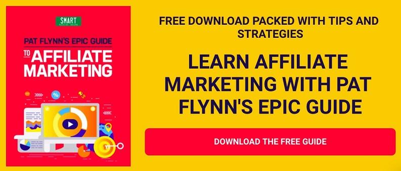
Notice anything missing?
Exactly. Where’s the form?
Click “Download the free guide” to find out:

Why this is an effective way to use pop-ups
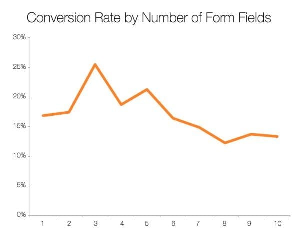
- The more form fields your landing page has, the lower its conversion rate (a general best practice, but strong enough that you can go with it for now). Therefore, if your landing page has no visible form fields, its conversion rate should be even better.
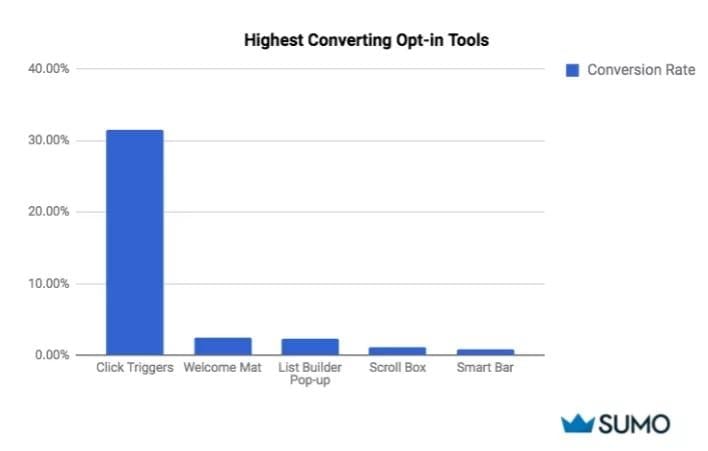
- Click pop-ups (or, as Sumo calls them, “click triggers”) convert 12x better than any other email pop-up. This is because the pop-up’s appearance is triggered by the visitor. There’s no surprise element. In essence, they’ve requested the pop-up.
2. Give a first-time buyer discount
As soon as you arrive on the Revolve ecommerce site, this discount offer appears in an entry pop-up:
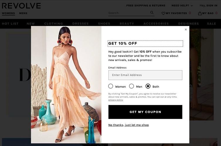
Why this is an effective way to use pop-ups
This is the kind of pop-up that I’d be annoyed not to see.
If I’m interested in buying something from this company (or any company) and there’s a 10% discount available, I want to know about it. Imagine seeing a coupon for “buy one get one free candy bars” lying on the ground outside a grocery store when you’re already walking out, candy bar in hand. You’d be annoyed, right?
Ultimately, the reason this is pop-up effective is because it delivers relevant value when the website visitor wants it.
10% off most products is worth my email address. Especially if I like the products and may, genuinely, be interested to learn more about them or (more likely) get more deals down the line.
Free guide >> The 36 Best Call to Action Phrases (Ever)
3. Offer a content upgrade, ebook, or exclusive content
For this one, it’s incredibly important that you offer something relevant.
Remember, your website visitors are literally in the middle of a paragraph when your timed or scroll pop-up appears. It’s like thrusting your head into someone’s face when they’re reading a book. If you don’t offer something valuable and relevant to what they’re reading, you might get hit in the head.
The coolest use case of this we’ve seen recently is Brian Dean’s exclusive articles, which have to be unlocked via the submittal of a visitor’s email address.
Here’s an example from the Backlinko blog directory:
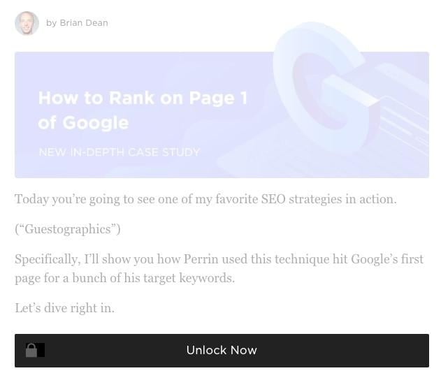
When the “Unlock Now” button is clicked, this click pop-up appears:
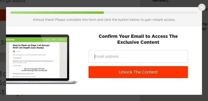
Why this is an effective way to use pop-ups
Brian Dean already knows that people who are on his blog directory are interested in reading his blog content.
Making his content exclusive increases the subjective value that his visitors place on that content: what isn’t publicly available must contain more valuable information than what is.
Locking that content behind an email-gate is a fantastic way to use pop-ups.
Top Tip: Progress bars, like the one at the top of this pop-up (which is part of many pop-up tool templates, by the way) have been shown to increase conversion rates by as much as 28.9%.
4. Advertise a free demo
When you visit Wishpond’s pricing page and stay on the page for more than 10 seconds but then try to leave, this exit intent pop-up appears
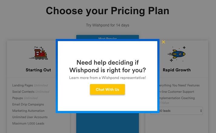
Why this is an effective way to use pop-ups
92% of your website visitors aren’t yet ready to buy, but that doesn’t mean they’re not interested in learning more about you.
Prompting a chat to discuss the cost/benefits of software is a great way to use a pop-up, and this is one of the few exit intent pop-up use cases which really hits it out of the park.
In fact, this pop-up only really works as an exit pop-up. You want to give people as much time as they need on your pricing page. Rushing them with a timed or scroll pop-up would do more harm than good.
5. Remind visitors of a limited time offer
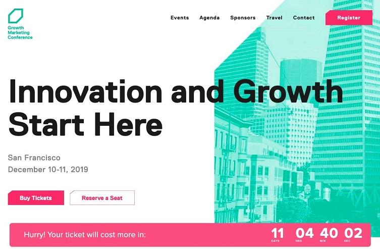
When you arrive on the Growth Marketing Conference’s homepage, a countdown timer pop-up immediately appears.
It shows at the bottom of the page and scrolls with you as you scroll:
Why this is an effective way to use pop-ups
There’s an A/B test I love from Marcus Taylor on ConversionXL. In it, he recounts how he set up “kind of Groupon deal for musicians.” He promoted it heavily and at great expense, so was hyper-focused on conversion optimization.
Among other tests, he ran the following:
Variation A:

Variation B:

Variation B won significantly.
In fact, the messaging “Time Left to Download” next to the countdown timer boosted conversions from ~3.5% to ~10%.
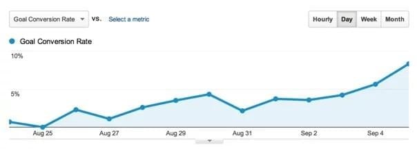
That’s a 332% increase.
So it looks like adding urgency to your promotions, deals, or sales can have a huge influence on their success.
And pop-ups (especially in the form of scrolling header or opt-in bars), are the best way to add that urgency.
Countdown timers, embedded within scrolling header or footer bars, don’t interrupt your visitor’s ability to interact with your website. They simply remind them that what you’re offering won’t be around forever and they need to engage or they’ll miss out.
6. Send them to a relevant, email-gated landing page
If you try to leave MarketMuse’s post “Website Content Writing Software (12 Tools and Resources to Consider),” the following exit intent pop-up appears:
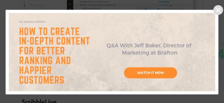
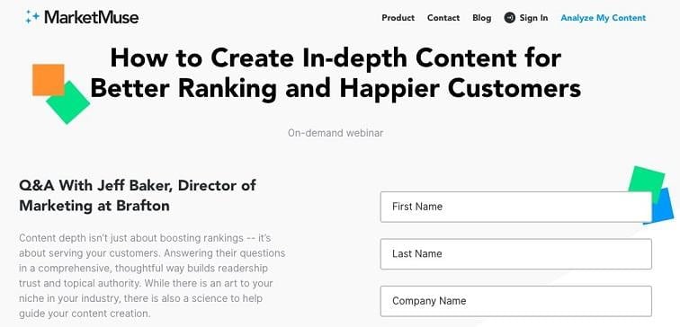
Clicking the “Watch it Now” CTA button sends visitors to the following landing page:
Why this is an effective way to use pop-ups
Pop-ups are a powerful way to help your visitors navigate your site.
We mentioned above that one of the reasons pop-ups work is because they’re guaranteed to be seen. So if you have something you want people to see (like a lead magnet, for instance), use a pop-up to get it in front of them.
For instance, when you have an upcoming webinar (as in the example above) or a sale on shoes or a limited-time promotion, a pop-up can be used to promote the single landing page from multiple pages on your website.
Top Tip: Managing all the landing pages for short-lived promotions as well as evergreen newsletter sign-ups and content download offers doesn’t have to be confusing—but you might need some assistance. WordStream’s CRO Toolkit has everything you need to maximize your advertising budget and convert more visitors today.
7. Combat shopping cart abandonment
If you put an eco-friendly T-shirt in your shopping cart on the Pact website and then attempt to leave, this exit intent pop-up appears.
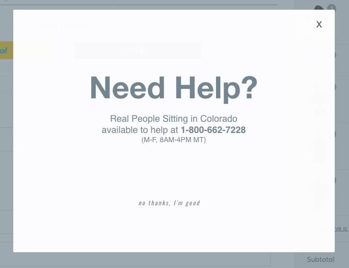
Why this is an effective way to use pop-ups
On average, 69.57% of all ecommerce shopping carts being abandoned. You need to do everything you can to get prospective buyers to stay on the checkout page.
This pop-up (prompting a call) addresses the primary reasons for abandonment.
Here are the most frequent reasons an online buyer might abandon a shopping cart:
- Unanticipated, extra costs.
- The site wanted me to create an account.
- Too long/too complicated checkout process.
- Couldn’t see or couldn’t calculate total order cost up-front.
- Didn’t trust the site with my information.
- Website had errors or crashed.
- Delivery was too slow.
- Return policy wasn’t satisfactory.
- There weren’t enough payment methods.
- Credit card was declined.
Adding an exit intent pop-up prompting a call addresses many of these (complicated checkout, trust, total costs, website errors, payment methods, etc.).
Try these strategies in your pop-up advertising!
In summary, here are the seven surprisingly effective ways that you can use pop-ups:
- Hide the form on your landing page
- Give a first-time buyer discount
- Offer a content upgrade, ebook, or exclusive content
- Advertise a free demo
- Remind visitors of a limited time offer
- Send them to an email-gated landing page
- Combat shopping cart abandonment
Test them, tweak them, try a single use case and abandon them, but don’t just disregard them as a viable way to grow your business. If you’re a WordStream Advisor subscriber, you have an easy way to start experimenting right at your fingertips—the Conversion Toolkit, which offers mobile-optimized pop-up templates you can quickly customize, launch on your site, and tweak as needed.
For many businesses, pop-ups have been a valuable (and viable) avenue for growth. Don’t miss out through stubbornness alone.



![Search Advertising Benchmarks for Your Industry [Report]](https://www.wordstream.com/wp-content/uploads/2024/04/RecRead-Guide-Google-Benchmarks.webp)


