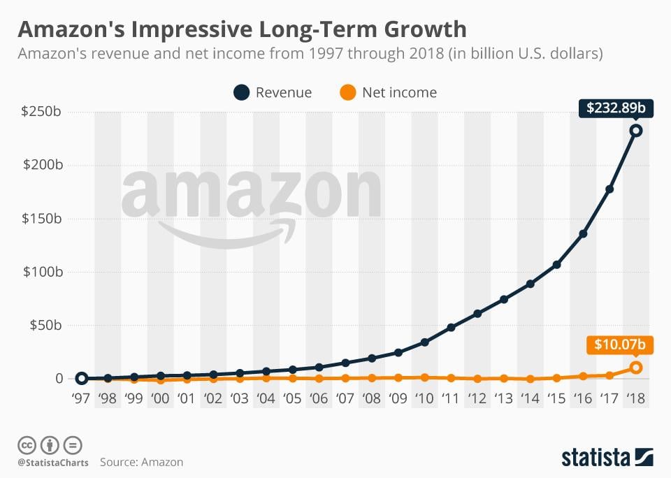
According to a recent BrandZ report, Amazon is now the most valuable brand in the world—beating both Apple and Google to take the top spot.
While there are a lot of keys to Amazon’s success, a core reason behind its massive and continued success is its focus on user experience, or UX. While most of Amazon’s approach to ecommerce UX appears to be simple on the surface, they follow principles that are backed by science and data—and they work really well.
Here, I’m going share the five key conversion rate optimization (CRO) lessons we can learn from Amazon’s approach to ecommerce user experience.
A multi-channel ecommerce strategy is an effective ecommerce strategy. Download our free guide to Google Shopping and start spreading your brand today!
Lesson #1: Recommendation engines drive sales
One of Amazon’s big ecommerce UX wins is its recommendation engine. Amazon artfully uses the recommendation engine to make it easy for users to discover relevant products, significantly enhancing the user experience and increasing its revenue in the process.
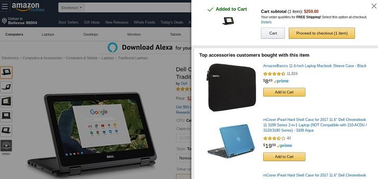
An example that demonstrates just how powerful Amazon’s recommendation engine is was a recent attempt to purchase a Dell Chromebook 11 on the ecommerce site. Upon adding the 11” Chromebook to my cart, the following pop up came up on my Amazon sidebar:
What better way to end a laptop purchase than by purchasing a laptop case to keep it safe, right?
Scrolling down the actual product page shows this:
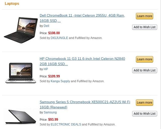
I didn’t eventually purchase the Dell Chromebook on Amazon’s site, but that didn’t deter the ecommerce giant. Instead, I got the following email with recommendations similar to my order days later:
So what is the method to Amazon’s madness? Research by Marketing Sherpa that studied email conversion rates analyzed two types of campaigns: the general “batch-and-blast” approach and the Amazon-style “targeted” approach where offers are targeted and recommended to users based on factors like interest and site activity. The Amazon-style approach converted significantly better, resulting in a massive 208% increase in conversion rates.
Amazon’s recommendation engine does two things:
- It tries to understand exactly what products a user is likely to be interested in immediately after making a particular purchase by using big data.
- It positions that product immediately alongside what the user is about to purchase and includes a prompt to purchase it.
So far, the result has been impressive. Amazon’s recommendation engine is responsible for a whopping 35% of revenue generated on Amazon.com. When you consider the fact that Amazon alone accounts for about half of all online retail sales in the US, that’s all the more impressive.
Lesson #2: Email is an extension of the on-site experience
If there is one thing Amazon does really well, it is the fact that they ensure perfect integration of the email-to-site experience. In most cases, Amazon’s ecommerce emails are an extension of the user’s on-site experience.
Firstly, Amazon does this by making sure that the email template it uses carries the look and feel of its site (the same color scheme and simplicity). It’s hard to confuse an Amazon email for an email from someone else.
Secondly, whether it is to make a purchase (by directly adding a product to cart or checking out immediately) or to leave a review, Amazon makes it extremely easy via email; if you receive an email from Amazon asking you to leave a review for example, and you click on the option to review in the email, you don’t have to worry about going through extra steps just to complete the process. You are taken right to the review page. The same is the case with the checkout process; when you click to add a product to cart from an Amazon email, you’re taken right to your cart on Amazon.com.
Lesson #3: A quick checkout process reduces cart abandonment
According to research from Baymard Institute, the average online shopping cart abandon rate is 69.57%. In other words, about 70% of people who get to the checkout page would abandon an order. This is significant, and it means a good portion of sales can be recovered simply by optimizing the checkout flow; and that’s just what Amazon does.
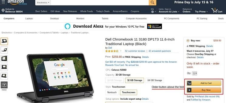
Firstly, Amazon makes it extremely easy to locate the order button and kickstart the checkout process; the order button is above the fold on all of Amazon’s product pages:
This point takes an in-depth look at how Amazon optimizes its checkout process to create little friction for users and ensure a flow that maximizes ROI.
Secondly, Amazon makes it easy to order recommended products without having to restart the checkout process. Just take a look at the example below—while the Gumdrop case and the AmazonBasics case are product recommendations and not part of the user’s original order, it is quite easy to “add all three to cart” or choose to add “all two” to cart:
Thirdly, Amazon masterfully uses the multi-step signup process to ensure a better checkout experience.
Numerous studies have shown that having too many form fields can negatively impact conversions, and that reducing form fields can boost conversions.
What do you do when you really need the additional information? Use a multi-step signup process like Amazon does; this makes the process appear faster while ensuring that conversions don’t get negatively impacted. Venture Harbour’s Marcus Taylor looks at several examples of multi-step forms boosting conversions. In a particular instance, changing from a basic contact form to a multi-step form boosted conversions by 743%.
Lesson #4: Don’t be too hasty to make design changes
Amazon was started in July 1994. In Internet years, 25 years is a very long time—yet, compared to other tech companies that have come and gone, not much has changed for Amazon when it comes to design.
Amazon is very careful when it comes to changing its design. Just take a look at Amazon’s homepage design from January 2016:
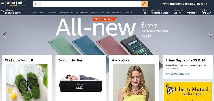
Now take a look at Amazon’s homepage design in July 2019:
Apparently, not much has changed in about three and a half years; for an ecommerce giant like Amazon, isn’t constantly redesigning expected to be wise? Not necessarily. As Snap Inc found out the hard way when it made its redesign, people are averse to change and will protest any drastic change in the look and feel of something they use regularly.
When users are accustomed to a particular design and site look and feel, you want to make sure that it appears to them that they are still getting this look and feel without appearing outdated. That is what Amazon does really well by making slow and gradual changes. This aligns with Weber’s Law of Just Noticeable difference in which the “difference threshold” or “just noticeable difference” is the minimum amount by which the intensity of stimulus must be changed in order for people to be able to “perceive” the change.
Amazon appears to be very slow to change, but not necessarily: Its design (both color and look and feel) has changed significantly over the years. Amazon’s genius, however, lies in making the changes in such a way that users don’t really notice it—the changes are rolled out gradually and subtly, until they are drastically different in a way that users become accustomed to.
It’s also worth noting that there are a few core elements that remain consistent in Amazon’s approach to design over the years. For example, Amazon has consistently used the orange CTA button, which has been found to be a conversion booster not just for ecommerce sites but also for software services and also for reviews.
Lesson #5: Focus on reviews—nothing attracts a crowd like a crowd
When trying to purchase a product on Amazon, what do you do next after taking a look at the product specs? If you are like the average ecommerce consumer, you quickly jump to the reviews to see what others are saying about the product. In fact, a particular study by Baymard Institute found that a massive 95% of people rely on online reviews to help them make product decisions.
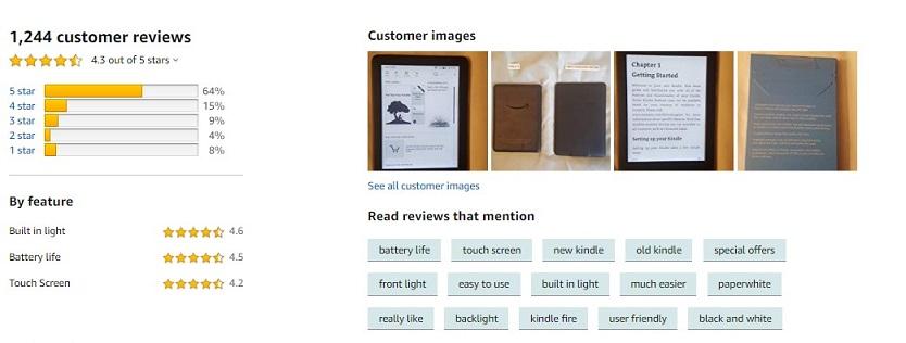
Realizing how important reviews are to the purchase process, Amazon doesn’t leave user reviews to chance; they have gradually worked on the review process to the extent that reviews are an integral part of the Amazon purchase experience.
More importantly, Amazon consistently incentivizes users to leave reviews for their products; users are constantly rewarded directly and indirectly on Amazon: Amazon rewards them directly with badges and rankings and these badges and ranking indirectly rewards them by increasing the chances of them being sent free products that they can review.
Boost your CRO with these Amazon user experience lessons
The fact that Amazon has a $900+ billion market valuation can make it seem like a bad example for businesses that are much smaller in size, but the reality is that a lot could be learned from how Amazon approaches user experience. The above are five key ways in which Amazon approaches user experience and what ecommerce businesses of all sizes can learn from it.
About the author
Jarrod Stone is a freelance consultant who specializes in helping web hosting brands boost their ROI through content marketing. He has been featured in top industry publications such as Internet Retailer and BlogHerald.

