Picture a faucet with a steady stream of water coming out. The water is pouring into a bucket, but the bucket is full of holes. Some of the water makes it into the bucket, but most of it is leaking through the holes, so you can never fill up the bucket. Now imagine the water is leads, and the faucet is PPC.
PPC will turn on that traffic and get those leads flowing down the pipeline, but if your pipeline is broken, you’re losing a lot of valuable leads that could have turned into sales.
So what can we do to patch up those holes? Here are 15 ideas that could provide substantial lift in your conversion rate.
1. Write a Clearer CTA
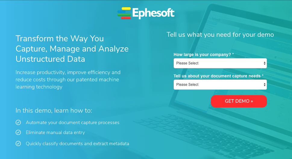
How many times have you landed on a page with a form and a button that just said “submit” or “continue”? Did that not feel completely impersonal? Did it confuse you a little bit about why you were giving your information and what exactly you were going to be getting out of it?
If your CTA isn’t precise about what you want the user to do, you may find that you’ll have a low conversion rate on your hands. I’ve seen a clear CTA outperform a vague one every single time.
Notice how this CTA tells the potential lead exactly what they’ll get by giving their information. That’s what you want. Take a look at the language on your landing page buttons and make sure it’s specific and clear.
2. Move your form
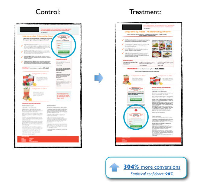
Time and again I’ve seen a form put directly in the hero of the landing page outperform pages with lightbox forms or forms at the bottom of the page.
However, don’t take best practice as gospel truth. In the test below, Michael Aagaard of ContentVerve found that moving the form to the bottom of the page increased conversions by 304%! By placing the call to action at the bottom of the page, they allowed the reader to understand the complete value of the service and its benefits before asking for a conversion.
So if your form is in a lightbox, try moving it out and onto the page. If your offer is complex and high-threat, try moving the form to the bottom of the page. That’s the great thing about A/B testing: there’s no “right” way to do anything. It all depends on your offer and your audience.
3. Try a multi-step form
We’ve all heard the phrase “less is more.” And we’ve been told this applies for landing pages too – i.e., your forms should be short and only ask for only the bare minimum of required information if you want to convert.
However, when used across the board, this advice can backfire.
As an example, one of the main questions someone typically has when faced with a landing page is how much your offer will cost. But if the offer on your landing page is for a free quote, you can’t necessarily disclose pricing on the page.
When there’s no pricing, but instead a form requiring a name, phone number, and email, the visitor knows they’re going to need to talk to someone to get an answer to their question (they’re well aware you can’t give a customized quote from such limited info), plus, prospects are very reluctant to give their information out to just anyone. They can click the back button and find a competitor that will give them what they want faster. So why would we expect a form with super generic fields to be compelling enough for someone to engage with us in all cases?
In situations like this, by increasing the number of steps and form fields, we could actually increase conversion rates! The key here for us has been the order in which we present our steps and what info we ask for first.
After filling out the initial, more interesting questions in step one, the last step of filling out the more sensitive fields like name, email, and phone number becomes much easier because of compliance psychology.
Dr. Robert Cialdini said it best:
“Once we’ve made a choice, we will encounter personal and interpersonal pressures to behave consistently with that commitment.” Influence – The Psychology of Persuasion
In other words, once you commit to small things, you’re more likely to continue onto bigger commitments aligned with your initial decision.
Scott Fraser and Jonathan Freedman also conducted research on how to get people to say yes. They went door to door asking people to put up a sign that read: “Drive Carefully” in their front yard, but only 20% of people agreed to this.
They then did the same test in a nearby neighborhood, but this time they asked people to put much smaller signs in their yard. This created the opportunity to get them to eventually say yes to putting up the original, larger signs.
Next time around, 76% of people agreed to put up the larger signs compared to the original 20%. Psychology baby!
Following the multi-step model designed to ease visitors into a commitment, here’s another successful landing page example from one of our clients:
Notice the questions being asked in the step one form:
- How many marketers do you have?
- What is your annual marketing budget?
These questions allow the user to stay anonymous. They also lead the user to believe that they will get a more custom response to their needs based on the specific information they input.
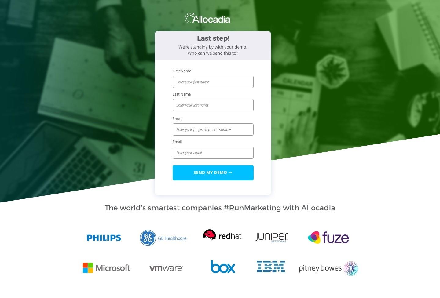
Next, they’re directed to the second step form fields:
This step is asking for the personal information. However, notice the change in headline on the form itself. “Last Step! We’re standing by with your demo. Who can we send them to?” This second step language is very important as it reminds the visitor as to why we need their information: it’s for their benefit. We want to give the visitor something not take something from them.
4. Match your form to the offer
OK, I just told you to add more fields. Now I’m telling you that may not be the answer, but hear me out: there’s a specific case where you’ll want to minimize the amount of fields: gated content.
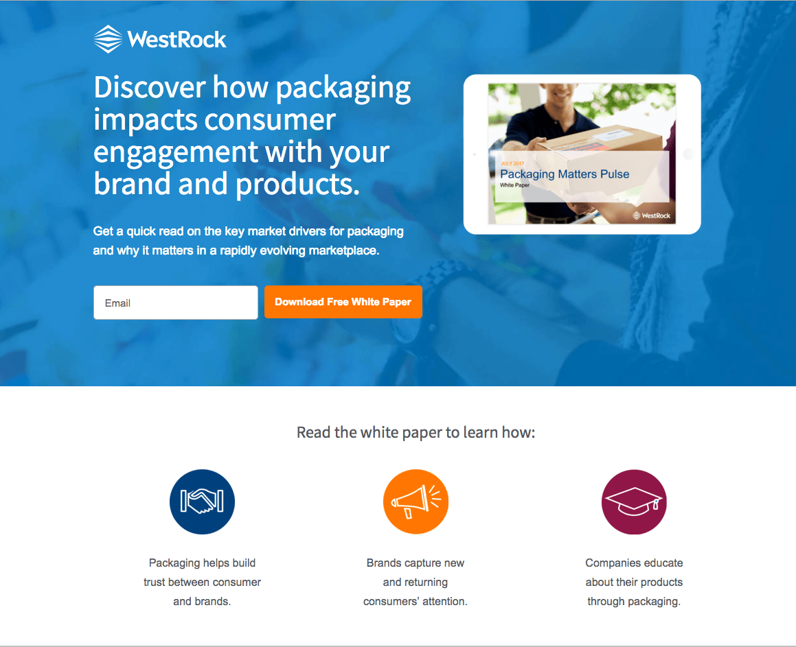
It’s less likely that someone is going to give away all of their information for a PDF download. In my experience, I have found that only asking for name and email is preferred when it comes to gated content such as whitepapers and guides.
If you’re like me and you’re doing this for clients who have a very particular CRM that must have the phone number, first name, last name, and email address, then you may have no other choice but to create a multi-step form.
Here’s a page we created at Directive for one of our clients. Gated content pages can be short and to the point. Say what the reader can expect to learn from the whitepaper or guide and only require their email (name and email at the most). The people coming to this page are interested but they are not ready to make a commitment. Requiring them to give all of their information away will deter most people from downloading your whitepaper. Better to have something than nothing.
5. Ask the right questions on the form
Let’s say you’ve done what I said and created a multistep form with the first step asking for number of employees, monthly ad spend, and business name. The second step asks for name, email, and phone. Do you see anything wrong with those first step questions?
Business name can be seen as a very invasive question. If you have the business name, you can easily look up the business and find out who works there. Although it may not seem like a very personal question, in our best practices, we’ve found that many people beg to differ.
So if you’re still seeing drop-offs even with your multi-step form, double check to make sure that you are only asking qualitative questions that cannot be linked to a specific organization or person.
6. Put your key selling point in the headline/subhead
The headline is going to be one of the first things your potential customers see. This is a very important piece of copy that should explain your unique value proposition. What helps me is thinking about it from the visitor’s point of view: “What’s so special about this and why should I pick it over the 25 other competitors?” “Will it save me money?” “Will it save me time?”
I have a client that is a marketing agency. Their original headline was “Don’t leave any opportunity. Capture it all.” A little vague, yes? I updated the page to say “Marketing strategy with unparalleled results” followed by a subhead of “Gain up to 70% profit.” That’s a key selling point which increased conversion from 9% overall to 16%. It nearly doubled. If your form is following best practices, try updating your headline and subhead to provide more value and clarity to prospects.
7. Add social proof
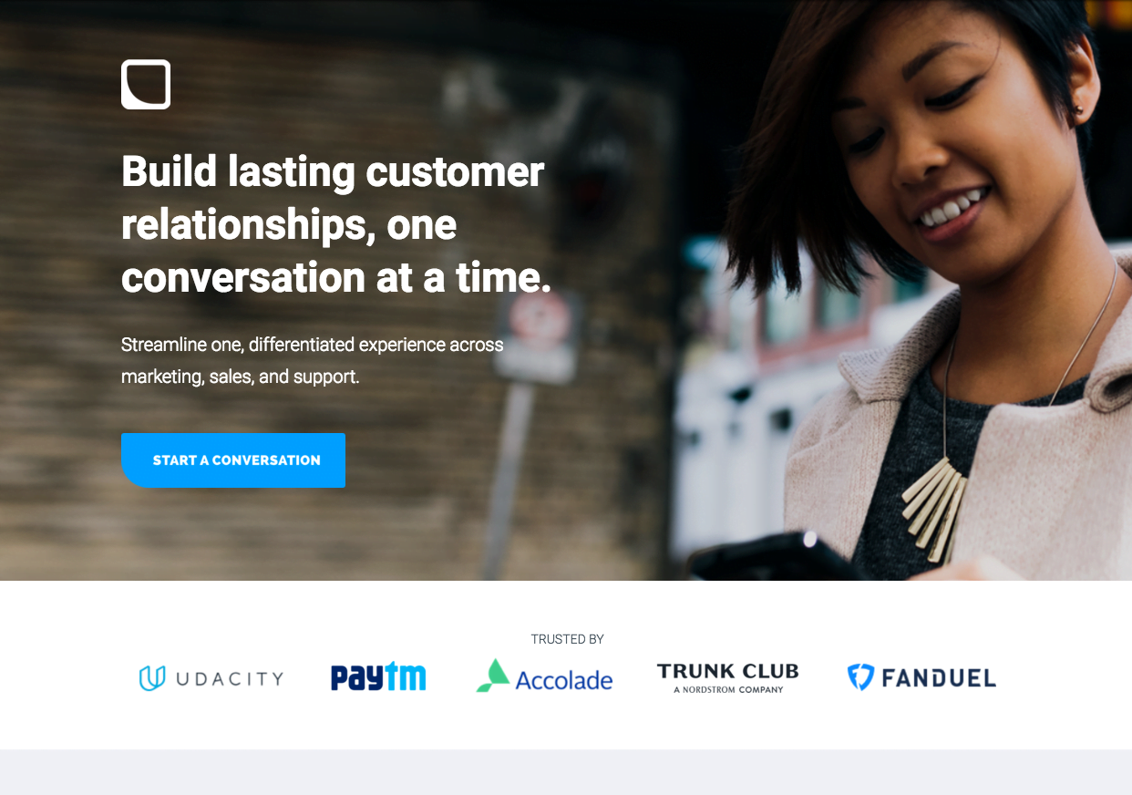
You can tell me all day that you’ll save me time, you’ll save me money, you’ll even double my ROI; but at the end of the day, I want a guarantee that what you’re saying is true. How do we prove that we have done or will do what we say we will do?
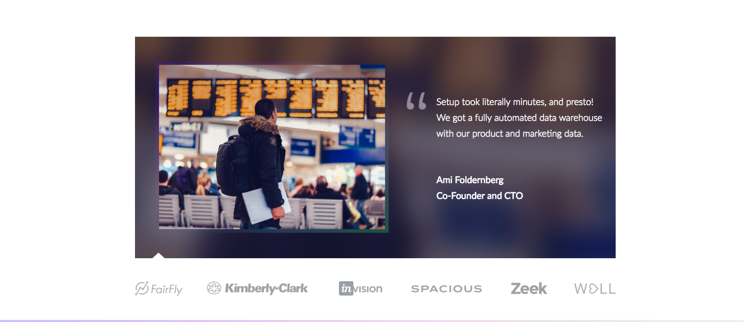
Social proof! This includes testimonials, badges/guarantees, affiliations, awards, and review ratings, case studies, and data and numbers.
Studies show nearly 70 percent of online consumers look at a product review prior to making a purchase.
In the examples below, you’ll see that we put the logos of clients to add legitimacy to the business. Real people have already used this service and most have been very happy with the experience.
We also include testimonials toward the bottom of the page just for that little extra help to quell any fears the customer might have.
8. Add a video
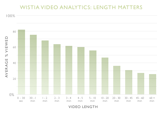
We strive to keep our messaging straightforward and to the point. Sometimes, that’s still not enough. Sometimes, we need something even more concise. Enter: the video.
65% of us are visual learners, according to the Social Science Research Network. That’s most of the population. It makes sense why a video could greatly help conversions. And 64% of consumers are more likely to buy a product after they watch a video about it.
Web pages with video have more engagement: The average user’s visit to a text and image-based website lasts only 43 seconds. For a web pages with video, the average visit lasts 5 minutes and 50 seconds.
According to EyeWideDigital, having a video on your landing page can increase your conversion rate by 80%.
Especially if your product or service is a little complex, try adding a video that makes its value clear and builds trust with your prospect.
9. No time for video? Try gifs
Think “video” but even faster, and the user doesn’t need to click to play. Gifs can get people focused and quickly turn their initial curiosity into genuine interest. People may ignore certain images and not bother to hit play on videos, but GIFs are impossible to go unnoticed.
We’ve found that gifs work incredibly well for SaaS and tech companies. What better way to explain a complex and technical solution than through quick visual walkthroughs of how it works!
Here’s an explainer GIF that Mailchimp created to better explain their product
Here’s a tutorial on how to create an explainer gif.
10. Add a decoy option
The Decoy Effect Can Increase Conversions
By incorporating a more expensive product in your options, you make the one you actually want people to buy not seem too bad anymore.
Dan Ariely, Professor of Psychology, made an experiment with his students. He asked them to choose a subscription from a magazine and here were the results:
A) Online subscription – $59 (was chosen by 16 students)
B) Print version – $125 (was chosen by 0 students)
C) Web and print subscription – $125 (was chosen by 84 students)
As you can see, almost all students chose Option C, as it appeared to be a better deal overall.
11. Put up an exit intent offer
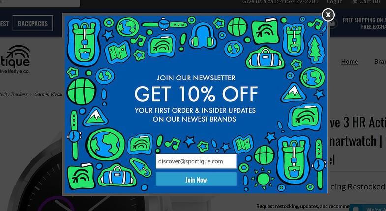
If your visitors starts to leave your page, stop them. Give your visitors additional value with discounts, contests, or special or limited time offers. This helps create a huge fear of missing out.
If you can’t get them to complete the initial action you wanted, you can at least get their information with another, less threatening offer.
Even if customers aren’t ready to buy, you can offer a discount if they sign up for your email list – then nurture them to purchase something later.
12. Install a chatbot
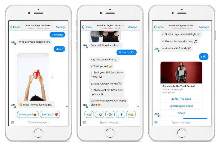
Two different American Eagle chatbot experiences that provide target audiences with information and inspiration – image source
Today, the number of users for messaging apps like WhatsApp, Slack, Skype and their analogs is growing in leaps and bounds. Facebook Messenger alone has more than 1.3 billion monthly users. With messengers taking off, virtual chatbots that imitate conversations between humans for solving various problems are in much higher demand.
According to Sensor Tower, worldwide iOS and Android downloads of Facebook Messenger grew 5.66% from 145.3 million in Q1 2016 to 153.5M in Q1 2017.
It seems like a no brainer to start using chatbots and live chats to gather up those lost leads that don’t have time for a form fill or a phone call. People want the information they’re looking for as soon as possible with as little friction as possible. That’s what makes chatbots so great: they offer instant access to value while eliminating friction. There’s no sign-in or sign-up process, like an app or a website–and since the bot already has access to your social profile, it can personalize information for you in seconds.
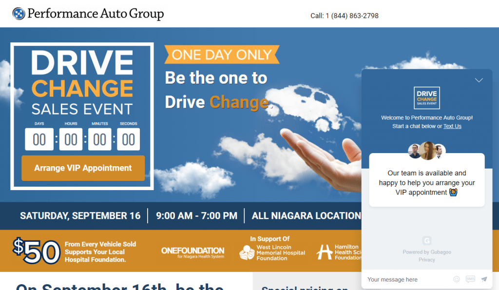
Here’s an example from Performance Auto Group using live chat – image source
This live chat, powered by Gubagoo, lets potential customers know exactly what its purpose is: to help people with scheduling their VIP appointments at the Drive Change Sales Event.
The three headshots help add a personal touch. Plus, being able to send a text instead of a live message also creates a more personal connection between representative and customer.
13. Improve your site speed
A 1-second delay in page response can result in a 7% reduction in conversions, according to Kissmetrics. When Firefox reduced average load time by 2.2 seconds, they increased conversions by 15.4%.
So here’s what you can do: resize images with Tinypng.com, compress your site with Gzip, and install Google PageSpeed. Lastly, if all else fails, consider changing your web hosting as that may be the problem.
14. Use heat maps, click maps, and polls
We learned earlier that sometimes best practices aren’t always the right choice. You can make a well-formed hypothesis and still lose. If only you could see into the customers’ minds to know exactly what they want. Technology hasn’t come this far yet, but we do have some tools in our arsenal that will make do for now.
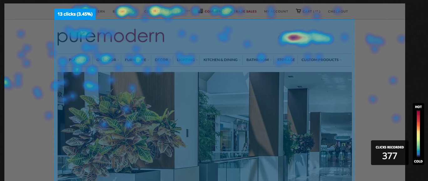
A click map for a clients’ homepage (pre-optimization)
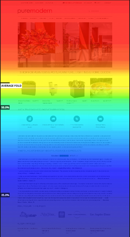
A full heatmap of the same page.
By using programs such as Hotjar or CrazyEgg, you can see where people are clicking on your page, and you can view how many visitors make it to the end of the landing page. In the scroll map example above, we found that most people weren’t making it toward the bottom of the page where some very important information was. This led us to move this information closer to the fold.
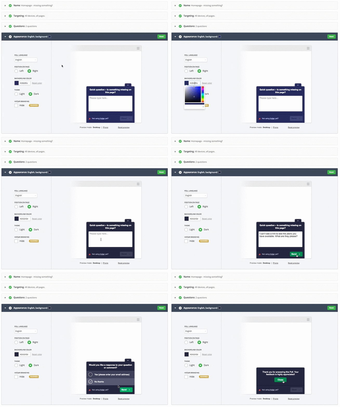
Even with your click and scroll maps, you may still not be sure why no one is converting. If this is the case, try setting up a user poll asking users what’s keeping them from getting their offer today. Some poll answer options I like to give are “I need more info” “I need pricing” “Site not trustworthy” or “I don’t need this right now”.
It’s very easy to create a poll with Hotjar.
Based on the majority of the answers, you can find out what you need to change on the page. They want pricing? Then mention on the page that you’ll give them custom pricing and info, you just need to send it to their email address. “Not trustworthy?” Get more social proof on that page. “Need more info”? Lengthen the landing page and put more content about the why and the how of your service or product.
15. Revisit your thank you pages
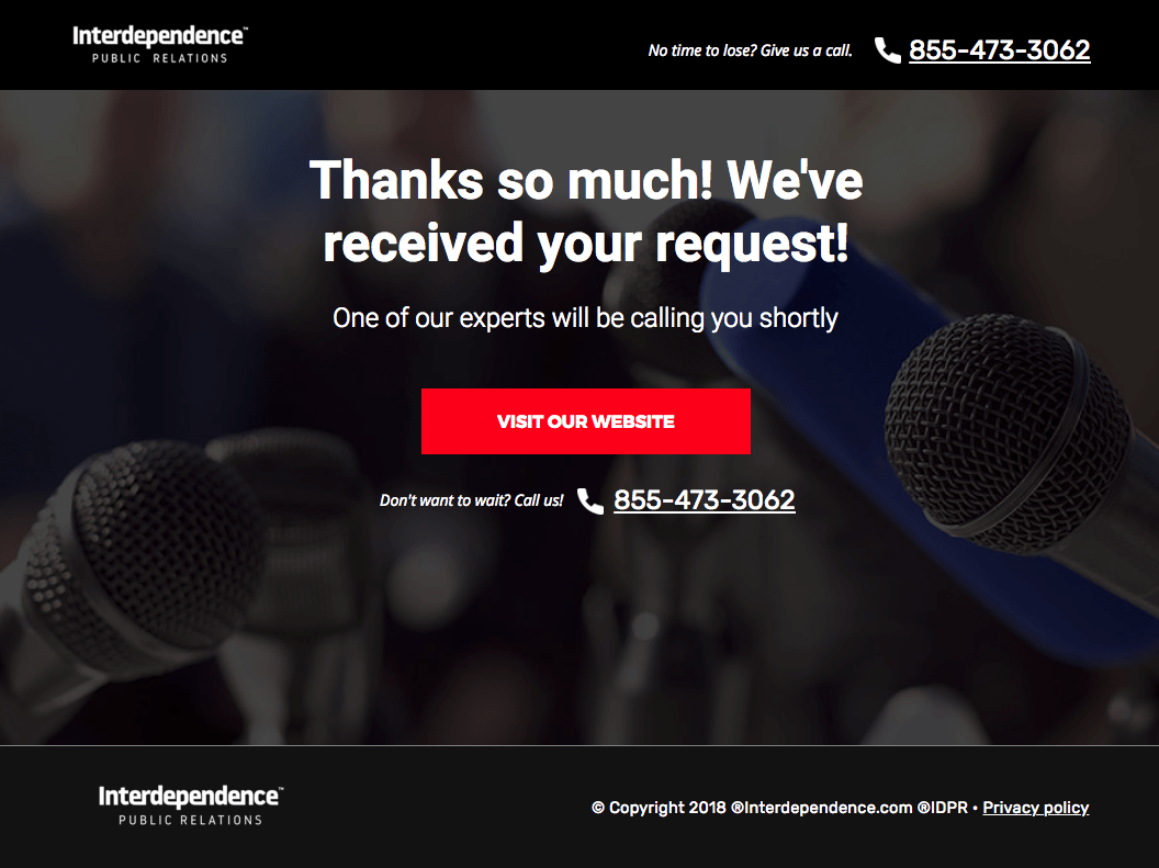
Even though, at this point, you’ve already captured a lead/sale/sign-up/conversion, thank you and confirmation pages are a necessary step in the funnel process. Here is why:
- They let the customer know that their inquiry/information has been received.
- If the goal of the page was to download a whitepaper or guide, this is where the download link should be.
- The thank you page allows for next steps, like a link to the homepage or social media for more information, keeping them engaged longer.
- It can also have other exploratory links such as “you might also be interested in these”…which might even push them toward another conversion.
Thank you page for a PR client
How to Set Testing Priorities
Awesome, you have your 15 tips but that’s a lot of things to test at once, and some of these changes will yield much bigger results than others. Beyond just knowing what you can test, you need to know what you should test and when.
I’ll make it simple. These four things, in this order, need to be addressed before going into smaller iterative testing: the CTA, the form, the headline, and the subhead. They’re the first things the customer will see when landing on the page, so you need to grab their attention fast and make your message clear as day. Tackle these areas first to see if you are addressing these questions:
- Is my CTA clear and is it offering the user something rather than asking them to do something?
- Is my form asking the right questions? Am I asking for personal info in the first step? If so, try a multi-step asking qualifying, non-personal questions in the first step followed by personal questions (name, phone, and email) in the second step.
- Is the headline stating a real UVP? (And please, “best customer service” is not a UVP. Everyone and their mother says this.) Explain to the customer how you’re saving them time or money. Back it up with stats like “Gain 60% more sales with [Software Name]”
- Does the subhead support the headline in greater detail? Does it support the offer and CTA on the page?
Conclusion
Always keep in mind that what may work for one landing page may not necessarily work for another. Gather the data on your customers through maps and polls, make sure your site is working at optimum speed, and then begin to question your business the way your potential customers will: “What do I get out of this and what’s so special about this product or service that I should choose you over a competitor?” The more you test, the more you’ll be able to find those quick wins that work the best for your business regardless of the best practices of conversion rate optimization. Happy testing!
👋 Looking for help with your marketing? Check out our digital marketing solutions to find out how we can help!
About the author
Bringing more than 8 years of experience in graphic design and conversion rate optimization to her role as Director of CRO at Directive Consulting, Olivia Ross has managed large teams in the execution of various landing page and website tests that have successfully increased conversions for more than 175 clients. When she’s not optimizing everything around her, you can find her watching films or playing video games with friends.







![Search Advertising Benchmarks for Your Industry [Report]](https://www.wordstream.com/wp-content/uploads/2024/04/RecRead-Guide-Google-Benchmarks.webp)


