A great email campaign is one thing, but if it’s conversions you’re after, emails are just the tip of the iceberg. The goal is to get your audience to open your email and click through to take a desired action—such as making a purchase or downloading your ebook.
That means the place where your customers land after they’ve received your email plays a big role in driving conversions from your email marketing efforts.
Each email promotion should have a specific landing page tailored to that campaign. If you’re still in the early stages or have a large enough audience to wisely segment your lists, you should also use this opportunity to split-test elements of your landing page to discover what works best—different colors, fonts and calls to action can have varying effects on your audience.
When looking at what to analyze, it’s important to cover all the basics and ensure you include the right stuff. These are the six elements of a perfect email-campaign landing page.
Be as clear as possible.
Clarity is the key to landing page copywriting, and nowhere is that truer than in headlines. “Save 50% off your order” is easy to understand; “Tis the season to save” sounds softer and more salesy.
The trick is to create a seamless funnel for people to click through. There shouldn’t be an opportunity for them to say, “Wait, what?” Like a grammatically flawless paragraph, a clear funnel—starting with the headline—will create a scenario that your customers won’t find jarring. Give your landing page one distinct purpose and make it easy for people to figure that purpose out.
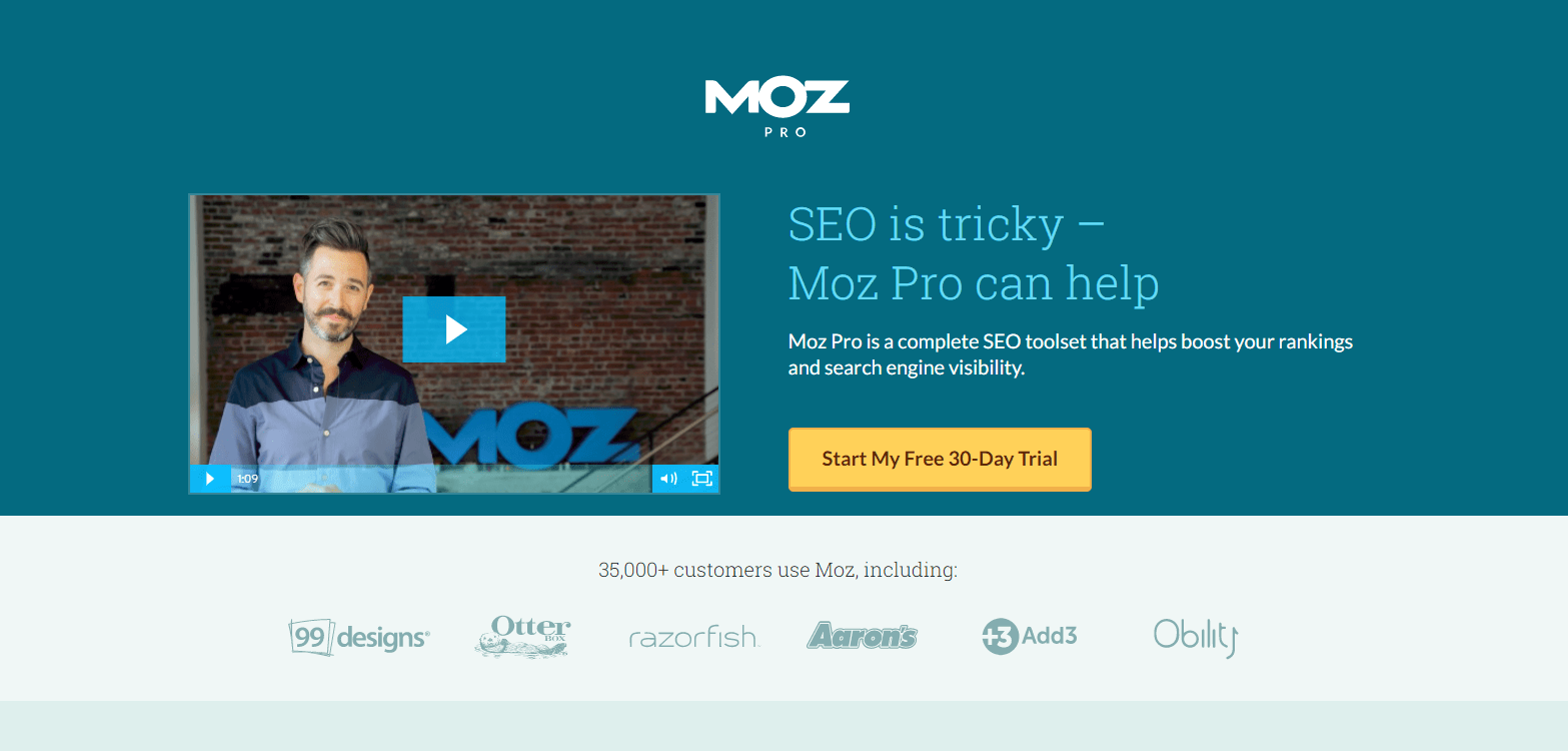
Moz does a fantastic job of getting straight to the point so there’s no confusion about what they’re selling.
Offer just one call to action.
A follow-up to that previous note: don’t bombard your audience with too much text or more than one CTA. Stick to the main goal of your landing page and hone your focus on it. This can have a huge effect on both clicks and conversion rates.
A good idea is to draw particular attention to it by highlighting it in a different color— and with a treatment that’s not used anywhere else on the page. The most important button on your landing page will be “Sign up now!” (or whatever your call to action is).
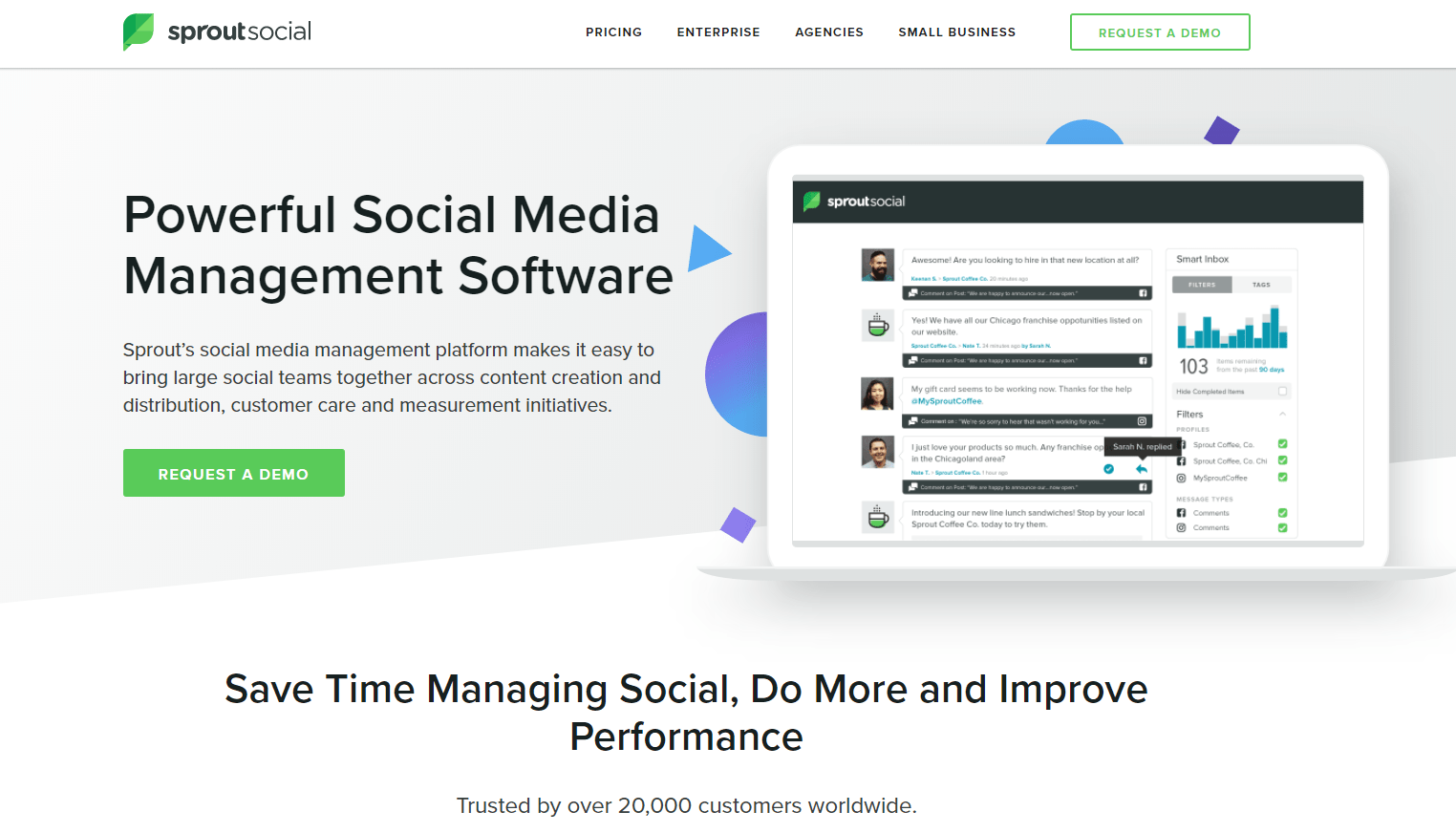
SproutSocial has a bold demo button next to their hero image so there’s no missing it, and it’s not fighting for attention with their header CTA.
Avoid giving your customers escape routes.
One factor you’ll notice in many professional landing pages is a lack of typical website elements—a footer, a header, support links, social media buttons, a clickable logo to return home, etc. The more opportunities you give people to click away from your landing page, the fewer people will actually do what you want them to do.
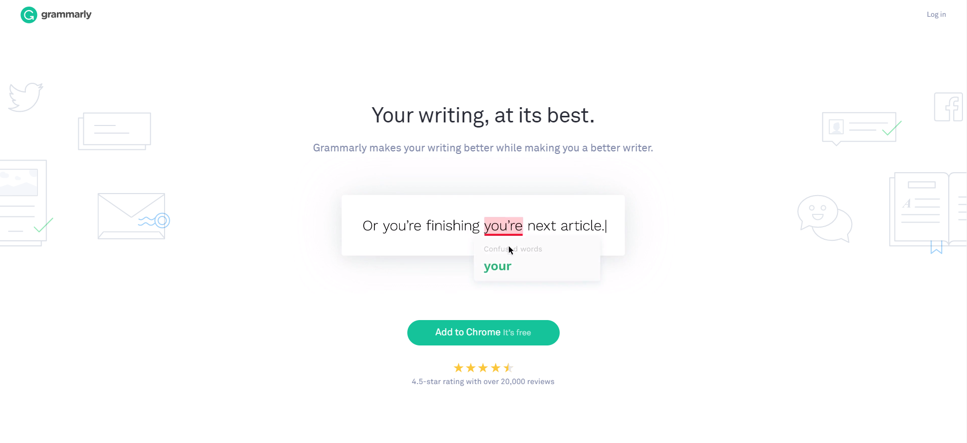
There’s one button and no distractions for Grammarly visitors.
In standard web design, we’d want to give people these opportunities, inviting them to lower our bounce rates and understand our product more, find our social handles and appreciate our breadth and personality. Now is not that time. Now is the time to get them to follow clear instructions, sign up for a webinar or download an ebook.
Through this action, hopefully, you’ll entice them so much with your offer that they’ll return to click around of their own free will.
Your landing page should look like your email.
If I click on a winter-themed email inviting me to download an ebook called Building the Perfect Snowman, then I wind up on a landing page covered in pink and yellow flowers and nary a snowman in sight, I’m going to raise an eyebrow. What’s more, I might get immediately suspicious and close the window, suspecting a scam or phishing link—that’s how unsettling uncoordinated marketing campaigns can be.
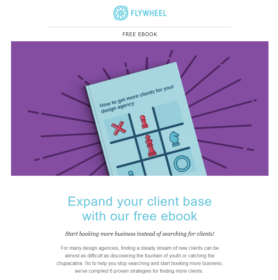
Flywheel’s email is on brand and attention-grabbing….
Any offer mentioned in your email should be prominently repeated in your landing page. The same goes for your aesthetic style—the colors, fonts and design should make gliding from email to landing page a natural movement. Nothing jarring, nothing confusing.
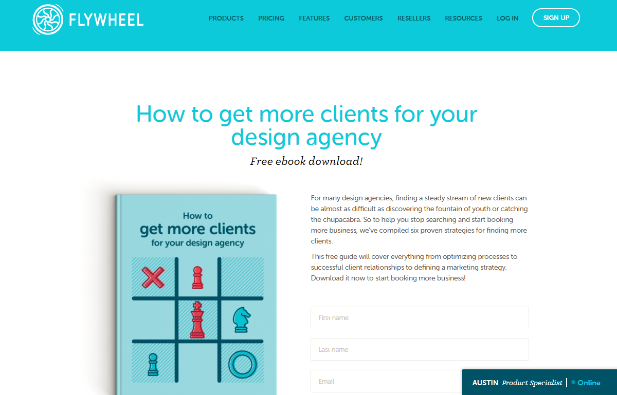
And the email perfectly syncs up with the landing page it directs visitors to.
Use this opportunity to close the sale.
Even if it’s not literally a sale, this is the conversion moment—the most critical, actionable decision your customer is making. They have decided to give you their personal information in exchange for whatever you’re offering.
Or, well, have they? Maybe they were just curious and clicked the link in that email. Maybe they’re not sold yet. In that case, use this opportunity to convince them that this a great deal—or reassure people who are already sold.
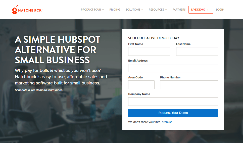
At Hatchbuck, we start with a clear message and CTA above the fold on our landing pages.
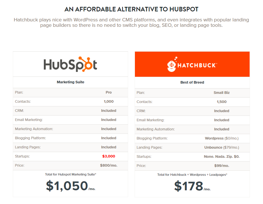
Upon a scroll, we have pricing and value proposition clearly broken out below.
Many landing pages make excellent use of bullet points to this end—they make for a legible, digestible, comforting list of reasons as to why you’re on the right track.
Keep things brief.
While bullet-point lists are wonderful, succinct bullet-point lists are even better. The same goes for everything on your landing page: keep the copy clear and free of extra words, don’t abuse your stock-photo collection and keep your web form well-designed, short and tied to what information is strictly necessary.
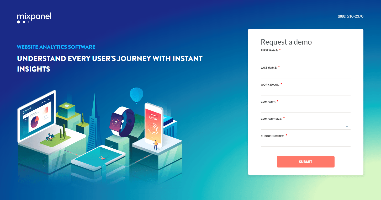
Mixpanel doesn’t add ANY unnecessary words to get their point across.
It takes a significant amount of work to capture the attention of prospects. If you do manage to attract visitors, you need to be certain you’re meeting their expectations. And for that reason, landing pages can be your greatest asset or your quickest downfall in your marketing efforts.
About the Author
Jonathan Herrick is co-founder, chief sales officer, chief marketing officer, and chief high-fiver of Hatchbuck, an all-in-one sales and marketing platform based in St. Louis. His extensive experience in digital marketing and sales strategies has been a driving factor in growing Hatchbuck’s sales by over 2,000 percent. A purpose-driven leader in all aspects, Jonathan has a passion for cultivating his team’s culture, spending time with his family, and working to make a difference in the St. Louis community.

