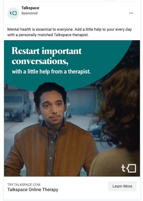
Aside from their granular targeting, one of the reasons Facebook ads work so well is their visual experience. You can’t escape the cookie-cutter search ad format, and try as they might, display ads just can’t quite match the clean and smooth nature of Facebook ads. But in being the least disruptive, this also means they need to be strong enough to compete with the cute babies and viral videos alongside them in users’ Feeds…
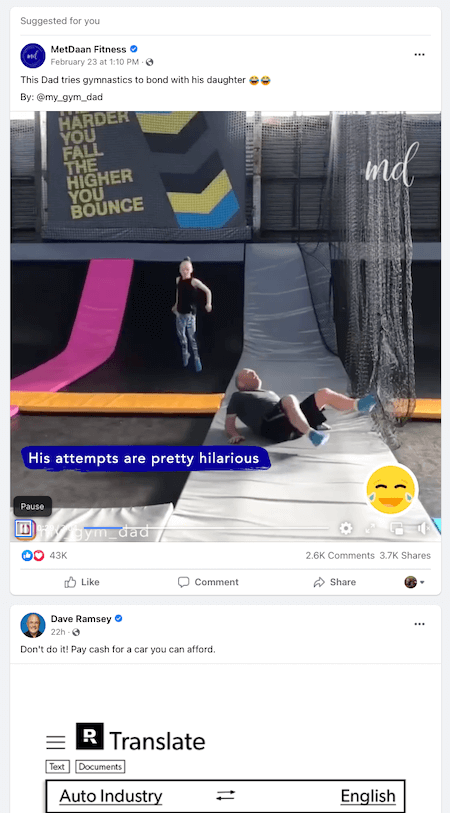
Hmm. Car buying tips? Or a dad attempting gymnastics…
In today’s post, I’m going to go over the best Facebook ad examples around and how you can apply them to set your ads apart from your competitors (and hilariously heartwarming videos).
Jump to an ad category:
- Fun Facebook ad examples
- Competitive Facebook ad examples
- Smart Facebook ad examples
- Facebook video ad examples
- Facebook carousel ad examples
These examples come with plenty of inspiration and takeaways for anyone, whether you’re a seasoned expert or just now learning how to advertise on Facebook.
1. Grin
True to its creative business name, Grin provides us with a light and fun Facebook ad example on an otherwise boring topic: ROI. It says Need to track that elusive influencer ROI? Time for the secret SaaS.
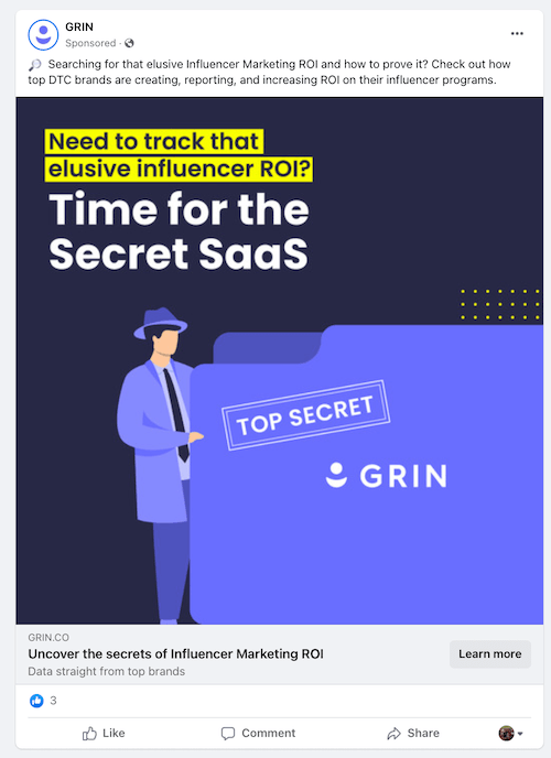
The text in this cute Facebook ad design is brilliantly positioned. The funny part (secret SaaS) speaks loudest with the big font, but the pain point grabs your attention first with the contrasting yellow highlighting. And then in line with the ad’s theme, the headline reads “Uncover the secrets of Influencer Marketing ROI.”
Takeaways:
- Hone in on the pain point. Grin understands that its audience isn’t concerned about whether influencer marketing works, but with measuring its success.
- Have fun with it! Emojis and plays on words are always an audience charmer.
- Use interesting, active words in your Facebook ad headlines to make your offer more appealing.
2. Nom Nom
In the testimonial ad below, Nom Nom exceeds the recommended character count for primary text. But for those who don’t want to read all those words, there’s a big old TLDR right in the ad creative: MY DOG LOVES THIS STUFF.
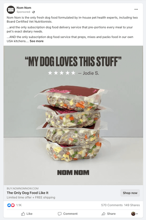
In most cases, the more specific the review or testimonial, the better. But the short and general, but relatable, ones have a place too…like in a Facebook ad where a person is not actively searching for reviews.
Takeaways:
- Pull conversational and catchy snippets out of reviews to use for quick and convincing ad copy.
- Provide important details in your primary text, but make sure your creative grabs attention and captures the interest to read more.
- Mention promotions and deals in your ad’s description.
3. A&E
All too often with holiday marketing, businesses bore their audience with the same creative and messaging everyone else is using. Enter this dark yet Mother’s Day-themed Facebook ad example by A&E. No pinks or purples. Just a picture of a handwritten card from Norm to his mom with a P.S. at the end that reads: (P.S. For the love of Mother, don’t miss Monday’s episode.)
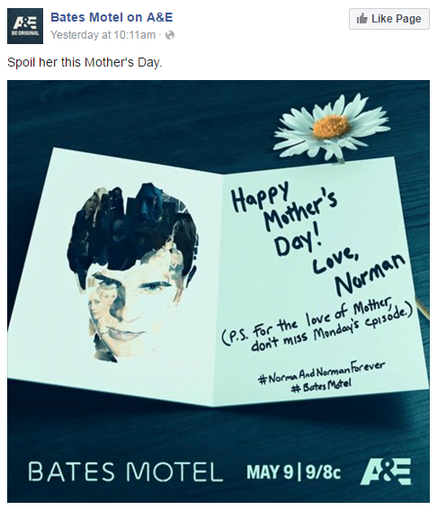
A&E’s “Bates Motel” Facebook ad
Of course, this is A&E and the longest-running original scripted drama series in the channel’s history, so there are obvious advantages. Even still, we can drum up some solid takeaways from this ad.
Takeaways
- Pop-culture references can be very effective, if executed well.
- Go against the grain with your holiday ads to stand out in your viewers’ feeds yet still be relevant.
- Try hand-written text in your ad creative—it has more voice to it.
Free guide >> 7 Fundamental Facebook Advertising Tips every advertiser should know.
4. Slack
Slack’s Facebook ad example below has a picture of a woman with a rainbow and unicorn that says “What it feels like to sit in 25% fewer meetings.” The headline says Slack: Make Work Better and the description is its value proposition: Slack brings all your communication together in one place.
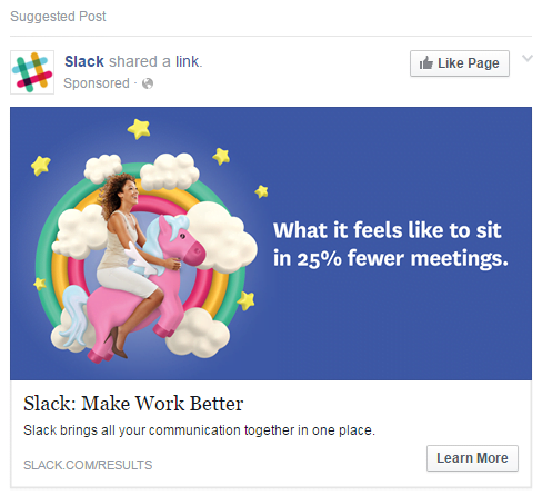
Slack’s “Make Work Better” Facebook ad
This is a great example of relatable Facebook ad copy—between the rainbows and unicorns and the acknowledgment that no one likes pointless meetings. The CTA is also well-positioned for the ad, as asking users to sign up based on this information alone might not be the most effective strategy.
Overall, it’s a great example of how a work-focused communications tool can be advertised well in a predominantly personal social media environment, and how even the most practical product or app can be made to seem more “fun.”
Takeaways
- Focus on how users or customers will feel after using your product (emotional words and phrases here!)
- Be imaginative with your ad creative/imagery.
- Consider using a snappy, memorable tagline or slogan as our headline.
Competitive ads can be effective if done tastefully. Here are some Facebook ad examples that show us how it’s done.
5. Shopify
While Shopify is typically known for its aspirational tone, this Facebook ad shows us its competitive side. It reads, From no listing fees to less competition – Learn the 10 reasons why merchants prefer Shopify to Etsy.
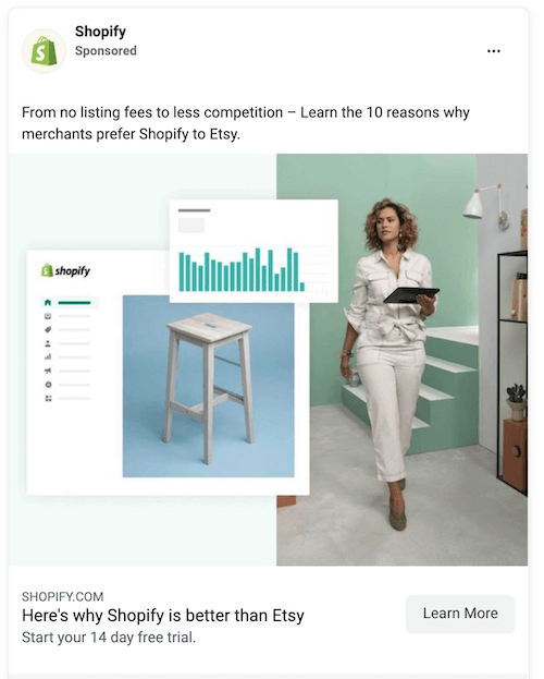
And then the headline reads Here’s why Shopify is better than Etsy. This is nice word choice, because “Find out why” would imply that you’d have to find out for yourself by using Shopify. In this case, it’s clear that clicking will bring you to the specific reasons like the ones mentioned in the primary text.
Takeaways:
- If you’re going to target your competitors, include specific reasons why you’re the better option for more convincing and more tasteful copy.
- Instead of saying “We’re better than [competitor], frame it as “[audience member]s prefer [your company] to [competitor].” Here, the subject is the audience, not your business.
- You don’t have to share an image of your competitor with a big red X through it to be effective. In this case, Shopify goes with a clean design on its product only, perhaps to keep the focus on the ad copy itself.
6. Tentsile
In this Facebook ad, Tentsile’s offer isn’t its product, it’s the report of its findings after testing its product against competing wannabes. The primary text reads: We tested FAKE Tentsile products so you don’t have to! Followed by a compelling headline of See What We Discovered 😱
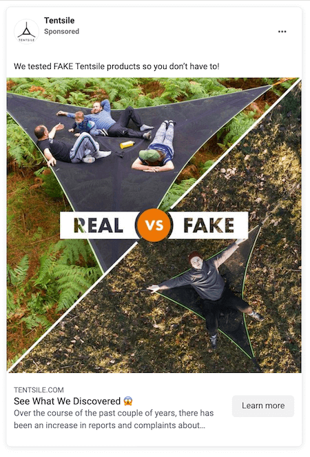
I’m not in the market for a tree hammock, but this Facebook ad copy is intriguing enough for me want to click and see what it found.
Takeaways:
- Don’t just talk about what sets your brand apart from competitors, prove it with empirical evidence.
- Use emojis. Not only does the gasp face make the “See what we discovered” headline even more irresistible, but it also wouldn’t have the same effect if it read “The results will shock you.”
- If you have an original product, be on the lookout for imitators and see if there are similar approaches you can take.
7. 360Learning
This Facebook Ad by 360Learning is a great example of creating demand and urgency. It reads: Netflix-style binge-learning won’t solve the current learning crisis. Then invites you to download an ebook on the topic.
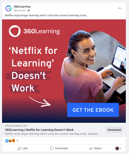
This bold and concerning statement is also placed in the ad creative on a red background. But what do we see right below it? A blue button oasis saying GET THE EBOOK. If you’re running a full-funnel Facebook advertising strategy, guides are great offers for top-of-funnel audiences to generate awareness and interest.
Takeaways:
- Grab attention with your Facebook ads with a bold claim. Viewers will want to see what you have to back it up with.
- Include the CTA button right in the ad creative. The entire image is clickable but it still invites the click much more than the gray CTA button in the standard Facebook ad display.
- Rather than digitally direct attention, personably guide your audience with hand-drawn arrows and illustrations.
8. Athos
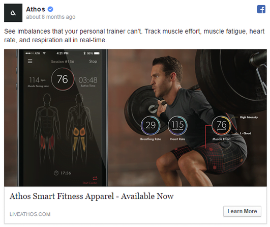
This Facebook ad example comes from Athos, the creators of what is basically FitBit, clothing style. For some products that are harder to grasp, the visual is everything and Athos nails it in this ad. It overlays the metrics you’ll see in the app on top of a picture of a person weightlifting—which demonstrates a stronger concept than simply just juxtaposing the two pictures.
Takeaways:
- Can you align your ads or products with existing successful products on the market? Even those in other verticals?
- Look at the imagery of your ad on its own, with no copy. Could the average user tell what your product or service does without any explanatory copy?
- Consider investing in professional product/studio photography, especially if you’re in a lifestyle business
You’d be surprised at how small details can make a difference and ultimately lower your Facebook ad costs. Let’s take a look.
9. Talkspace
This Facebook ad example by online talk therapy service Talkspace is a great example of not just features and benefits in copywriting, but the “why.” The primary text reads: Mental health is essential to everyone. Add a little help to your every day with a personally matched Talkspace therapist. So yes, we see a feature (personally matched therapist) and a benefit (help to your every day)…
…but the why is the most prominent text in the ad: Restart important conversations, with a little help from a therapist.
The idea of getting help with your every day feeds into the common misconception that therapy means you’re weak. But the idea of being able to restart and master important conversations of life is much more appealing—and empowering. This is the ultimate “why” that is so important in writing copy that sells.
Takeaways
- Go beyond the features and benefits of your offering and describe the emotions your customers will feel as a result of it.
- Make the most important copy of your ad stand out by puyting it in the creative, with bold, contrasting colors.
- Use realistic (and not posed, smiley stock) photos to represent your audience using your product or service.
10. Dollar Shave Club
This Dollar Shave Club Facebook ad example comes from the archives, but its takeaways are even more relevant today than they were back in 2016. It shows two razors, one for him and one for her, but you can’t tell the difference between the two.
The ad reads: It’s 2016. Who says a lady’s razor has to be pink? Dollar Shave Club delivers amazing razors (to both genders) for just a few bucks a month. Try the Club today.
See what I mean?
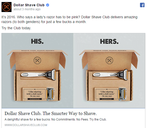
Inclusivity and gender neutrality are in just about every 2022 digital marketing trends round-up, but that doesn’t mean they haven’t always been important or that brands haven’t been demonstrating it in their campaigns. Dollar Shave Club not only challenges gender norms with this campaign but opens up its product line to an entirely new market in the process.
Takeaways
- Inclusive brand values can capture exclusive attention from your audience and benefit society all at once.
- Is there a way to promote an existing product line to an entirely new audience?
- Take a look at your buyer personas. Are they truly representative of your ideal customer, or are you inadvertently overlooking potentially valuable audiences?
11. Heal
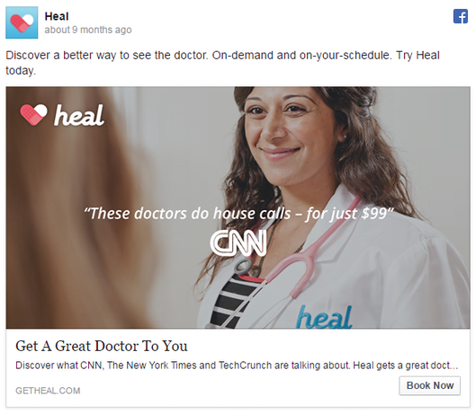
Despite amazing technological advances in modern medicine, actually finding a doctor that takes your insurance and scheduling the appointment is a clunky process. This ad by Heal tells you to Discover a better way to see the doctor. On-demand and on-your-schedule.
Takeaways:
- Make customer pain points central to your messaging.
- Include strong, recognizable trust signals if possible.
- Keep using those interesting words! “Discover” has much more appeal than “find.”
Facebook video ads range from actual footage, to animation and slideshow style, to just a few seconds of movement. Here are some examples that cover all of the above.
12. Cash App
The Cash App allows you to send, spend, deposit, and invest your money all in one place. But the ad below is for something different: a customizable debit card.
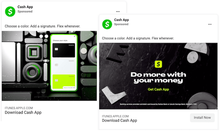
Apart from the ad itself being visually captivating, this is a great marketing strategy. Not only is personalization the name of the game today, but it supports the overarching concept of the app being flexible. Plus, what other money management apps offer a customizable debit card? Bonus points for a unique selling proposition.
Takeaways:
- What bonus offering can you add to your mix to set you apart from your competitors?
- Use subtle repetition as a copywriting technique. The repetition of three short sentences in the primary text of this ad (Choose a color. Add a signature. Flex whenever) gives it a rhythm.
- Finish off your ad videos with your value proposition.
13. Bolden USA
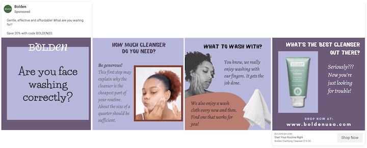
This Facebook video ad by Bolden shares an excellent Facebook ad idea with a short tutorial on how to wash your face in the form of FAQs.
Click to enlarge | Watch video ad
Then the last question is What’s the best cleanser out there? with a picture of Bolden’s cleanser, a playful caption that reads Seriously??? Now you’re just looking for trouble! and a call to action to shop its website.
Takeaways:
- Provide product-agnostic tips in your ads to show your expertise, build trust, and add value.
- The smallest tweaks can hook viewers in your videos. If this one had begun with How to wash your face correctly, I might dismiss it. But the question Are you face washing correctly? instills a mix of doubt and curiosity that makes me want to find out.
- Be transparent. Bolden promotes its own product at the end (would it be an ad if it didn’t?), but doesn’t try to sneak it in.
14. Blue Diamond
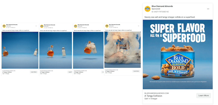
Who knew that salt and vinegar could be cute? In this Facebook video ad example, Blue Diamond animates a salt shaker and vinegar canister backing up, counting to three, and then running at each other to collide. The sound effects are adorable, but not necessary to capture the cuteness of the ad.
Click to enlarge | Watch video ad
Takeaways:
- It’s a Facebook advertising mistake to create videos that require sound. But instead of captioning your videos, see if you can capture the experience without words.
- Incorporate trending or popular topics into your ads. “Superfood” was hardly a word until about five years ago.
- Try personifying objects. You’d be surprised at how entertaining they can be.
This ad type offers the added space to share more content, but gives the viewer a little more control than having to watch a video. Here are some awesome Facebook carousel ads to model after.
15. Chubbies
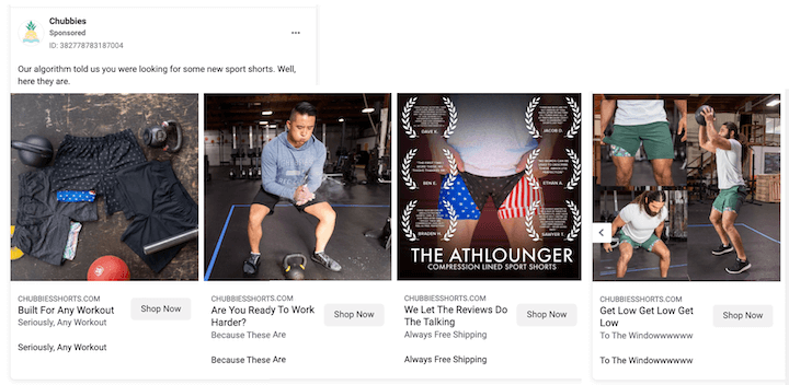
The visuals in this Chubbies’ carousel ad aren’t anything to write home about, but the copy, well that’s another story.
- Our algorithm told us you were looking for some new sport shorts. Well, here they are
- Built for any workout – seriously, any workout
- Are you ready to work harder? Becuase these are
- We let the reviews do the talking
- Get low get low get low…to the windowwwwwww
Takeaways:
- Add customer reviews to your ad copy, whether in the creative itself or in the primary text.
- Try out short, witty ad copy. Even though I’m not a male seeking short workout shorts, I’d still be curious to see the website where that copy came from.
- Be transparent. Just like Bolden’s Facebook ad, this one tells it like it is with Our algorithm told us.
16. Brandfolder
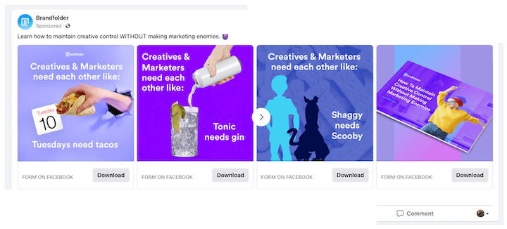
Here’s another fun carousel ad. It reads: Learn how to maintain creative control WITHOUT making marketing enemies. Then each card in the carousel has a different Creatives & Marketers need each other like…Tuesdays need tacos.T onic needs gin. Shaggy needs Scooby.
Takeaways:
- Instead of allotting a different feature or benefit to each card in your carousel, try for different variations on something funny. It’s highly likely to get viewers to scroll through—and remember your ad.
- Use bright, complementary, and contrasting colors to catch (and treat) your viewers’ eyes.
- Try out small accents, like one word in all caps or a single emoji to give your primary text a little pop.
Use these Facebook ad examples for inspiration
Hopefully, these examples of some of the best ads we’ve seen on Facebook have given you a few ideas of things you could try when you run your own ads, especially if your Facebook ads aren’t working, or at least give you some things to look for next time you’re sneaking a look at Facebook when you’re supposed to be working. Hey, what’s wrong with a little competitive analysis?

