Growing up I was always fascinated by construction sites. I loved watching bricks getting stacked, door frames getting measured, and drywall getting hammered. I was eager to watch nothing become something.
Designing a landing page is a lot like constructing a building — there’s nothing on a page when you begin. But as you start adding the necessary elements, you see something amazing come alive.
The finished building only looks great if you’ve built it using the correct materials in the right places — the same is true for landing pages.
Besides a lead capture form, every landing page contains a mix of various elements. There’s the headline, copy, image, customer testimonials, trust seals, customer badges, call to action button, and a video or gif. Each element plays its part to get the visitor to convert. For example, you can’t pay less attention to the copy so that your headline becomes more noticeable, nor can you ignore the form to give the CTA button the spotlight.
All elements deserve a noticeable place on your dedicated page because it’s the balance between these elements that helps persuade the visitor to convert into a lead/customer.
When you don’t maintain this balance, this is the kind of page you can expect to see:
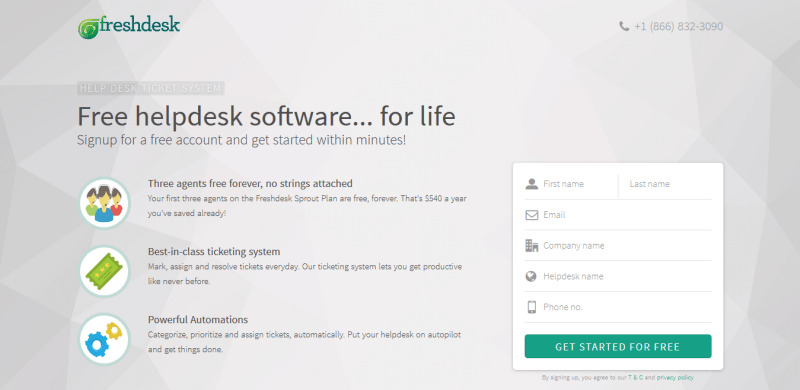
And when every element is given a chance to shine, this is the kind of page that you can create:
So, what’s the difference between these two landing pages? Both pages have the necessary elements needed to score a conversion. What the Freshdesk page has that the TaxSlayer page doesn’t have is an element often overlooked with landing pages — white space.
What Is “White Space” Anyway?
Jan Tschichold had this to say about white space: it “is to be regarded as an active element, not a passive background.”
White space (aka negative space) is any portion of a page that is left unmarked — the empty space on a page. In design terms, white space can be defined as the space between text, margins, columns, graphics, and any other page elements.
It’s this open space that makes all other landing page elements look more pronounced and draws focus to them. It wouldn’t be wrong to say that white space is the glue that holds a landing page together. Without white space, you’re left with a messy page (like TaxSlayer above) that’s not conversion-worthy.
The space is called “white” and yet, it doesn’t always need to be white. You can have this space be any color as long as it looks natural with the page design and helps draw attention to each element (especially your CTA and form).
You can include white space practically anywhere on a landing page to help everything stand apart and get your visitor to take notice.
The Four Types of White Space Design
There are four main types of white space design:
- Micro white space: This is the negative space between smaller elements (e.g. the space between an image and a caption and between words and letters).
- Macro white space: This is the blank space between main elements (e.g. the space between the headline and the copy).
- Active white space: This kind of space is consciously added to the page in order to make it more structured. It is mostly asymmetrical and makes the page look dynamic.
- Passive white space: This is natural occurring white space, and it’s not added deliberately. It’s the space between words on a line or the space around a graphic.
All four types of white space are necessary for great landing page design to draw attention to your landing page elements.
Negative space plays a major role in landing page design. Let’s discuss some reasons why you should include this page element in all the landing pages you create.
White Space Design Enhances Readability
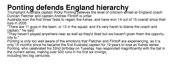
By using white space in your copy, you’re able to de-clutter the text, allowing the visitor to have a more enjoyable reading experience. To demonstrate, let’s look at this paragraph of copy that doesn’t have any whitespace:
How many lines did you read? Or did you do what I did and not even attempt to read it?
Clutter is a conversion killer; white space is like the superhero who saves your page from being a victim of clutter.
Let’s see how the same text looks like after adding active whitespace:
Better? You might have even liked it if you’re a cricket and Ponting fan.
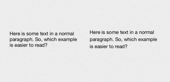
Line spacing (aka “leading”) has a big impact on readability. This is the micro white space between lines of text. As a rule of thumb, the larger the leading, the easier it is to read and comprehend the copy on the page.
Which paragraph is easier to read?
Cluttered letters aren’t readable; the same applies to letters with too much leading. For example, people can mistake letters with too much space in between them for words and not letters.
Make sure you add the right amount of white space in your copy, just as Halogen does on its landing page:
White Space Design Guides Your Visitor’s Gaze
With the help of white space, you can establish a visual hierarchy for visitors by dictating which element they should see first and which element needs to follow. White space is the reason why your visitors will first look at your headline, then move to the copy, proceed to the form and finally your call-to-action button.
White space allows you to provide spatial relationships between each page element — allowing you to guide your visitors through the page.
Look at this Sendible landing page as an example:
The negative space on both sides of the page guides visitors’ eyes to the middle, where they’ll find the primary and secondary headline. This is not what F and Z page patterns dictate — yet due to white space, you are forced to start looking at the page from the middle.
White Space Design Makes Your Landing Page Upscale
White space can be used to add a sense of sophistication and elegance to your landing pages. Less white space generally gives off a low-quality vibe, whereas a page with generous negative space comes across as premium and luxurious.
Take these two ads as an example:
Which one looks more premium?
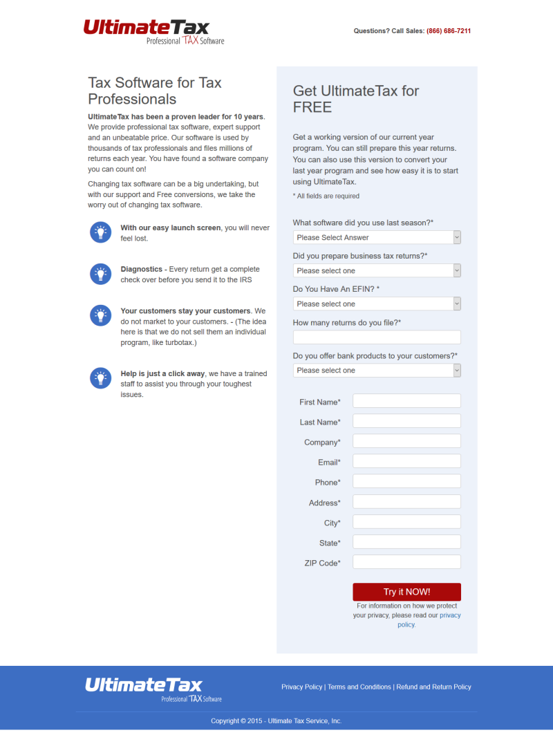
Landing pages are no different. The Ultimate Tax page doesn’t give off a sophisticated vibe because it doesn’t use ample negative space:
There’s plenty of white space at the bottom, but the top of the landing page is very text-heavy.
This E-file page, on the other hand, looks much more clean and sophisticated and, thus, premium:
White Space Optimizes Your Lead Capture Forms
Lead capture forms can make or break your landing page conversion rates. If the form isn’t designed properly you can risk losing visitors who were ready to convert but got turned off by the form. White space eliminates this risk because you can easily format your form fields.
The Gestalt principle explains that visitors tend to overlook elements in proximity to each other. You can avoid this by having enough white space between fields so that the visitor isn’t confused when he’s trying to input his information.
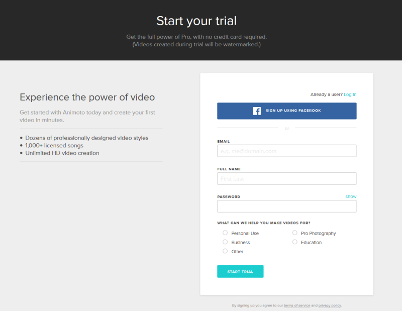
When you click-through on this Animoto page, you see the page and form below, which has sufficient white space:
White Space Is Anything But Wasted Space
Even though white space is sometimes referred to as “empty space,” by no means is it wasted space. It’s not the section of the page you couldn’t fill. It’s the space on the page you deliberately left blank so that the remaining areas could draw more attention.
White space gives your page elements room to breathe so what you design is a simple, sophisticated page that has the power to persuade visitors to convert — and that’s what all landing pages are created to do.
About the author
Fahad Muhammad is a Content Marketer at Instapage. Being a veteran Instapage writer, he has witnessed the industry progress rapidly. He writes about landing page examples, marketing trends, Instapage updates, and conversion psychology on the Instapage blog. When he’s not busy hunting down landing page examples he can be found glued to an episode of Top Gear.


