
“I’m getting tons of traffic to my page, but conversion rates are low.” Sound familiar?
Whenever I hear this complaint, it’s not hard to troubleshoot the source of the problem – the landing page. It’s like having a talented soccer team that can execute everything aside from scoring the goal; there’s no shot in generating leads if you can’t get them in the net.
Often, when marketers test their landing pages to try to up conversion rates, they’re focused on the small stuff, like testing button colors and placement, when they’re missing key elements on the page (like a headline! or a value proposition!).
There’s also a clear distinction between a purchase or check-out page and a landing page for lead generation. Acquiring a new contact from a lead generation landing page is just the start of convincing them to convert. When your business model requires a bit more TLC to push prospects down the conversion funnel, the lead gen landing page to capture new leads and contacts is one of the most critical, make-it-or-break-it parts of a new visitor’s journey.
When your sales cycles are longer, the last thing you want to worry about is a lack of conversions on your landing pages – there’s already enough work to be done once a new contact comes into the system. So make your life easier by making these 8 smart improvements to your landing pages for lead generation.
#1: Keep Forms Short & Sweet
I’d estimate 80% of forms I see on landing pages ask for more information from the prospect than is actually needed. Nowadays more information about a prospect is a Google search away so why do you need to know their biggest fear and social security number?
Even if you’re not taking it to that extreme, spend some time evaluating your lead capture forms and weighing what information is truly needed to take a lead to the next phase of your purchase funnel. People don’t like giving out more information than they need to – it’s time consuming, taxing, and feels like a privacy violation. Chances of losing them mid-form increase as each new form field is added.
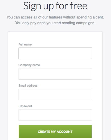
Take a look at the well-done form from a Campaign Monitor lead generation landing page above. All the lead has to do is fill out four basic bits of information to start their trial – it’s that easy! Asking for too much data off the bat is a good way to lose potential leads to a competitor.
#2: Be Consistent In Your Messaging
An easy way to turn new visitors away is by not delivering what you originally promised. I’m not talking about promising a demo and offering a white paper, I’m talking about the language and messaging you’re using to entice people to visit your page.
This is something to be especially cautious about if you’re generating traffic to your landing pages via paid search, because it’s easier than you realize to use keywords and ads that don’t reflect your landing page. You need to use consistent messaging throughout your entire PPC campaign – from the keywords you’re bidding on to the ad copy to the landing page. If your messaging differs as the prospect moves from SERP to landing page, your leads will feel confused or misled and leave.
Your PPC keyword should be reflected in the headline of your ad and landing page. If someone searches for “affordable project management software,” your ad and landing page should feature that same language. This may mean that you need to create more landing page variations, but it’s worth the effort for the higher conversion rates that will follow.
RELATED: 11 Landing Page Trends & Ideas You Can Actually Implement
#3: Write Scannable Copy
Landing pages for lead gen should contain copy to explain why your prospects need to sign up, right? But how does the copy on your landing page appear to the distracted eye? You need to remember we live in a multitasking world with diminishing attention spans. Visitors are not going to see large paragraphs of text and feel the slightest bit tempted to read them.
The best approach is to keep your landing page copy short, sweet, and to-the-point in an easy-to-scan format (think bullet points, arrows, dashes).
Here’s an example I came across from Core Power Yoga’s instructor courses below. Can you image if those bullets were stringed together in a large block of text? There’s no shot leads would be reading and feeling compelled to take action. The list layout makes the page much easier to take in.
#4: Tell a Story with High-Quality, Relevant Visuals
The brain processes visuals 60,000 times faster than it does text, according to this QuickSprout infographic. And content with relevant images get 94% more views than content without. Great visuals can take your lead gen landing pages to a completely new level, instantly expressing what you’re all about.
Take a look at Base’s lead generation landing page below. Not only does this image make their business feel more human, it tells a story and gives you a sense of what kind of company they are (young, hip, productive).
#5: Provide Validation from Big Brand Clients
There are certain brands we all know, like Coca Cola and GE; then there are some that are less familiar. This doesn’t make them bad brands, but if the majority of potential leads don’t recognize them then their logo isn’t especially useful on your landing page.
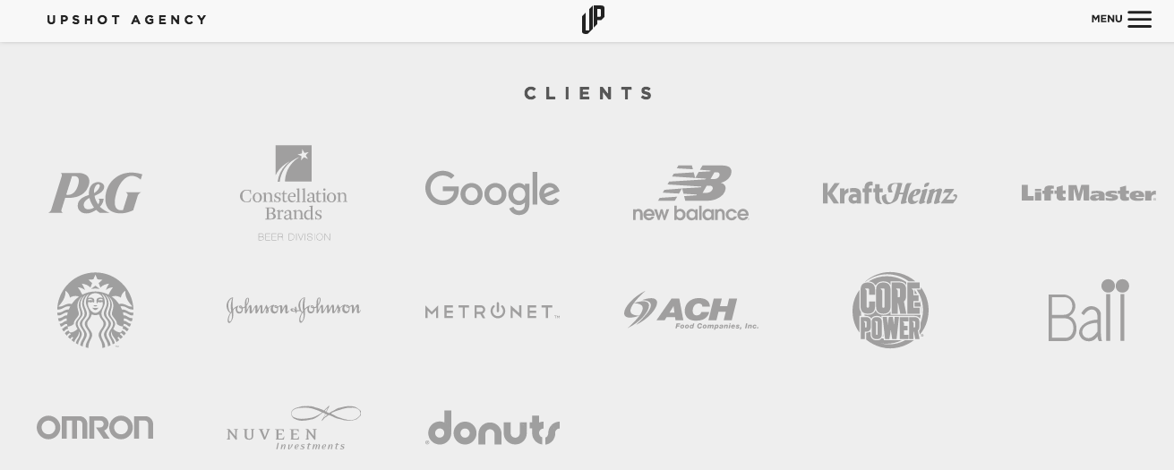
However, if you do have some of these popular well-known brands in your customer base, then you should be sharing that on your landing pages, like Upshot Agency did below. This not only provides legitimacy to your brand, but it increases trust. If Google uses this agency then they must be good, right?
#6: Implement a Chat System on Your Landing Pages
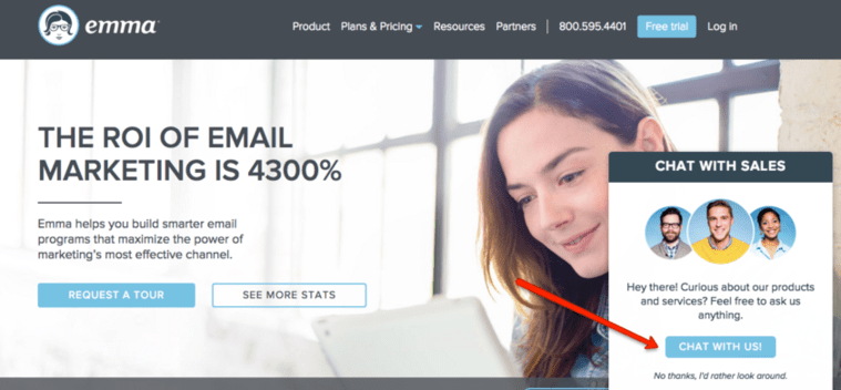
This tip is only applicable if you have the bandwidth to support it. If your customer success team is either non-existent or incapable of giving attention to chat during business hours, then bypass this advice. But know that a chat system is an excellent way to provide A+ service and increase your chances of gaining new leads.
Being available to answer questions about pricing, service, etc. exactly when your prospects are looking for those answers is an extremely effective way to get a hot lead and maybe even close the deal.
#7: Include Trust & Privacy Signals
Often with new leads, the biggest barrier is trust. Why should they trust you with their contact information, not knowing if you plan to have your sales reps cold-call them at all hours of the day and night? Depending on the industry, it can be even harder to gain a lead’s trust (think legal or medical), but regardless you should always incorporate trust signals and privacy policies on your landing pages to ensure your visitors that you’re not going to make their information public or misuse it.
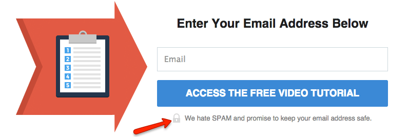
Check out the example below from Lead Pages. They include a line about providing 100% security and a link to their privacy policy to put visitors at ease.
Once you click the button, there’s even more reassurance that your information won’t be misused!
#8: Remove All Distractions
I just told you a bunch of things you should include on a lead generation landing page, but what should you leave out? Anything that serves as a distraction! It can be tempting to link all over your site, but this mistake often leads to visitors becoming distracted and further away from the goal of filling out the form.
Get rid of the navigation at the top of the page, don’t link elsewhere within the copy of the page, and remove all unnecessary distractions to keep your leads focused on the ultimate goal.
Check out seven more lesser-known lead generation ideas here.






Comments
Please read our Comment Policy before commenting.