For those of us who spend all day in the Google Ads (formerly known as Google AdWords) UI, there’s almost no report out there that can include every bit of information we use to optimize our accounts. But even for the most hardened veteran of that grey and white landscape, trends can be hard to see without quick visualization.
At WordStream we love creating custom dashboards for our clients so they can easily communicate goals within their company and staff. We automate it whenever possible so we can spend more time optimizing your account!
Below is an introduction to getting your way on making aesthetic and functional Google Ads reporting dashboards that you can white-label yourself. I highly recommend going through the steps yourself; however we have included a Google Ads report template at the bottom if you wish to go straight to the final product.
Run our Google Ads Performance Grader today and you’ll get a free, instantaneous audit of your Google Ads account!
Downloading Your Google Ads Data
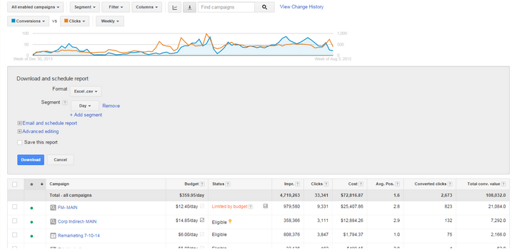
Select your date range – if creating a brand new report go back as far as you want! We’re doing 2014-Today.
Make sure you have only the following columns: Impressions, clicks, cost, average position, converted clicks, total conversion value (you can substitute conversions for converted clicks if necessary).
Click on the Download button and segment by “Day”. Add another and segment by week, then add another and segment by month. Then download and open it!
Your report should look like the one above.
We want to delete a few columns now, so for campaign state click on the letter above it, in this example you will click on the “D” which selects the whole column. Rather than hitting “delete” and clearing the column we want to hit “Ctrl & -“ to remove the row altogether. Do the same for the other highlighted columns.
The remaining columns should be: Day, Week, Month, Campaign, Impressions, Clicks, Cost, Avg Position, Converted Clicks, Total Conv. Value.
Now we will add a simple formula so that we can get an accurate read on average position. (Note, we will be using a Weighted Average Position).
Title the column WAP and in the first cell use the formula =Impressions * Avg Pos (Displayed here as =E3*H3).
Drag this formula down your data (or double click in the small black box of the selected cell for instant drop down!)
Delete the first row of the sheet that contains the date range using “Ctrl –“ and go to the end and delete the 4 total rows as well. (Click on the number to the left of the row to select the entire row). Select cell A1, then in the toolbar go to “Insert”.
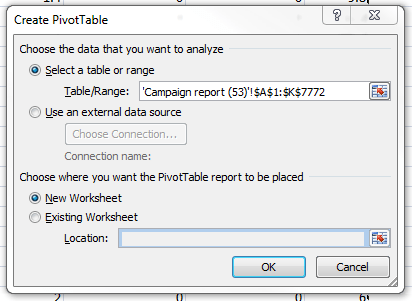
Now for the Pivot Table!
The default settings for the pivot table are what we want to be using so just hit “OK”.
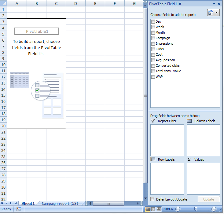
We now have an empty pivot table, so grab your stress ball and squeeze it a few times, and get ready to wonder why you ever afraid of them to begin with!
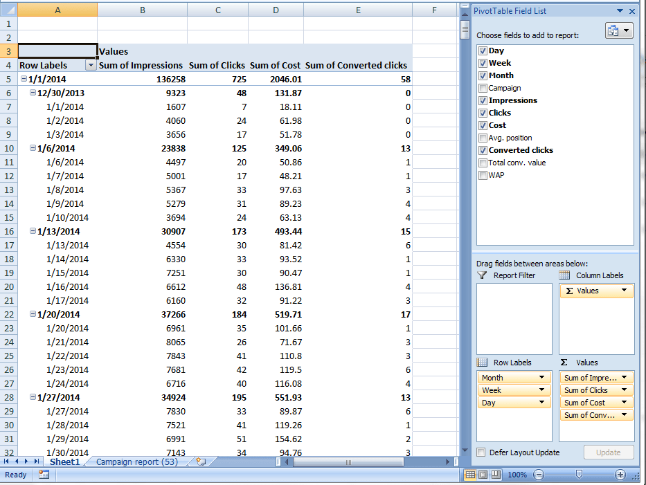
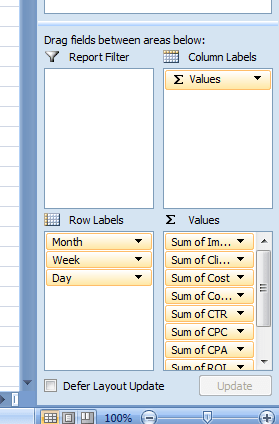
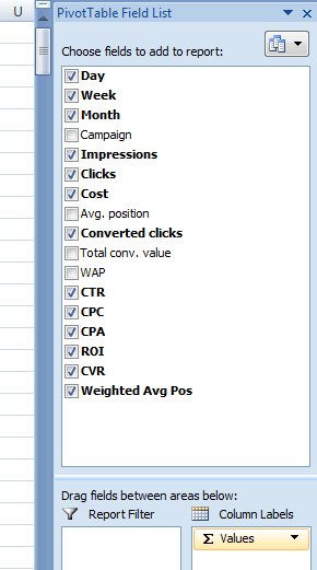
Here we have the initial metrics dragged in. These are the metrics that just get added together!
For the metrics that require multiplication or division (CTR = Clicks / Impressions) we have to do one quick special step.
Go To “Formulas” and then “Calculated Field”:
Name and create the following metrics:
- CTR = Clicks / Impressions
- CPC = Cost / Clicks
- CPA = Cost / Converted Clicks
- ROI = Total Conversion Value / Cost
- CVR = Converted Clicks / Clicks
- Weighted Avg Pos = WAP / Impressions
All right, things are coming together! But it’s still pretty ugly. If you present this to your board or client you’ll get a face full of hot coffee or a pink slip so let’s put lipstick on this pig.
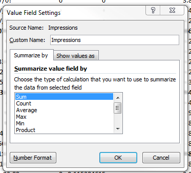
Currently the columns are named “Sum Of XXXX” so let’s rename them and give them the proper units. In the values area click on the drop down for the first option, impressions, and go to value field settings:
Rename it to just “Impressions “ (make sure to put a space at the end of the word{excel intricacies}).
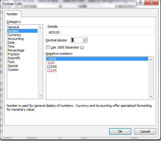
Then go to Number Format:
For Impressions we want “Number” with 0 decimal places. Details for the rest are below:
- Clicks: Number, 0
- Cost: Currency, 2
- Converted Clicks: Number, 0
- CTR: Percentage, 1
- CPC: Currency, 2
- CPA: Currency, 2
- ROI: Currency, 2
- CVR: Percentage, 2
- Weighted Avg Pos: Number, 1
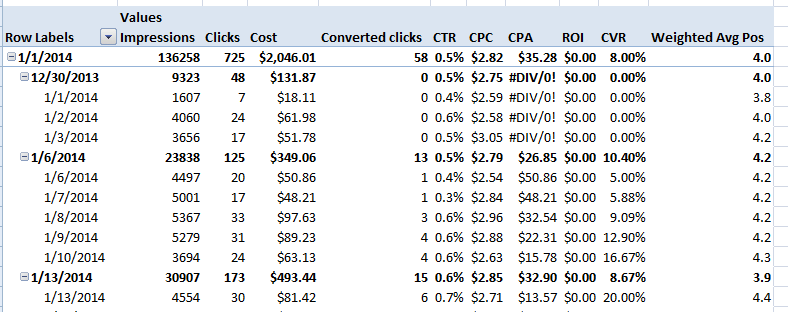
Much better! Now let’s sort the data so the new data is on top!
On the right panel click on Month and sort “Newest to Oldest” and repeat for week and then day.
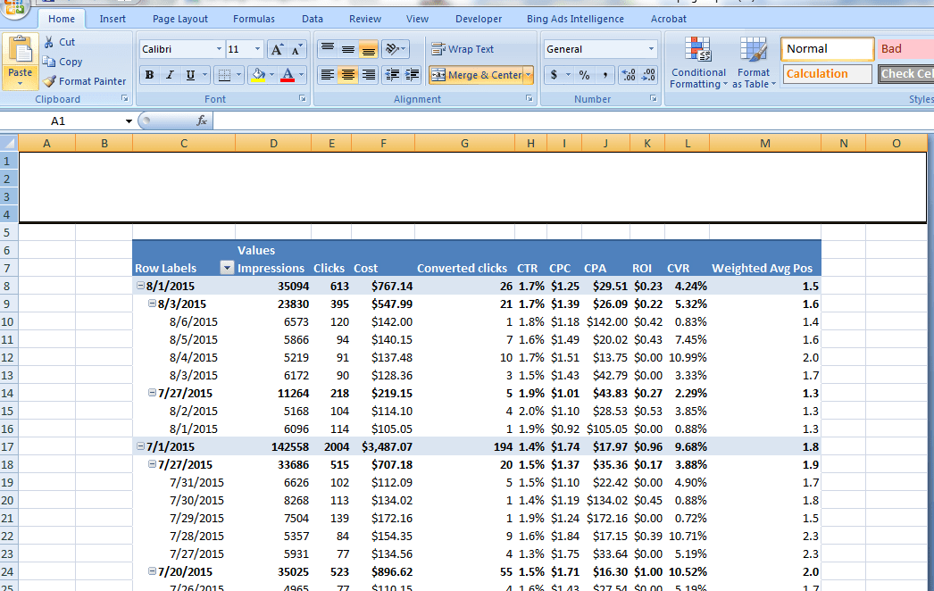
Now we’re at a point where we can start to see some actual trends in the data.
Add some color by going to the design tab and picking whatever is aesthetically pleasing to you.
Add a few columns to the left of the pivot, and a few to the top. Then highlight a column at the top, click “Ctrl Shift Right arrow” and right click the header letters and click “Hide.”
Highlight the top few rows above the pivot and under “Home” click on “Merge & Center.”
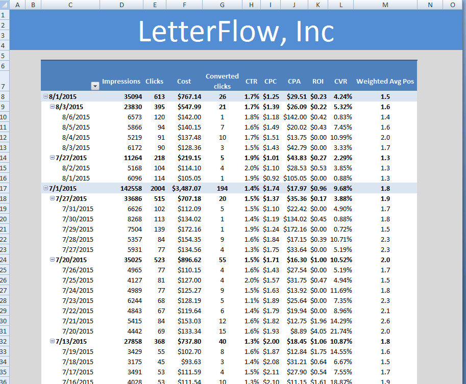
I like to match this header to the color scheme of the pivot and then type in your client’s name.
And now in a mere 15 minutes we have a great-looking Google Ads report that can be sent to any client! Click here to download a free PPC report template.









Comments
Please read our Comment Policy before commenting.