What is a Squeeze Page?
A squeeze page is a landing page designed to capture opt-in email addresses from potential subscribers. The goal of a squeeze page is to convince, cajole, or otherwise ”squeeze” a visitor into providing one of their most sought-after and coveted pieces of personal data: the email address.
What Makes a Good Squeeze Page?
As its name suggests, there is an element of intentional yet subtle forcefulness involved in a squeeze page. Think the Star Wars crash compactor scene. Squeeze pages should work a bit like that.

It’s a trap!
You don’t want to leave those golden geese a means of escape, and putting in as few hyperlinks as possible narrows the walls around your victims prospective clients. A squeeze page should act as an ultimatum for visitors – either take the offer or leave the page. It should be black and white (not literally though – color is actually pretty important!).
In the same vein, content should be kept to a minimum on a squeeze page (at least above the fold – we’ll get into that in a bit). Content bloat only distracts from your offer. That’s another thing – you’ll want a convincing offer. Something shiny, enticing, and desirable. Your offer needs to be worth surrendering an email address for – in online terms an email address is equivalent to a slice of your soul.
What Makes an Enticing Offer for a Squeeze Page?
While you can host many different types of content on your squeeze page, some will prove more valuable than others. Prime types of squeeze page content offers include:
- Email Course
- E-Book
- White Paper Collection
- Templates / Design Aids
D. Bnonn Tennant of Kiss Metrics makes a very interesting point, claiming that if you are going to ask for a user’s email address, it should be absolutely necessary for the offer. Asking for an email address in exchange for a download file or video makes the hair stand up on a user’s spine. Most users know that they shouldn’t have to provide you with an email address in order to watch a video. However, if you are going to send them an e-book, needing their email to do so makes a bit more sense.
In fact, if you try to get users to provide an email in exchange for a video, some users may jump on over to YouTube to find the video on their own, which is a major marketing fail! That’s why I didn’t include video on the list above – online users are just way too accustomed to getting videos in exchange for nothing at all. The key is to stay subtle and be discreet about your true intentions.
If the best offers are those that align with the user data you’re asking for, then when it comes to email opt-ins, naturally email courses are the recommended plan of action.
Email courses are a great offer for a number of reasons:
- You’re sending info in smaller, more easily digestible chunks, which makes the user more likely to use and get value out of the offer.
- If the email course is valuable to the user, they will look forward to your reoccurring emails, building a positive relationship that will make it easier for follow-up offers and pitches down the line.
- Email courses can have added value when you add in video sections within the courses.
- As already discussed, an email course aligns perfectly with asking for an opt-in email address, making you look more reputable and less spammy.
How to Create a Squeeze Page
So how do you create a squeeze page? There are a few different methods:
- DIY: Build a squeeze page manually, as you would any other landing page.
- Squeeze Page Generator: There are several tools on the market that assist in generating squeeze pages. WordStream’s new Landing Pages & Leads tool serves as a great squeeze page creator – the simple and easy landing page wizard lets you choose from different squeeze page templates, colors, and themes. The tool helps you with forms, copy, thank you pages, tracking codes, and other best practices that are baked into the tool. Give it a try!
- WordPress Squeeze Page Plug-ins: There a few different WordPress plug-ins that provide landing page or squeeze page templates for WordPress users.
- WordPress Landing Pages Plugin: Create and track landing pages
- WordPress Easy Sign Up Plugin: Easy sign up forms for newsletters, offers, etc.
- WordPress Lead Plus Free Squeeze Page Creator: Fast and easy squeeze page templates for WordPress.
What elements should be on your squeeze page? What should it look like? In the next section, we’ll look at squeeze page formats and examples to get you started.
Surprise! Everything you know about conversion rate optimization is wrong. Find out why.
Splash Page vs. Pop-Up Squeeze Page: Two Popular Formats
The term “squeeze page” is an umbrella term, encompassing any webpage with a primary goal of getting users to sign up for an offer. How you choose to format your squeeze page is up to you. Two common forms of a squeeze page are splash pages and pop-ups.
Pop-Up Squeeze Pages
Pop-up squeeze pages are annoying as hell – you’ll often find them floating on top of content you’re attempting to read, distracting and harassing you until you give up your email address or manage to find the (oftentimes camouflaged) X button.
One survey by Jakob Nielsen found that 95% of users found their online experience was negatively, or even VERY negatively affected by pop-ups. Equally horrific, in another study it was found that over 50% reported that popups negatively affected their opinion of the advertisers. Yikes! Granted, this study was done back in 2004, but pop-ups still tend to be despised by many (although some advertisers do see a drastic increase in conversion rates from offer pop-ups). It’s best to think twice before using pop-up squeeze pages. If you’re going to do it, do it right.
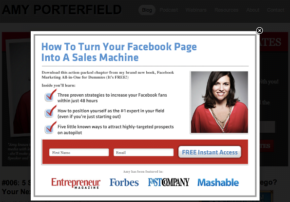
Good Pop-Up: This pop-up isn’t so bad. Sure, it’s blocking content we want to see, but it’s quick to read and there is an obvious X button in the top corner.
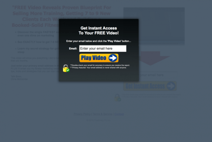
Bad Pop-up: This pop-up is ugly and is asking for your email address so that you can see a video – a video you thought you were only one click away from seeing. It looks like spam and most likely is. Also, no X button anywhere to be found.
Splash Page
A splash page is another way to implement a squeeze page. Splash pages are custom pages users are sent to when they first visit your homepage. Having your splash page also serve as a squeeze page means more eyeballs on your offer. The risk is that some visitors may immediately click away from your squeeze page, leaving your site entirely and never even seeing your real homepage! To prevent this, it’s best to include a big old “no thanks” buttons that lets users easily head straight to your homepage. Usually on a squeeze page you don’t want to direct users away, but on a splash page it’s a bit different – users are trying to get to your homepage, so you should still make it easy for them to get there. You’re just throwing them an offer before you let them head home. If you love something, set it free!
If you decide to go the splash page route, make sure the design, copy, and feel correspond with your regular homepage – you don’t want users to wonder where you are. Also add a cookie so that when they visit your site a second time they go straight to your homepage rather than dealing with the splash page again.
The splash page below from the Information Highway Man is a good example, with a very obvious “take me to the normal site” button so that users can still get where they want to go.

And remember, there’s nothing wrong with using a classic landing page as a squeeze page. It’s all up to you!
Squeeze Page Design Best Practices & Tips
Here are some tips for optimizing your squeeze page design.
- Testimonials & Success Stories: Testimonial quotes from happy customers can prove to users that your offer is of value. Social proof is smart to implement when possible. If a user sees a Facebook friend (no matter how distant) has downloaded your ebook, they will be much more likely to follow suit.

- Video/Multimedia Elements: Video and multimedia elements will help keep a visitor’s attention and can be used to provide additional information that you can cut out from the copy, leaving you with cleaner, less distracting piles of text. Please for the love of all things beautiful, avoid using audio. I have yet to see audio elements used well. They are at their best obnoxious and at their worst terrifying. I promise you, no one is staying on your squeeze page because of your soothing angelic voice describing the benefits of fish oil vitamin supplements.
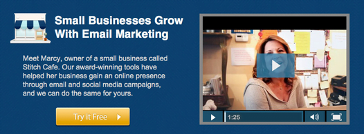
- Color Psychology: Good squeeze pages make careful use of color. Pay attention to contrast, white space, etc.
- Page Text Design: Make your content easily digestible and scannable with headlines, bullets, etc. Provide the important info and make sure that info stands out, is easy to find, and read. Read more content design and marketing tips!
- Below the Fold Content: Remember how we were saying that too much content is bad because it drives visitors away and decreases conversions? This is true, but only for above the fold content. You see, Google isn’t a huge fan of squeeze pages, primarily because they tend to be content-light and can come off spammy (when not done properly). The workaround for this little issue is to add keyword-rich content below the fold. This gives your squeeze pages an added SEO boost and keeps them healthy and performing well. Keep squeeze page basics like opt-in forms, bullet points, and videos at the top of the page. On the bottom, put more detailed content and product info.
- Scarcity AKA Missing-Out-Syndrome: Scarcity elements push a user to take advantage of an offer NOW rather than mulling it over. Pushing your offer as a “limited-time deal” can encourage visitors to take the plunge.

- Don’t Make Your Offer Too Big to Handle: Not a ton of people have read Leo Tolstoy’s War & Peace (no one’s judging, I haven’t either). It’s considered one of the most important pieces of world literature, so why isn’t it read more often? Well, because it’s huge. It’s intimidating. You don’t want your offer to be like War & Peace.
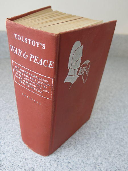
I’m sure more than a few of us have a collection of those huge 32-page PDF files buried on the C drive somewhere. While massively huge collections of white papers may seem enticing in the moment, people aren’t likely to read them. They’re just too busy and don’t have the time. As Kiss Metrics notes, you want to provide something a user will use, not just should use. There’s no value in any single resource unless it’s used.
- Stick to minimal form fields: It’s been shown that the more form fields you include on a squeeze page, the less likely a user is to take advantage of your offer. Ideally, you’d ask for just the email address, although some marketers really want the name as well to personalize future emails (the necessity of this is debatable). One smart technique is ask for the bare minimum upfront, but have additional form fields on the following thank you page. They may or may not fill out the added form, but at least you got the email and have more leads as a result. Some marketers also believe that the more info you ask for on a form, the more likely a user is to give you a fake email – they catch wind that you’re not asking for all this info just to send them a free “How to Shave Your Kitten” tutorial.
Keep in mind the form fields that serve as major turn-offs for most users. I myself HATE giving out my phone number – when filling out a free offer, if my phone number is required, more than a few times I’ve simply left and abandoned the offer.
- Adjust Language to Emphasize Value for Users : Make sure you promote the payoff and emphasize the benefits of your offer. Also make sure to adjust your button language from the generic “submit” to something more relevant like “Download Templates” or “Send Me my Free Kitten Shaving Guide” etc.

- Auto-responder email: Squeeze pages usually go hand-in-hand with an autoresponder email so that you can provide users with your offer the moment they fill out your form. Can’t you just see them studying their inbox with anticipation, awaiting your incredible kitten shaving ebook? Don’t keep them waiting!
- Images of Your Product: Images are always recommended for an engaging webpage experience, and this is true of squeeze pages as well!
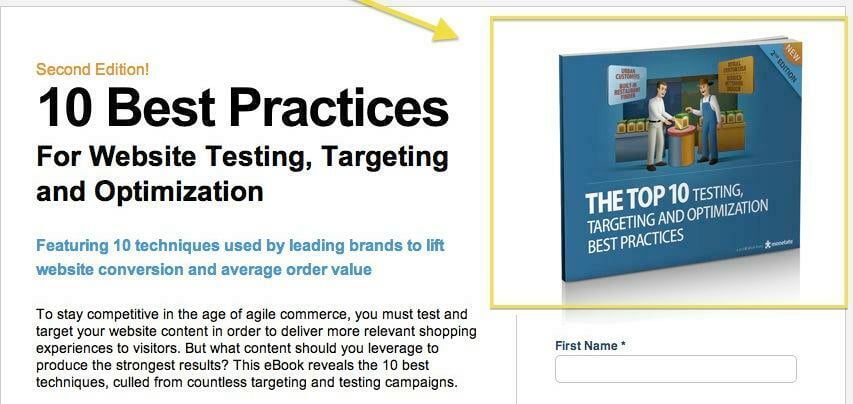
These images won’t always be the most interesting, especially when dealing with ebooks and white papers, but something is better than nothing.
- Encouraging Statistics Like # of Downloads: At McDonald’s it’s “Over 1 Million Served.” If you’ve got a solid number of people taking advantage of your offer, show off that statistic as it encourages other! You might want to wait until you’ve got a nice number though. “2 People Have Taken This Offer” doesn’t exactly scream confidence.
Looking for more tips about bumping up your landing page conversion rates? No problem!
Squeeze Page Examples
Below are some examples of squeeze pages in all their gruesomeness and glory. Enjoy!
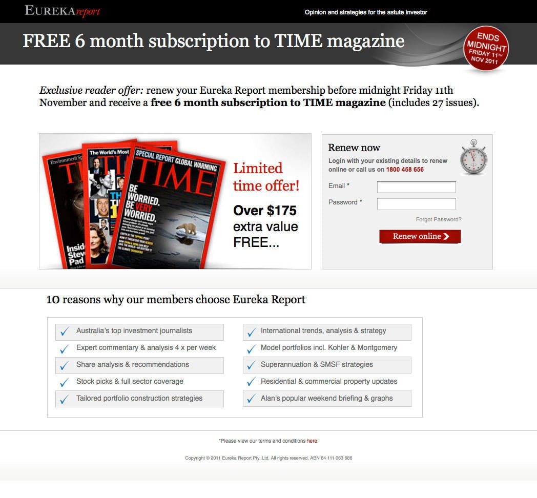
What Does it Do Right?
- Relevant button text
- Scarcity elements in bright red push user to take action
- Short form field
- Large, bright, attractive image
- Minimal text, formatted in bullet points to make content fast and easy to read
What Does it Do Wrong?
- It seems a bit weird that the top 10 list isn’t numbered
- The offer is supposed to be centered around renewing with Eureka Report, but it feels misleading – are we signing up for Time magazine or renewing with Eureka? It isn’t clear and feels confusing.
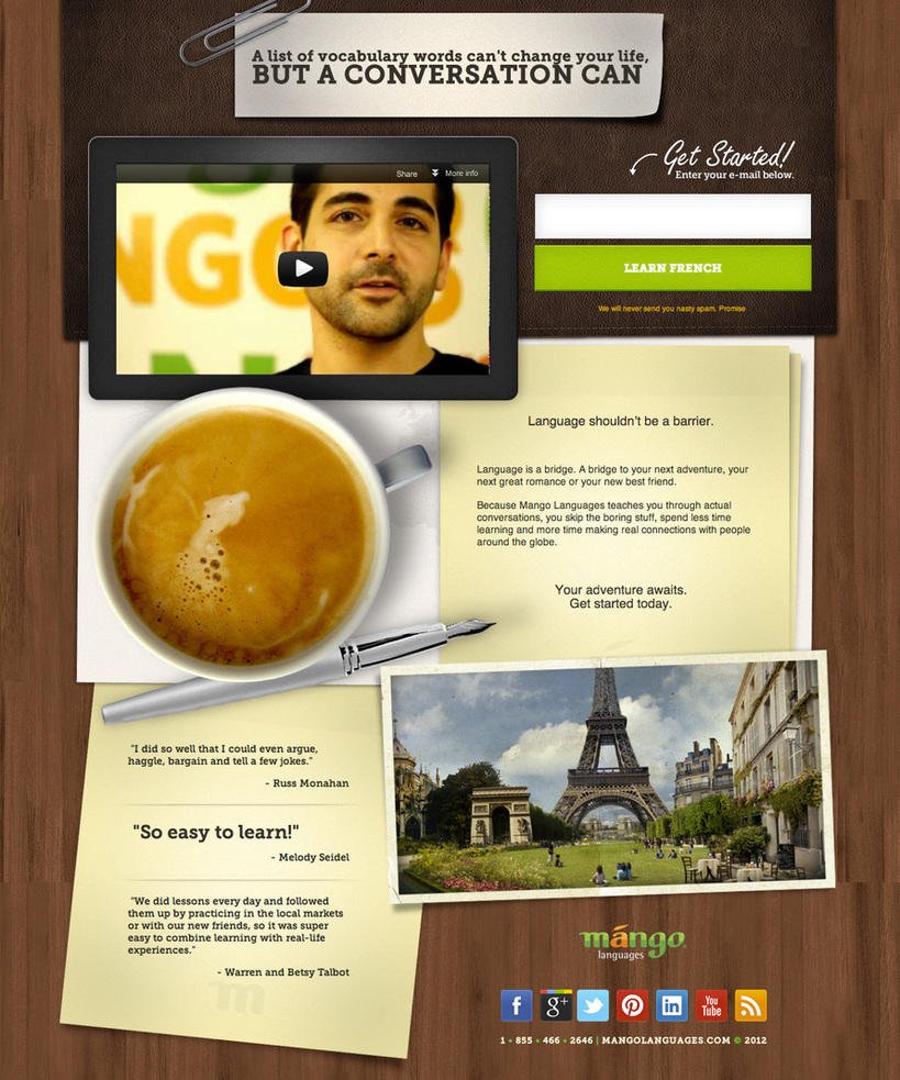
What Does it Do Right?
- Really slick design. It looks great!
- Great visual and media elements with the video at the top, coffee cup in the middle, and Eiffel tower at the bottom. I feel like I’m in France already! Bonjour!
- Minimal text with social sharing buttons at the bottom
- Testimonials, especially that big one from Melody Seidel over there
- Short form – just the email address and a big, colorful, offer-specific button
What it Does Wrong
- Not much, I think it’s pretty fantastic
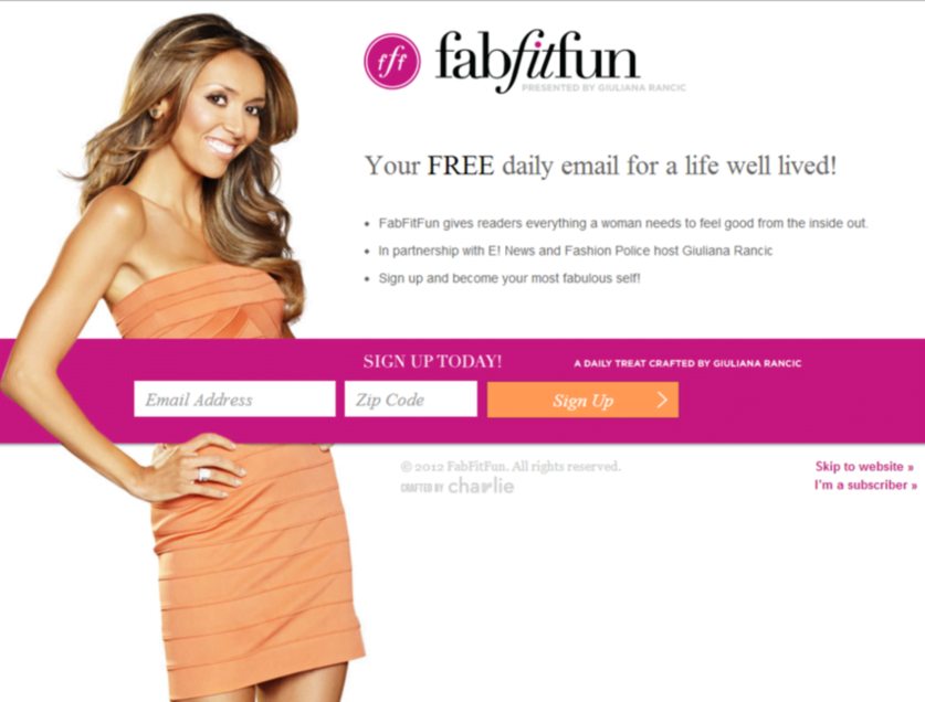
What it Does Right:
- Cool design, bright and captivating
- Short form field, and the horizontal look makes it seem even smaller than it is
- Minimal text which is formatted in bullet points
What it Does Wrong:
- The bullet points don’t really give any information as to why I should sign up for these emails. “Everything a woman needs to feel good from the inside out” is an incredibly vague description.
- The “skip to website” link could be a little bigger
We hope you enjoyed this guide to squeeze pages. Do you have any advice on how to make a super squeeze page? Tell us in the comments!
Attribution: Several squeeze page example images taken from Unbounce, War and Peace image from Wikicommons



![Search Advertising Benchmarks for Your Industry [Report]](https://www.wordstream.com/wp-content/uploads/2024/04/RecRead-Guide-Google-Benchmarks.webp)


