
What big brands are able to do with their enormous marketing budgets is inspiring – though sometimes it mostly inspires jealousy. The typical small business can’t sponsor the Olympics or get an ad spot during the Super Bowl. You have to tinker around with more accessible campaigns that cost less but typically have smaller reach as well.
PPC is an example of an incredibly accessible marketing channel – it’s being exploited by tiny one-man shops and huge multinational corporations alike. But how much better is a big-brand PPC ad than an SMB ad – if at all? Is it like comparing the latest Pepsi commercial to what your local furniture store puts together?
Let’s look at five big-brand Google Ads (formerly known as AdWords) ads and see what they do well and what they could do better.
(More: Dear eBay, Your Ads Don’t Work Because They Suck)
By the way, I fully admit to stealing the format for this post from Oli Gardner at Unbounce, who recently did something similar with big-brand landing pages. Thanks, Oli!
Big-Brand PPC Ad #1: LightingDirect.com
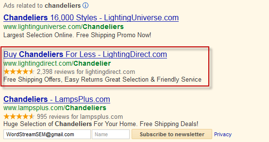
A Google search for “chandeliers” turned up these three ads in the coveted top-of-page ad spots. Let’s focus on the middle ad from LightingDirect.com (a Build.com network site), comparing it to its close competition.
What I Like:
- Seller Ratings – Both LightingDirect.com and LampsPlus are making use of the seller ratings extension available in Google Ads. This helps them stand out a little more from the top-ranked ad. It’s working to the second ad’s advantage in particular because the company has over twice as many reviews as the third ad.
- Lots of Benefits – This ad manages to pack four different benefits (free shipping, easy returns, great selection, and friendly service) into a small amount of space. The other two ads only include two benefits in their message.
What I’d Change/Test:
- Punctuation – Putting punctuation at the end of the first line of descriptive text (a comma or period after “Easy Returns”) would have made this ad easier to read, since top-ranked ads often find their two description lines expanded into a single long line. They could probably also increase CTR by including an exclamation point.
- Call to Action – There’s no explicit call to action in this ad. (The first ad makes the same mistake; the third ad has the “Subscribe to newsletter” button to entice an action.) I might try losing one of those four benefits and turning one of the benefits into a CTA – for example, “Claim Your Free Shipping Offer” or “Check Out Our Great Selection.”
Big-Brand PPC Ad #2: Audi
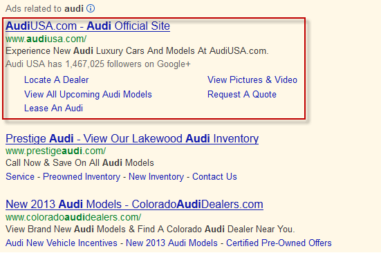
Unsurprisingly, Audi owns the top spot for a search on “Audi.” (And yes, we think even small businesses should bid on branded terms.) So what are they doing with the prime real estate?
What I Like:
- Sitelinks – Sitelinks are an easy win: They make your ad bigger and give users many more places to click. In fact they increase CTR even when users aren’t clicking the sitelines themselves, meaning you get a lift on the main headline link too.
- Verbs – Audi isn’t missing a call to action like LightingDirect was – in fact, the main description line as well as every single sitelink includes a verb, enticing the searcher to take action.
- Social Extensions – Audi has an insane number of followers on Google+, so they’re right to show that number off. (According to Google: “On average, search ads with annotations have a 5-10% uplift in click through rate and the Google Ads Social Extension helps you show more of them.”)
What I’d Change/Test:
- Headline – Since this is the top result on a brand search, it probably has a super-duper high CTR, but nonetheless, I think the headline could be doing more work. All it really tells us is that this is the official site. Compare to this BMW ad that also tells us we can use the official site to build our own car.
Big-Brand PPC Ad #3: Olay
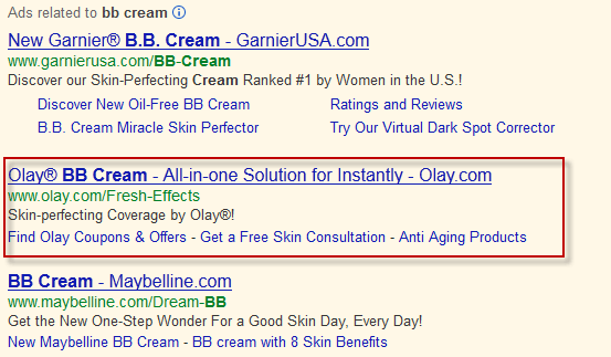
I know some of you dudes out there are thinking “What the %^&$ is BB cream?” Basically, it’s like gussied up tinted moisturizer … which is like a sheer foundation … never mind. The point is, it’s makeup, and you can buy it. Let’s take a look at the Olay ad and the other competition in the yellow box.
What I Like:
- Use of Symbols – Did you know that using symbols, like the registered trademark symbol, can boost your ad performance? Test this now! They’re also using that powerful exclamation point.
- Offers – I like the specific offers in the sitelinks, especially “Get a Free Skin Consultation,” which sounds like a great lead builder.
What I’d Change/Test:
- Shorter Headline – The headline is too long so it gets truncated. Instantly what? We don’t know. [EDIT: As some commenters have pointed out, the first line of the description appears to have been pulled up into the headline, so the real issue is that the description doesn’t work when broken up into two parts; still something to be mindful of. It’s probably not a good idea to end your first description line with an adverb.]
- Longer Description – On the other hand, the description line is throwing away its extra characters, space that could have been used for a call to action (Maybelline’s CTA in the third ad is awesome) or to repeat the keyword (“BB Cream”) in the text again. Remember, when the search query appears in your ad, it appears in bold face, so your ad stands out more.
Big-Brand PPC Ad #4: ULINE
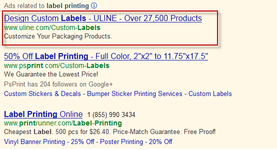
ULINE is one of the top PPC spenders in the business and industrial category, spending over $35 million a year on Google Ads advertising. Are they making the most of that big PPC budget?
What I Like:
………… <crickets> …………
I don’t like much about this ad. Let’s get to what I don’t like.
What I’d Change/Test:
- Better Keyword Matching – It looks like they’re broad-matching on “labels,” but they’re not using dynamic keyword insertion (DKI), so the word “printing” doesn’t actually appear in the ad – not a great intent match. The ad is all about designing and customizing labels, not printing them. They should be keeping a better watch over their search query report and building out more targeted ad groups.
- More Benefits – The only benefit here is “Over 27,500 Products” – which, some might argue, is actually a shortcoming. Who wants to search through nearly 30,000 products? Paradox of choice, anyone? Sounds like a waste of time. Compare this to the other two ads, which offer lots of information on price and specific details about label sizes and other information that would help the searcher make a decision.
- Ad Extensions – ULINE’s ad doesn’t make use of any extensions at all. Can we get a sitelink up in this piece?
Since ULINE’s ad is relatively weak compared to the #2 and #3 ads, they’re probably bidding higher and paying a lot more than their competitors per click.
Big-Brand PPC Ad #5: SelectQuote
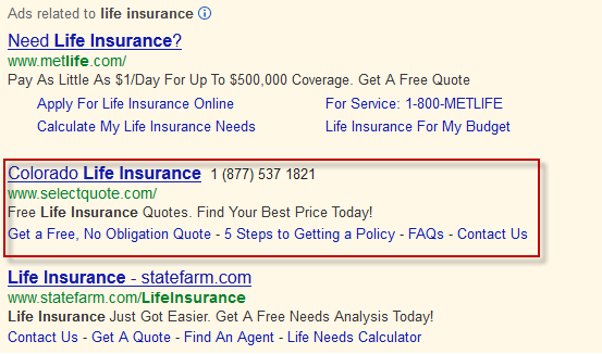
Here’s an ad that follows a lot of the best practices we’ve already mentioned – clear call to action, using the search query in the text, sitelinks, etc. What are they doing that’s new?
What I Like:
- The Local Connection – SelectQuote has localized their ad to recognize my location. I’m in Colorado, so I might want to deal with a local agent.
- Communication Extension – Including a phone number means that your ad could lead to conversions even if they don’t click the ad. (That means it’s free, yay!)
What I’d Change/Test:
- Numbers – The top-ranked Metlife ad gets specific with numbers: “Pay as little as $1/day for up to $500,000 coverage.” If I were SelectQuote’s PPC manager I’d test out concrete dollar amounts in my text too.
- Appeal to Emotions – People looking for life insurance might be driven by some strong emotions – fear, compassion, concern for one’s loved ones, etc. An ad that speaks to those emotions could really do well here. I’d test something like “Take Care of Your Family. Get a Free Quote Today.”
Do you steal from the big boys when it comes to writing ad text? Or do the little guys do it better?







Comments
Please read our Comment Policy before commenting.