The chances are pretty good that, even though you may not have realized it, you’ve seen several examples of native advertising. These days, native advertising is everywhere – and it’s getting harder and harder to spot.

There’s something not quite right about this cheeseburger…
In today’s post, we’re going to look at what native advertising is, why it can be so controversial, and several native advertising examples that are really impressive – as well as a few that are downright terrible.
What Is Native Advertising?
Simply put, native advertising is paid content. Articles, infographics, videos, you name it – if a content producer can make it, corporations can buy it and publishing platforms can promote it.
Now, you might be thinking, “How does a native advertisement differ from an advertorial?” Well, in order to be considered a true native advertisement, the content should align with the publication or site’s established editorial style and tone, and must also provide the kind of information that the publication’s audience typically expects.
These qualities are what make native advertisements difficult to spot, as they often blend in with the “organic” content extremely well. This is made even more challenging by the fact that there are no defined rules or guidelines on how publishers must label native ads, and standards of transparency vary widely from one publication to another.
It’s also worth noting that native advertising is not necessarily the same thing as content advertising. Unfortunately, the overlap between the two disciplines and their similarity in name often result in confusion.
<<Need help with your ads? Check out our (free!) All-Star Playbook to Online Advertising>>
Why Is Native Advertising So Controversial?
“Don’t trick them. Don’t piss them off.”
This was the advice of Eric Goeres, director of innovation at Time magazine, speaking at the recent Contently Summit. Goeres spoke during the “Truth in Advertising” panel at the event, during which the topic of native advertising took center stage. Goeres’ words of warning refer to the trust between a publisher and its audience, and he emphasized the dangers of angering readers by resorting to trickery and deception to make a quick buck.

Brands and advertisers love native ads, mainly because the click-through rates tend to be much higher than typical advertisements and engagement is usually much stronger. However, not everyone is as enamored with native ads, particularly consumers.
Several professional organizations have weighed in on the often vague nature of native advertising. The Federal Trade Commission is considering implementing regulatory measures on brands using native ads to promote their products, and the FTC has also indicated it may monitor the market closely to ensure that native advertising is being used in a manner that benefits consumers. The American Society of Magazine Editors has also called for greater transparency and oversight when it comes to native advertising.
The reason that many publishers see native advertising as a risky proposition is the potential for this kind of content to erode the public’s trust. After all, if The New York Times publishes a “story” by Dell in exchange for money, can the Times objectively report on matters relating to Dell, or has every mention of the company been paid for? This is the dilemma facing publishers today.
Native Advertising Statistics
Before we look at some of the best native advertising examples (and a rogue’s gallery of some of the worst), let’s acquaint ourselves with the state of the native advertising landscape:
- Almost half of consumers have no idea what native advertising is
- Of those consumers who do, 51% are skeptical
- Three out of four publishers offer some form of native advertising on their sites
- 90% of publishers either have or plan to launch native advertising campaigns
- 41% of brands are currently using native advertising as part of wider promotional efforts
5 Great Native Advertising Examples
So, now that we’ve established that native advertising is here to stay (for the time being at least), let’s take a look at some of the best – and worst – native advertising examples.
1. “Woman Going to Take Quick Break After Filling Out Name, Address on Tax Forms,” The Onion
One of the funniest satirical sites on the web, The Onion also has a strong grasp on native advertising, as exemplified by this particularly well-known example.
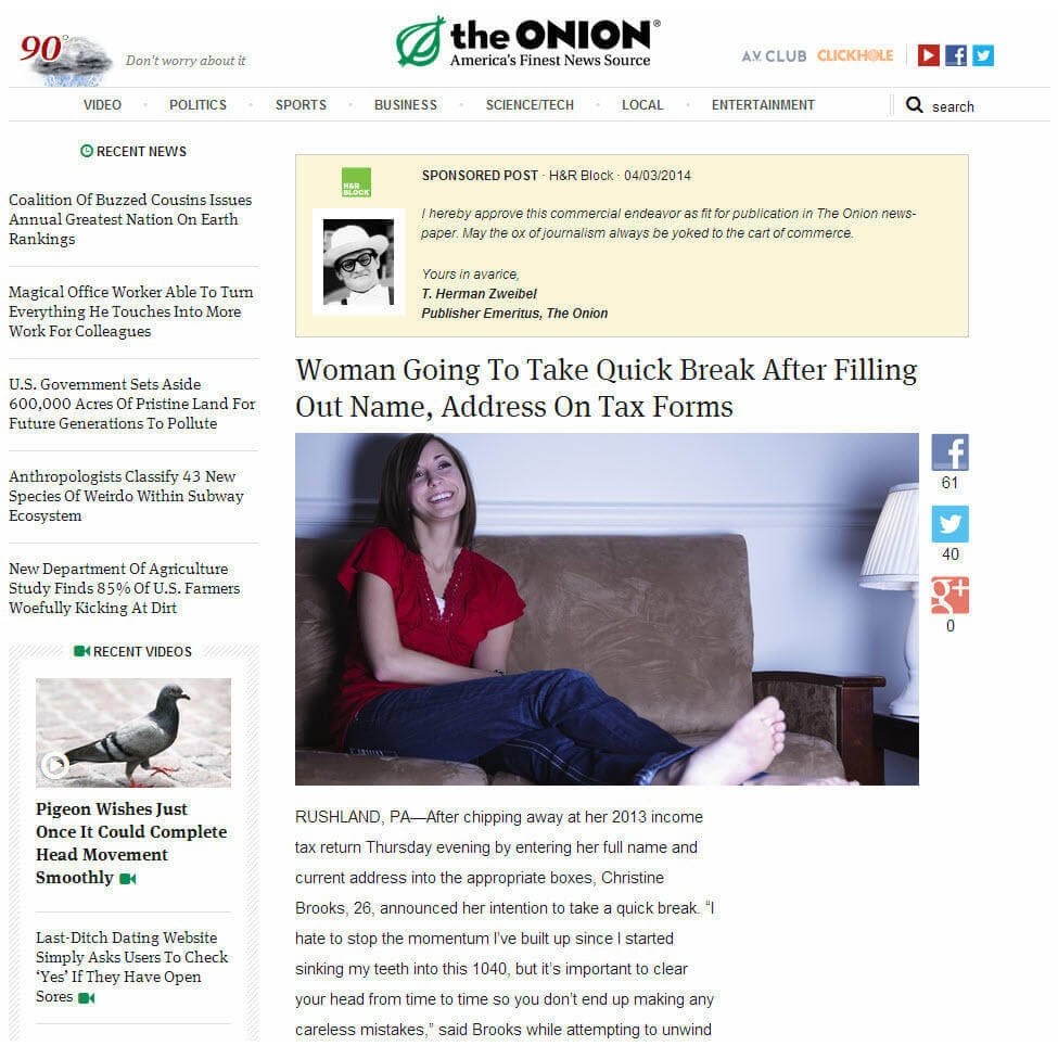
This example is, admittedly, a little murky when it comes to the definition of native advertising above. Firstly, The Onion created this content specifically for its client (in this case, H&R Block), rather than Block simply publishing its own content on the site. However, the content itself and its positioning still classify it as native advertising, rather than “traditional” sponsored content, at least in my book.
When this content was published in 2012, it was framed by several traditional vertical and horizontal banner ads for H&R Block. Even if visitors didn’t click on these banners (which they’re unlikely to, as you’re 475 times more likely to survive a plane crash than click a banner ad, according to Solve Media), the result was significantly increased brand awareness.
Why It Works
Although the content of this post isn’t about H&R Block specifically, it does address the typically bland, dry topic of taxes in a fun, relatable and highly entertaining way, creating a positive association with the advertiser. This native ad even poked fun at the box that clearly marks the page as sponsored content by including an endorsement from The Onion’s fictitious “publisher emeritus” T. Herman Zweibel.
Although the banners served as calls to action, the main purpose of the campaign was to further increase H&R Block’s brand awareness – a goal that this native advertising example accomplished admirably.
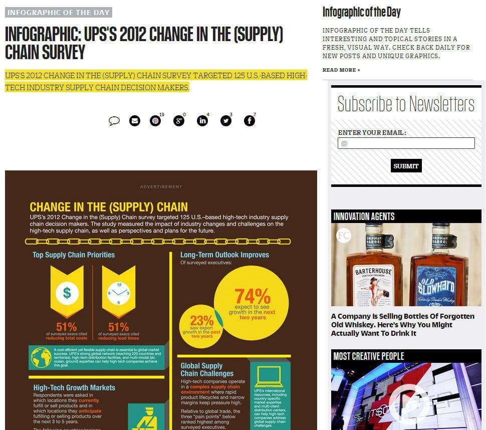
2. “Infographic: UPS’s 2012 Change in the (Supply) Chain Survey,” Fast Company
This infographic highlighting UPS’s innovations in its supply chain management operations is another excellent example of native advertising. It’s not the prettiest infographic you’ll ever see, but it gets the job done.
Why It Works
What makes this infographic such a great example of native advertising is that its virtually indistinguishable from Fast Company’s typical content. Notice the tiny gray “Advertisement” tag at the top? It’s definitely easy to miss. The infographic’s use of UPS’ brown and yellow color scheme further reinforces the content’s brand messaging in a subtle way, and the infographic succeeds in selling UPS’ services in the tried-and-trusted “problem/solution” format.
3. “10 Quotes Every Grad Needs to Read,” BuzzFeed
Alongside Upworthy, BuzzFeed is the most successful viral hit factory on the web. Is it any wonder that the site would eventually open up its coveted readership to sponsors with deep pockets? Case in point, the BuzzFeed “Community” pages, featuring brands like publishing giant HarperCollins:
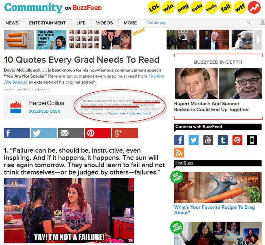
As you can see above, posts made to the Community section of BuzzFeed have “not been vetted or endorsed by BuzzFeed’s editorial staff,” meaning that HarperCollins (and Mini, and Pepsi, and the other brands that publish content at BuzzFeed) have simply paid for the privilege of getting their brand in front of BuzzFeed’s audience. Apart from the prominent HarperCollins logo above the social share buttons, there’s little to set this apart from BuzzFeed’s regular content.
Why It Works
Timeliness factors into the success of this native advertising example. Firstly, the post was published in late June, coinciding well with graduation season. Secondly, the basis of the post was teacher David McCullough, Jr.’s famous “You Are Not Special” commencement speech, which itself went viral.
The post adheres strictly to BuzzFeed’s popular animated .GIF/listicle post format, making it easily digestible, and the headline is impeccably crafted for BuzzFeed’s audience, as you’d expect. There’s very little obvious connection between the client (a major publishing house) to the content, aside from the implied relationship between college graduates and books, so the ad comes off as a “soft sell,” which is easier for audiences to stomach than forceful product placement.
4. “Should You Accept Your Employer’s Pension Buyout Offer?”, Forbes
Forbes has published articles like this for years, but as the publication has transitioned from a full-time staff to a contributor-led model, it’s hardly surprising that Forbes has begun to publish native advertising by financial institutions like this one from Fidelity Investments.
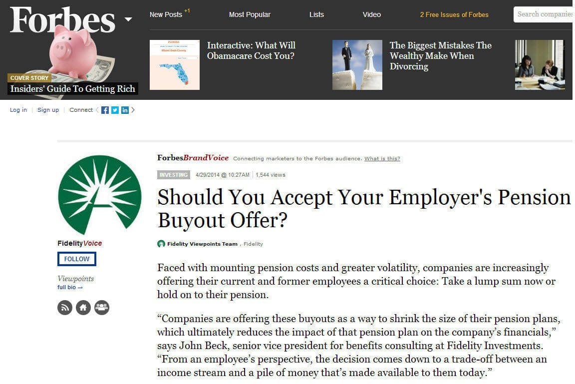
This is a particularly good example of native advertising, as while the post is most definitely branded and has an unmistakable angle, the post itself contains some real substance. It outlines the pros and cons of both monthly payment and lump sum pension buyout options, backed up with hard numbers about inflation rates and how accepting a pension buyout offer can affect your tax status.
Why It Works
Yes, it’s blatantly branded content, and Fidelity makes no secret of its services, but this post actually contains more financial advice and insight than most typical Forbes finance and business content. Readers should most definitely remain aware of Fidelity’s agenda when reading, but overall, this native advertisement provides real value to the reader, does so in a way that Forbes’ audience would expect, and aligns with the publication’s editorial and stylistic guidelines. A great example.
5. “Hennessy Fuels Our Chase for the Wild Rabbit … But What Does It All Mean?”, Vanity Fair
Vanity Fair has a long tradition of publishing effortlessly trendy lifestyle journalism, which makes it an ideal vehicle (pardon the pun) for native advertising.
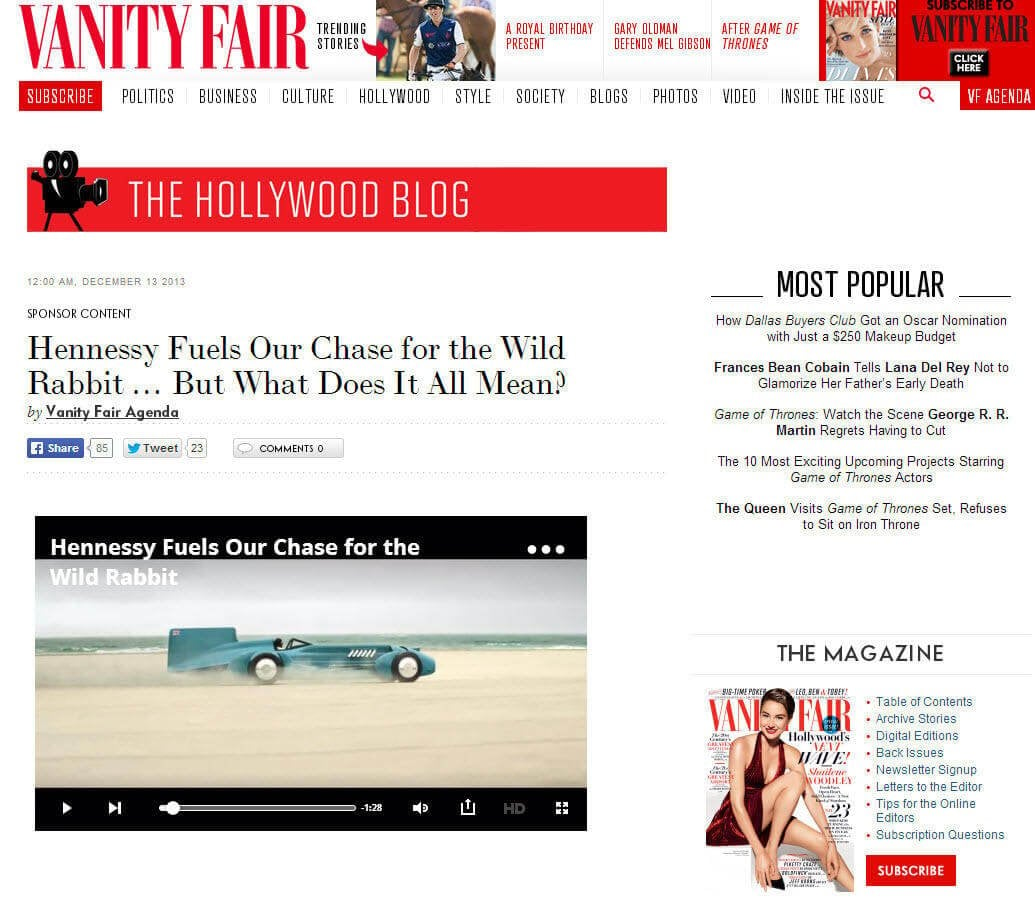
This native ad combines video and written content to go behind the scenes of a video about English race car driver Sir Malcolm Campbell, “The Fastest Man on Earth.” Campbell was the first man to break the 300mph land speed record way back in 1935, and he remains an enduring symbol of ambition – the perfect gentleman to sell top-shelf liquor. Hennessy partnered with creative agency Droga5 to produce the video, which coincided with the drink maker’s “Never Stop, Never Settle” campaign.
Why It Works
In addition to drawing a subtle yet striking comparison between Campbell’s spirit of adventure and Hennessy’s “Wild Rabbit” campaign (“a metaphor for one’s inner drive to succeed”, according to the article), the piece is genuinely interesting. The content’s inevitable product placement is handled well, and it doesn’t feel gratuitous or tenuously positioned alongside the subject matter. Finally, the piece is as stylish as a regular Vanity Fair feature, which results in an engaging experience for the reader.
The Hall of Shame: Terrible Native Advertising Examples
Now that we’ve seen how the pros create sponsored content, how about we point and laugh at some of the very worst native advertising examples on the web?
“David Miscavige Leads Scientology to Milestone Year,” The Atlantic
Although The Atlantic was quick to pull this disastrous foray into native advertising from its site soon after it went live, it will live on forever thanks to the fine folks at the Poynter Institute for Media Studies, who decided to permanently archive it – presumably to prevent such a tragedy from ever happening again.
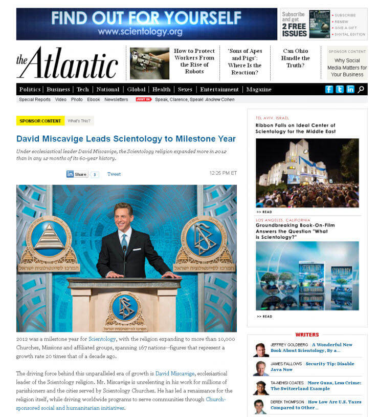
Now, aside from the boatloads of cash The Atlantic must have received for publishing this shameless advertorial, I can’t think of a single reason why shilling for what some describe as a dangerous cult in a reasonably well-respected national publication ever seemed like a good idea.
Yes, The Atlantic had the common sense to highlight (with a bright yellow tag) that this was “Sponsor Content”, but this did little to mitigate the damage. The publication was widely mocked in the mainstream media, and this classic blunder is routinely used as the poster child for bad native advertising examples.
“How to Transform into a Total Nerd Babe,” Gawker
I find everything about this content – and I do mean everything – utterly objectionable and completely offensive, from the vapid headline to the clichéd copy. Unfortunately, that’s not even the worst part.
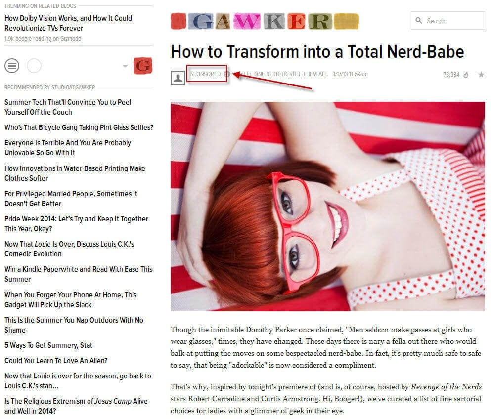
This “content” was originally created to promote the TBS reality TV show “King of the Nerds.” Aside from the tiny “Sponsored” tag toward the top of the post (highlighted above), there is nothing to distinguish this ad from the type of drivel Gawker usually publishes. After the promo was over, the editorial staff at Gawker couldn’t even be bothered to restructure the article to remain grammatically correct, and instead just deleted the name of the show (see the second paragraph). For shame.
Gawker (deservedly) took a lot of heat for this and its other native ads, which led the publisher to implement a new policy of transparency. These days, a native Gawker ad looks like this:

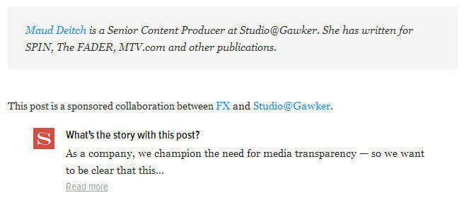
Gawker’s native ads are now tagged by network, appear in a dedicated section of the site (Studio @ Gawker), have their own writers, and the nice, clear statements at the bottom indicating that this is, indeed, an ad. At least now it’s easier to identify which posts should be avoided.
“Will Millennials Ever Completely Shun the Office?”, The New York Times
This advertorial is so bad, it’s actually a little embarrassing.
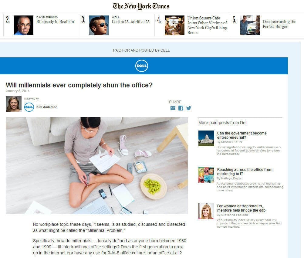
Not only is the agenda of this piece completely transparent from the outset, the “Millennial work ethic” angle is so tired it’s practically comatose. Even the question posed by the article is ridiculous – no, Millennials will not “shun” offices, because most of them are saddled with back-breaking student loan debt and can’t find work. Oh, but if they do choose to shun the office, they can always use Dell hardware to telecommute, right?
The only thing this native ad has going for it is that it’s impossible to mistake this ad for the Times’ actual editorial content. It also appears that (as of the time of this writing) the Times has removed Dell’s other three sponsored posts, which I’m guessing is because the whole experiment was an unmitigated disaster.
Oh dear.
Native Ads: More Than Meets The Eye?
Done well, native ads can be interesting, informative and sell a product or build a brand. Get them wrong, however, and your readers will hate you for it. Knowing how to strike this delicate yet crucial balance is difficult, but that hasn’t stopped publishers from jumping firmly on the native ads bandwagon. Only time will tell whether the FTC or other regulatory bodies will chime in on how these ads should be displayed, but for now, it seems likely that both brands and publishers will continue to try and discover the magic formula.


