I was at the Google Performance Summit this week and in addition to learning about all the new changes and features coming to AdWords soon, I got a chance to try out the new AdWords interface coming in 2017, which isn’t even available in beta yet.
At the Summit, Google had it running on a bunch of demo-pods and you could ask the product managers questions. Right now it’s literally about half built – areas like opportunities, the shared library, etc. haven’t been implemented yet (clicking on them triggers a “coming soon” image).
However, there’s enough built to get an overall feel for how the new system works, and in this post I’ll give you a quick overview of the new AdWords interface along with my first impressions.
New AdWords Interface Design Principles
They’re saying the new interface is designed for these three principals:
- “Data at your fingertips” – This principle about making data-backed insights easier to surface and more actionable.
- “Focus on your business” – With this one the goal is to make it easier to optimize campaigns based on your specific business goals and targets.
- “Powerful, yet simple” – The new design is intended to be generally sleeker and easier to use.
When I asked them who is the intended target user of the new interface, they said it’s a tough question but in general the audience is intended to be sophisticated power users.
New Visual Dashboards
In the new interface, when you start the application you see some visual dashboards: top keywords, campaign overviews, device overviews, time of day overviews, etc.
Right now there are only three or four dashboards implemented, but Google plans to create many more dashboards that you can choose from, such as a chart to monitor for your high or low CTR keywords.
New Application Navigation System
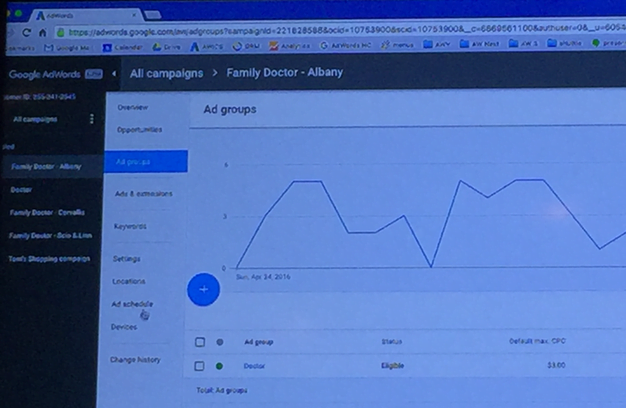
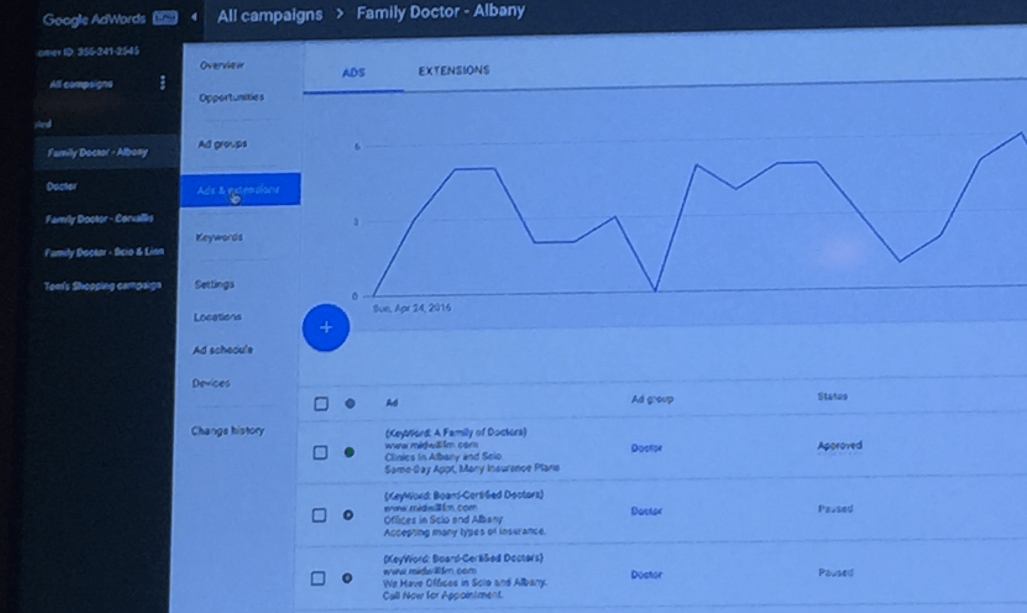
The Keywords, Ad Groups, Settings, Extensions (etc.) tabs that used to be along the top of the screen are now moved to the left side of the screen. The Opportunities tab, which used to be a separate area in the top-level navigation, is now made available in-line at every ad group/campaign in the left explorer navigation, as shown here:
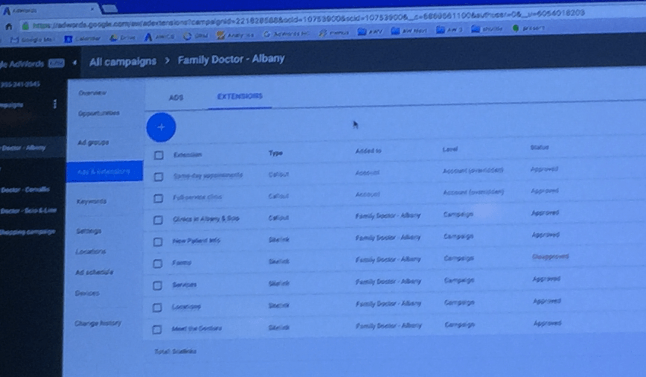
You can see here that they’ve grouped together stuff like ads and extensions in the same tab, because they’re related and usually you need to access both in the same context – it’s more intuitive.
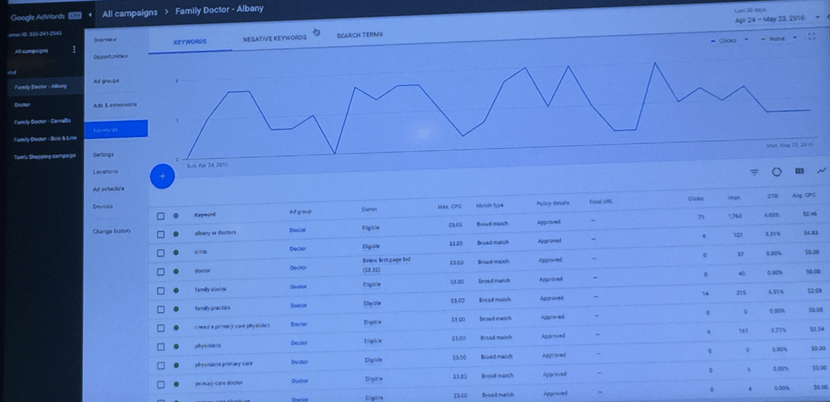
Similarly, the keywords, negative keywords and search terms are all in the same section:
Goodbye AdWords Dimensions Tab?
The dimensions tab was always one of the weirdest neighborhoods in the AdWords interface. It felt like a dumping ground for detailed reports on every imaginable thing. Now, they’re taking some of the more popular reports from the dimensions tab and exposing that information directly at the campaign and ad group levels.
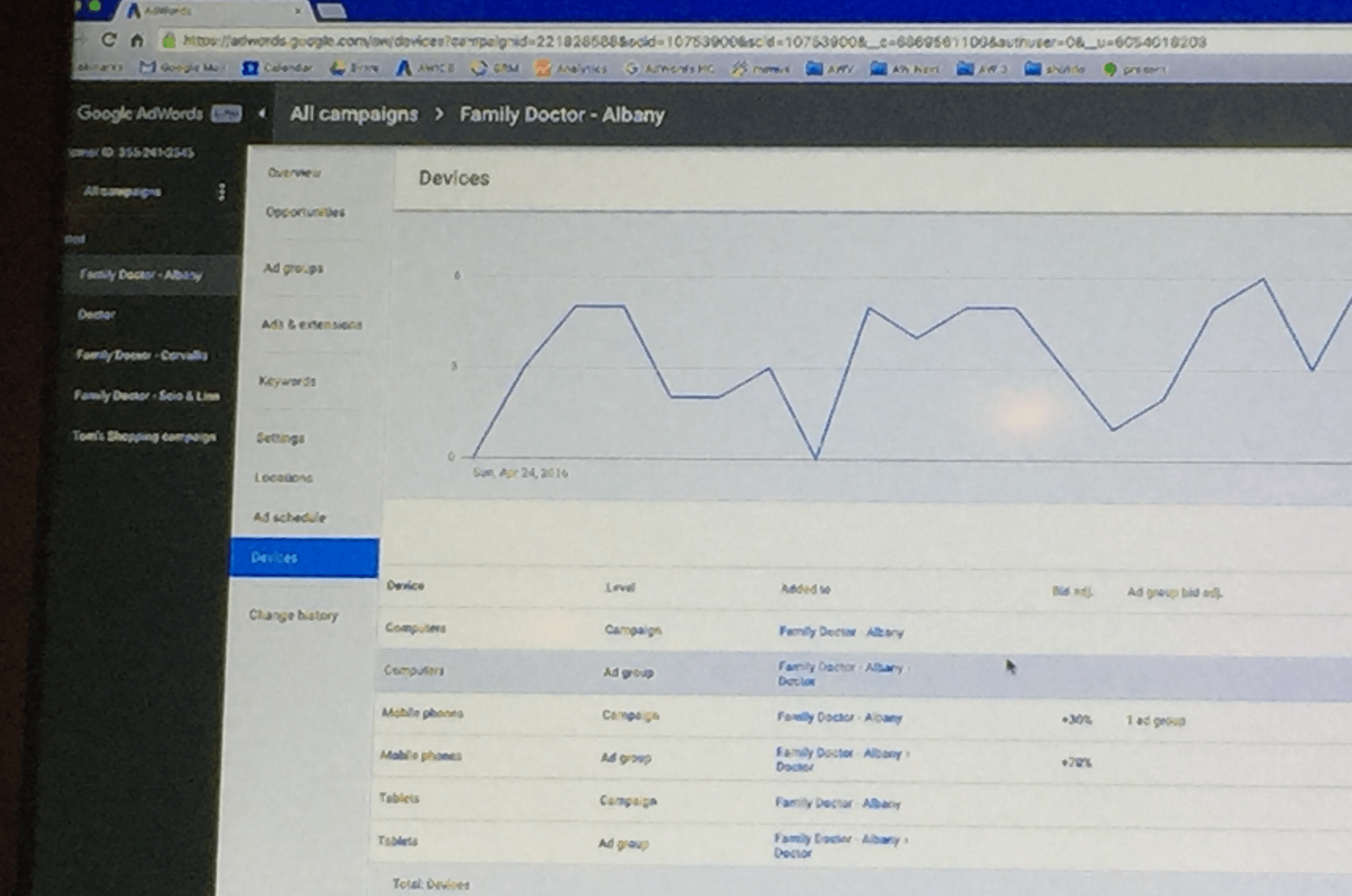
So for example, the devices summary used to be a report in the dimensions tab – it’s now just a click away in the new interface.
Similarly, a location summary showing where your clicks are coming from is exposed in every campaign and ad group. Previously, you had to run a report in the dimensions tab to get that data.
I think this makes it easier to use, because in the current interface, people might not realize this functionality is available in the first place.
New AdWords Campaign Creation Wizards
When you hit the “+” button to create a new campaign (shown below) a new goals-based campaign creation wizard appears.
There are so many different campaign types in AdWords it can be hard to remember them all – they’re trying to make it easier for users by asking you up front, what are you trying to accomplish? This photo is pretty hard to see but basically it’s asking you questions like: Are you trying to drive actions? What types of actions? Calls? Store Visits? App Installs? Ecommerce Sales? Your answers will determine what type of campaign you create.
Control freaks, don’t worry: Google assured me that if you already know what kind of campaign you want to create, you can skip this wizard altogether.
Final Thoughts on the New AdWords Interface
Overall, the new interface is pretty familiar. I’m relieved because even though AdWords is cluttered and complex, I’ve been using it for years and I already know where everything is – I was worried that they were going to overhaul everything. But I could find the stuff I wanted to find.
I think it’s like how if you have tons of stuff at home, and you’re piling on more stuff all the time, every once in a while you need to reorganize. Google has been adding tons of new features and functions over the years (and the dimensions tab might have been becoming like a catch-all junk drawer). I think this is a pretty nice re-org that makes things easier to find but doesn’t wreck everything!
As for who will get the most out of it, I think power users will love it. People who are newer to AdWords will probably like the sleeker look, but it remains to be seen if the completed build-out of the new interface actually reduces the complexities of AdWords or if it’s just a reskin of the existing beast.
What do you think? Are you excited about the changes?





Comments
Please read our Comment Policy before commenting.