
Landing page optimization is one of the best ways to increase the performance of your PPC campaigns and maximize your ROI. Over the course of the past few years, WordStream has offered dozens of landing page tips and tricks to improve your campaigns – but which ones are our favorites, and which consistently prove to be the most effective?
In this post, we’ll be revisiting some of our hottest tips to provide you with the definitive guide to PPC landing page optimization. From simple tweaks to bold, show-stopping optimization strategies, each of the techniques listed below will have an immediate impact on your conversion rates.
Our top landing page tips…ever
When you’re done with these tips and tricks, head on over to these awesome landing page examples to get inspiration!
1. Keep the messaging between ads and landing pages consistent
Sure, this might seem like a no-brainer, but you’d be amazed by how many advertisers fail to do this. If there’s a disconnect between what the ad promises and the landing page delivers, you may as well have a broken URL in your ad for all the good it will do.
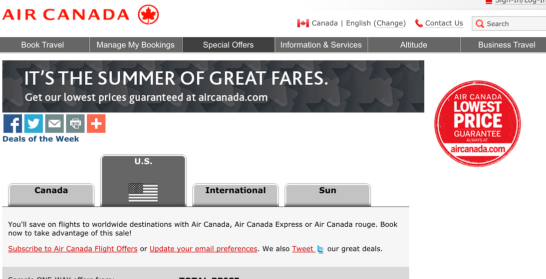
Take a look at the example below (which was taken from this blog post about landing page message matching). First let’s check out the ad:
And now let’s look at the accompanying landing page:
As you can see, the landing page matches the ad perfectly, resulting in a predictable and relevant experience for the user. Again, this seems so obvious, but I’ve lost count of how many advertisers simply send PPC traffic to either their homepage (bad) or a generic splash page (worse). Keep your messaging consistent! This is also important from a visual perspective. To learn more about visual continuity, check out this post on Facebook landing pages, which has more information on this principle.
2. Radically change the sign-up flow of your landing pages
Larry is fond of saying that small optimizations make for small results – and he’s right. Changing button colors and font kerning might feel like you’re moving the needle, but in reality, you’re wasting time and missing out on opportunities for huge conversions.
To see big results, you have to make big changes, and radically adjusting the sign-up flow of your landing pages is one of the biggest changes you can make. Let’s see this in action, in an example from this recent blog post on increasing conversion rates:
This landing page doesn’t just give prospects one way to sign-up, but three – each of which is positioned differently to suit the individual needs of the visitor. This is very clever, as it reinforces the sense that the user is in control and can determine their own course of action without being forced into rigid, linear decisions. Whatever changes to your sign-up flow you make, be sure to A/B test them first to make sure you’re making good calls based on hard data. Speaking of A/B testing…
3. A/B test the position of forms on landing pages
A lot of marketers focus too much on landing page forms themselves (more on this shortly), but far fewer consider where those forms should be.
In this post (which is full of awesome landing page optimization advice), Aaron Levy strongly recommended testing the positioning of landing page forms on your pages to see considerable gains in conversions:
In the example above, the control page (left) already had a strong conversion rate of around 11% prior to testing. The variant (right), however, performed even better with a conversion rate of just under 16%. This might not qualify as one of the show-stopping changes Larry often advocates for, but it does prove that testing elements such as form position can have a major impact on your conversion rates.
4. Make your landing page forms mobile-friendly
Ever finished filling out a web form on your mobile device? No? Then expecting your prospects to amounts to lunacy. This is a key tip in our coming soon landing page post as well, and for good reason.
Mobile ads are so effective because they appeal to consumers’ desire to buy something right now, which means your mobile landing pages – and their forms – need to make it as easy as possible for them to convert while they’re on the go.
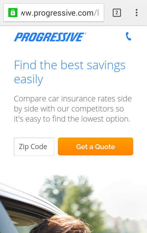
In the example below, taken from this blog post about landing page forms, Progressive has made it virtually effortless for the visitor to enter their information. Even sending a simple text message would likely take longer.
Granted, this form doesn’t give Progressive much in the way of information about the user, but that’s not the point – it’s all about the user, remember? By making their journey as easy as possible, you’re giving prospective customers what they want. This best practice, in turn, is likely to make them go the distance and convert.
RELATED: Our 50 Best Marketing Tips in 5 Minutes
5. Craft a killer call to action
If you’re still using “Submit” as your call to action, it’s time to rethink your strategy.
Calls to action are incredibly important. They can mean the difference between a bounce and a conversion, yet so many advertisers don’t seem to give them more than a few minutes’ consideration. Without a strong CTA, it doesn’t matter how good the rest of your landing page is.
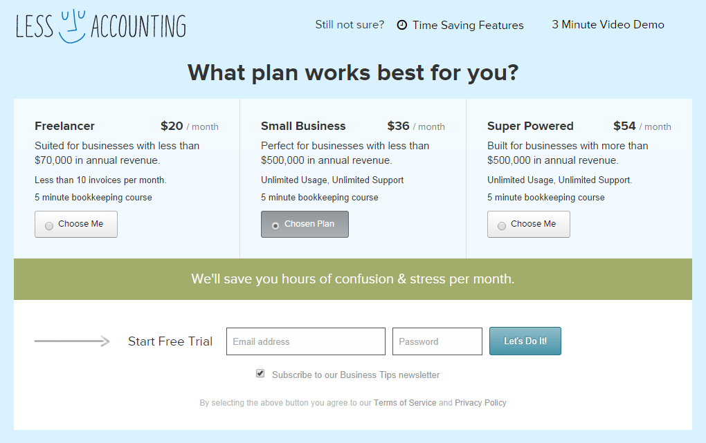
In this post about creating killer CTAs, we looked at several examples of excellent CTAs, my personal favorite of which is this example from Less Accounting:
I talk about Less Accounting’s messaging often, simply because it’s so warm, friendly, and accessible – not an easy task for a SaaS company focused on accounting and bookkeeping. Notice how the CTA uses connecting language to strengthen the implicit teamwork associated with Less Accounting’s product? “Let’s do it!” is far more compelling than “Submit” or an equally cold, distant CTA.
Next time you sit down to come up with a CTA, use the “I want to…” strategy. Your CTA should complete a sentence beginning with, “I want to…” Let’s take a look at a real example of this:
Obviously you don’t have to literally include the words, “I want to…” in your CTA, but these two examples show how this principle can result in strong, clear CTAs. You wouldn’t say, “I want to submit,” right?
6. Use the voice of the customer in your copy
Design considerations are very important to the success of a landing page, but the copy is just as important – if not more so. One of the best ways to create a compelling landing page is by using “the voice of the customer.”
Far too many landing pages (and marketing materials in general) are filled with sleazy marketing buzzwords and terminology lifted straight out of sales training manuals. This is particularly evident among enterprise-level businesses, many of which seem to think the more indecipherable the language, the better. However, speaking to customers using their language is far more effective, and will result in much higher conversion rates.
In this blog post about the voice of the customer, Brad McMillen explains that using language that emphasizes prospects’ wants and needs is a powerful way to appeal to would-be customers. Finding the voice of your customer isn’t guesswork, though – it’s an empirical, data-driven research process that identifies what your customers want and why, then structures your offering in a way that directly appeals to these desires.
In the example below from cloud-based accounting software platform FreshBooks, you can see how the language of this landing page has been crafted with prospects’ needs and wants first:
Every selling point has been emphasized from the perspective of the benefits to the customer – not how technically impressive the software might be, not how many clients they have, or anything else that marketers tend to love promoting about their product.
Read more about finding and using the voice of the customer in your landing pages and get ready for a deluge of conversions.
7. Use power words in your landing page copy
Using the voice of the customer in your landing page copy is powerful. Combining this with “power words” can make your pages damned near unstoppable.
In this post about how to write persuasive landing page copy, I explain how utilizing power words in your copy can take a compelling message and make it almost irresistible. However, using power words is about much more than choosing certain words or phrasing carefully; it’s about structuring your copy in ways that appeal to your prospects’ emotions. Look at this example, for instance:
The inclusion of a single word – “again” – in this context is powerfully effective. By saying, “Make home feel safe again,” the copywriter is implying that home used to feel safe, but doesn’t anymore. This copy subtly manipulates prospects’ fears, making this a remarkably effective line of copy.
Check out the full post to read more about the effectiveness of using power words, how to use narrative techniques in your copy, and other strategies for making your copy significantly more persuasive.
8. Include video on your landing pages
Including video on your landing pages can be very powerful, especially if you’re trying to convey a complex idea without bogging your visitors down with reams of text. Video is also an excellent way to reinforce your overall messaging and branding.
In this example, taken from this blog post about video landing pages, Rosetta Stone not only make the idea of learning a second language fun and entertaining, but also alluring and enticing – qualities not often associated with the considerable task of learning another language:
9. Use new ad formats and get rid of your landing pages altogether
For our final two landing page tips, we’re busting out the big guns and advocating for a truly bold strategy – getting rid of landing pages altogether. This might seem counterintuitive (or downright crazy), but today, there’s actually no real need to force prospects to a landing page at all.
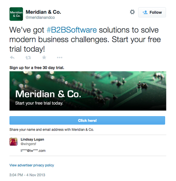
In another example from Larry’s post about increasing conversions without touching a landing page, there are several new ad formats available to advertisers that eliminate the need for landing pages. Rather than hurting conversion rates, these new ad formats can prove to be even more effective than the traditional funnel approach. Twitter’s Lead Generation cards, for example, allow prospects to take advantage of offers directly from within the ad itself, saving your prospects time and minimizing the steps necessary for the visitor to convert:
This is a perfect example of the kind of mentality Larry often talks about concerning big changes and big results. Many marketers are still caught up in ways of thinking that are quickly becoming outdated, so having the courage to take bold steps can put you ahead of the competition.
10. Use call-only campaigns
Our final landing page conversion optimization tip is another that removes the need for landing pages altogether. The reason this is our top tip is because, quite simply, it blows the others out of the water in terms of its potential impact on your conversion rates.
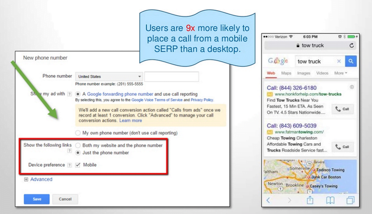
On average, users are NINE times more likely to convert from a mobile SERP than a desktop SERP. When you combine this with the fact that calls to businesses are worth at least three times as much as clicks, there’s a powerful case for abandoning the traditional landing page by using Call-Only campaigns.
AdWords’ Call-Only campaigns allow you to include a clickable phone number as part of your ad. This actually replaces the traditional URL altogether, meaning that your ad lets visitors call your business directly from your ad – no clicks, no web forms, no landing pages. Just get straight to the point and help prospects pick up the phone and call you.
That does it for our top 10 landing page optimization tips. Which ones are you already using, and which are you thinking of trying out? We’d love to hear about optimization strategies that are working for you, so be sure to comment and let us know how you’re crushing it on your own landing pages.
Our best landing page tips recap
To recap, here are the best landing page tips:
- Keep the messaging between ads and landing pages consistent
- Radically change the sign-up flow of your landing pages
- A/B test the position of forms on landing pages
- Make your landing page forms mobile-friendly
- Craft a killer call to action
- Use the voice of the customer in your copy
- Use power words in your landing page copy
- Include video on your landing pages
- Use new ad formats and get rid of your landing pages altogether
- Use call-only campaigns










Comments
Please read our Comment Policy before commenting.